I am a graphic designer based in Laurel, Maryland with a passion for print design, books, and illustration.
Quadmania 2023
Logos ⬩ Branding ⬩ Print Design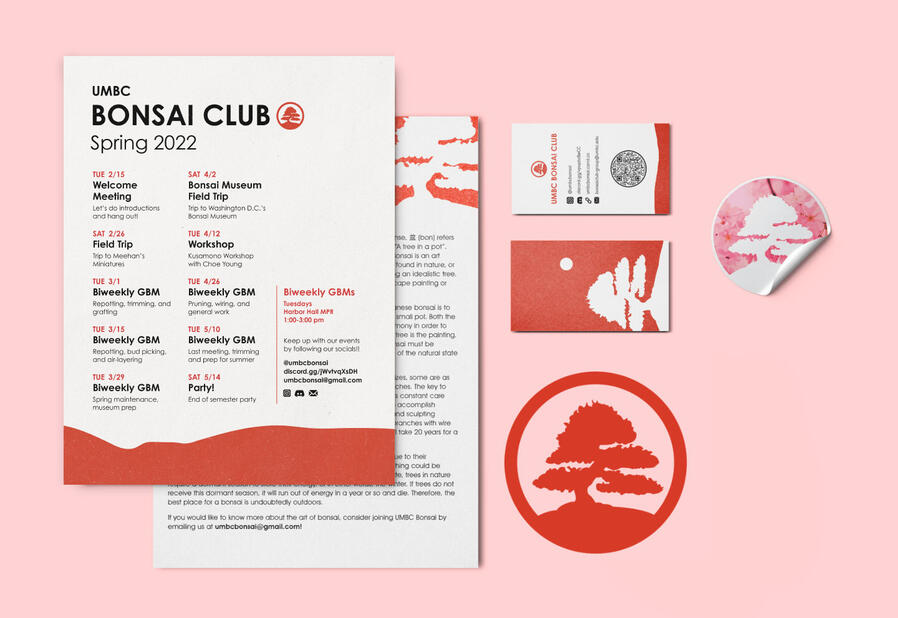
UMBC Bonsai Club
Logos ⬩ Print Design
UMBC Student Events Board
Social Media ⬩ Print Design
The Colonized and the Colonizer Within Me — Chinen Aimi
Book ⬩ Typography
Can You See That? — Two Birds
Book ⬩ Documentation
Pleasantville
Infographic ⬩ Research
Ascend at Aspen Institute
Submark ⬩ Icons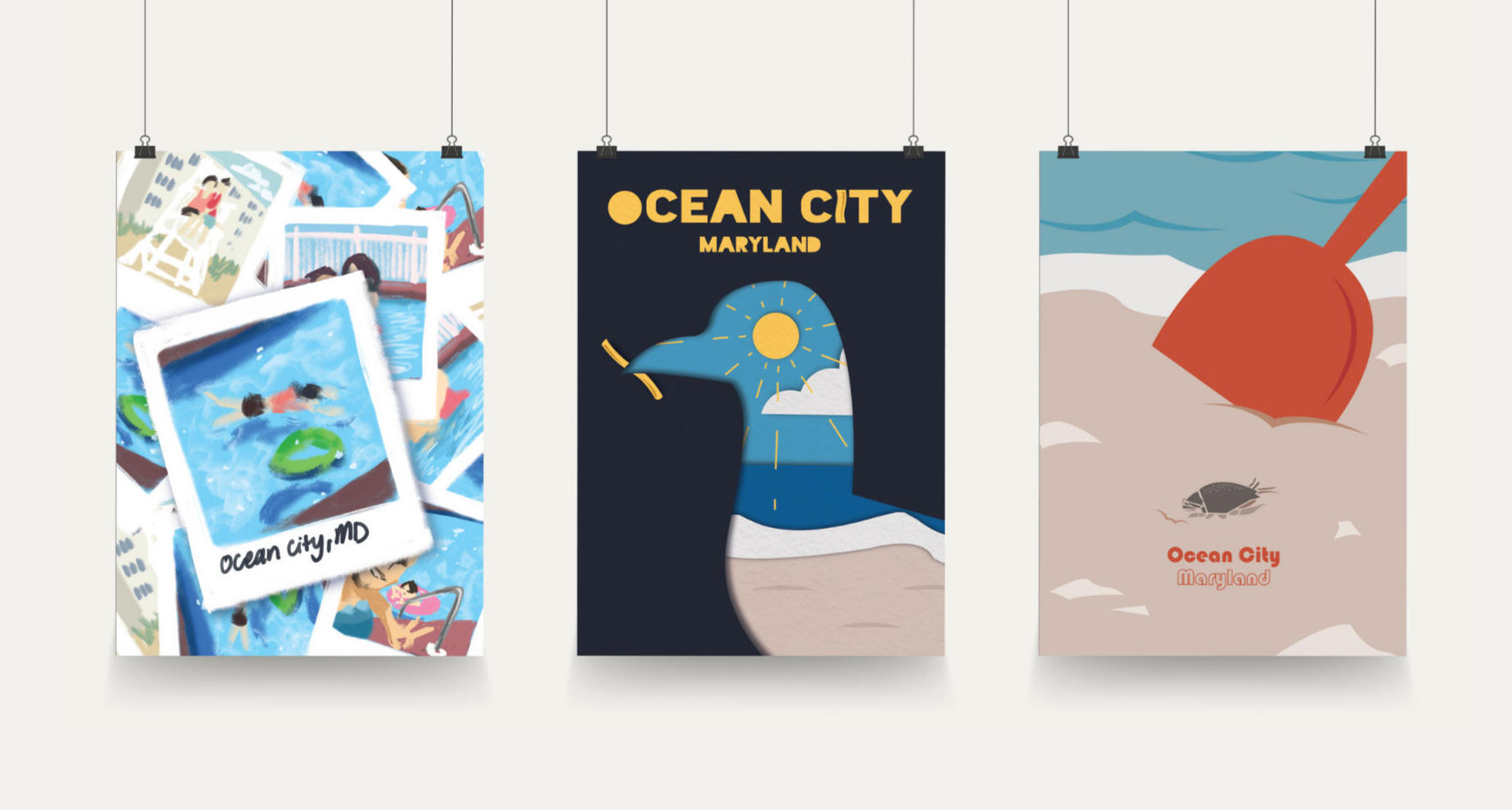
Ocean City Travel Posters
Posters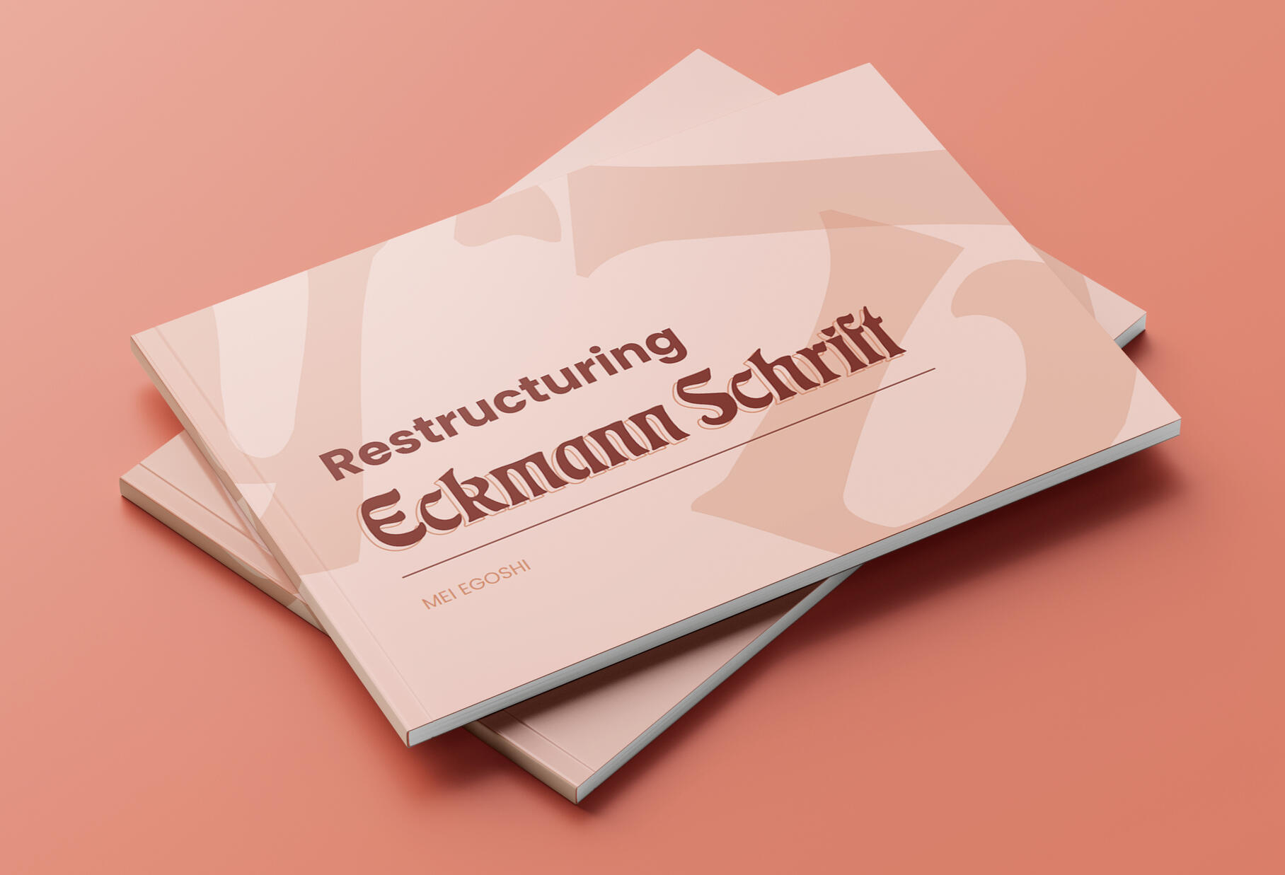
Restructuring Eckmann Schrift
Book ⬩ Research ⬩ Typography
Pleasantville
Infographic ⬩ Research
Tools & Skills
Adobe Illustrator
Adobe InDesign
Google Slides
Research
Deliverables
Infographic
About
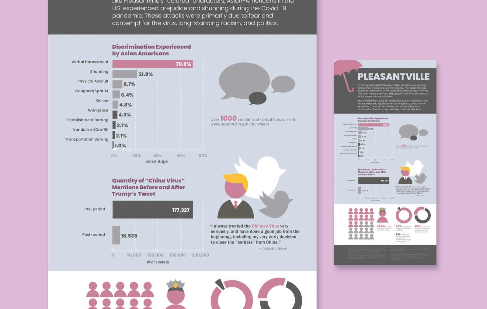
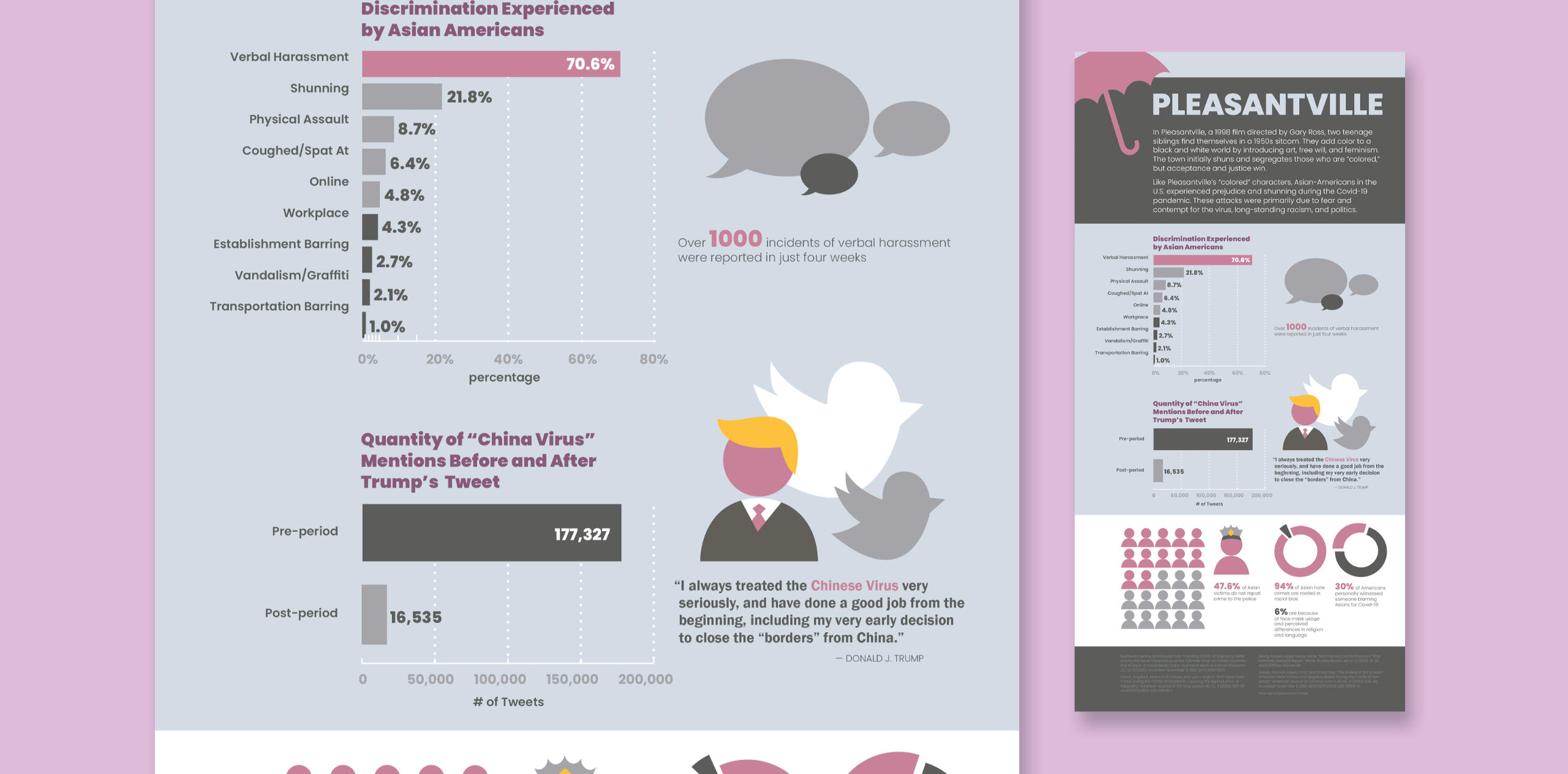
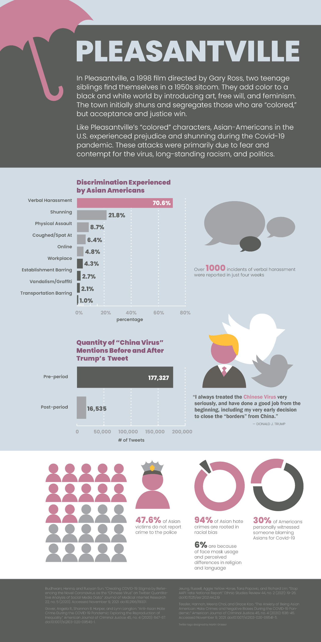
The assignment was to create an infographic based on a current real life issue and a film of our choice. I chose to do my project on Pleasantville (1998) directed by Gary Ross. I related the film to the increase in Asian American hate crimes during the Covid-19 pandemic. I researched about the issue, created icons and graphs, and put them all together in an organized layout.
Process
Research
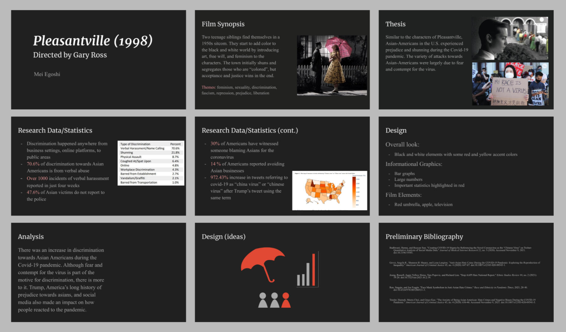
To begin this project, I created a thesis statement connecting the film's plot and characters to Asian American discrimination. Then, I listed relevant statistics I found while researching articles. I also brainstormed graphics and elements needed in the infographic to convey the information effectively.
Colorways
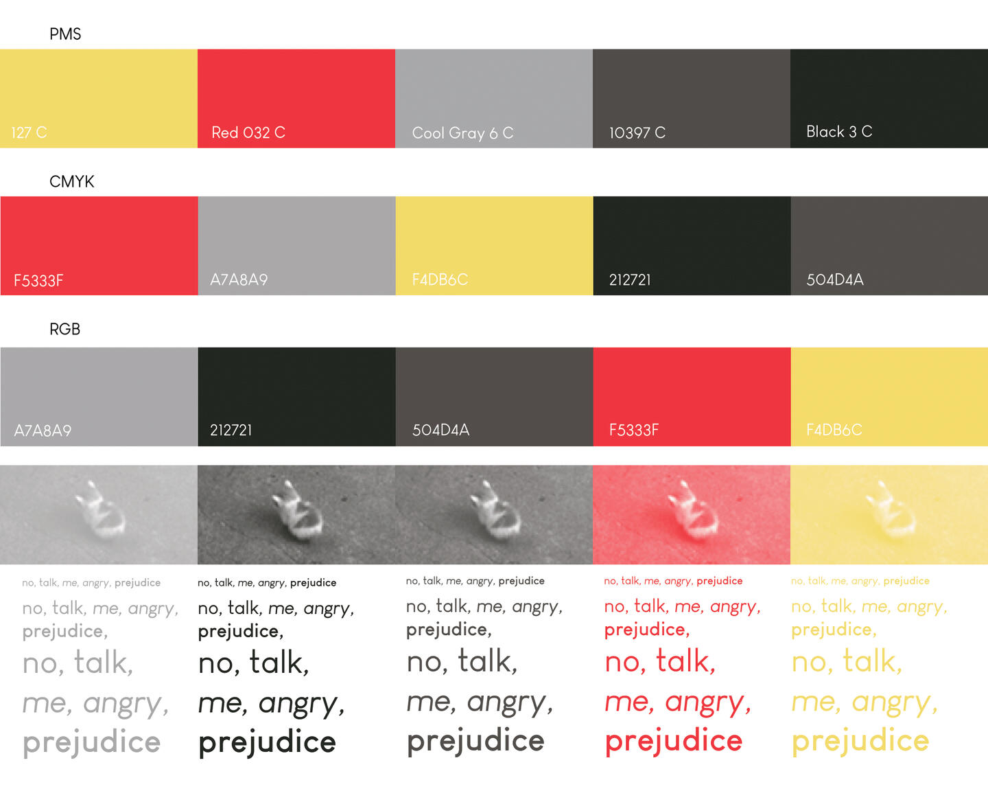
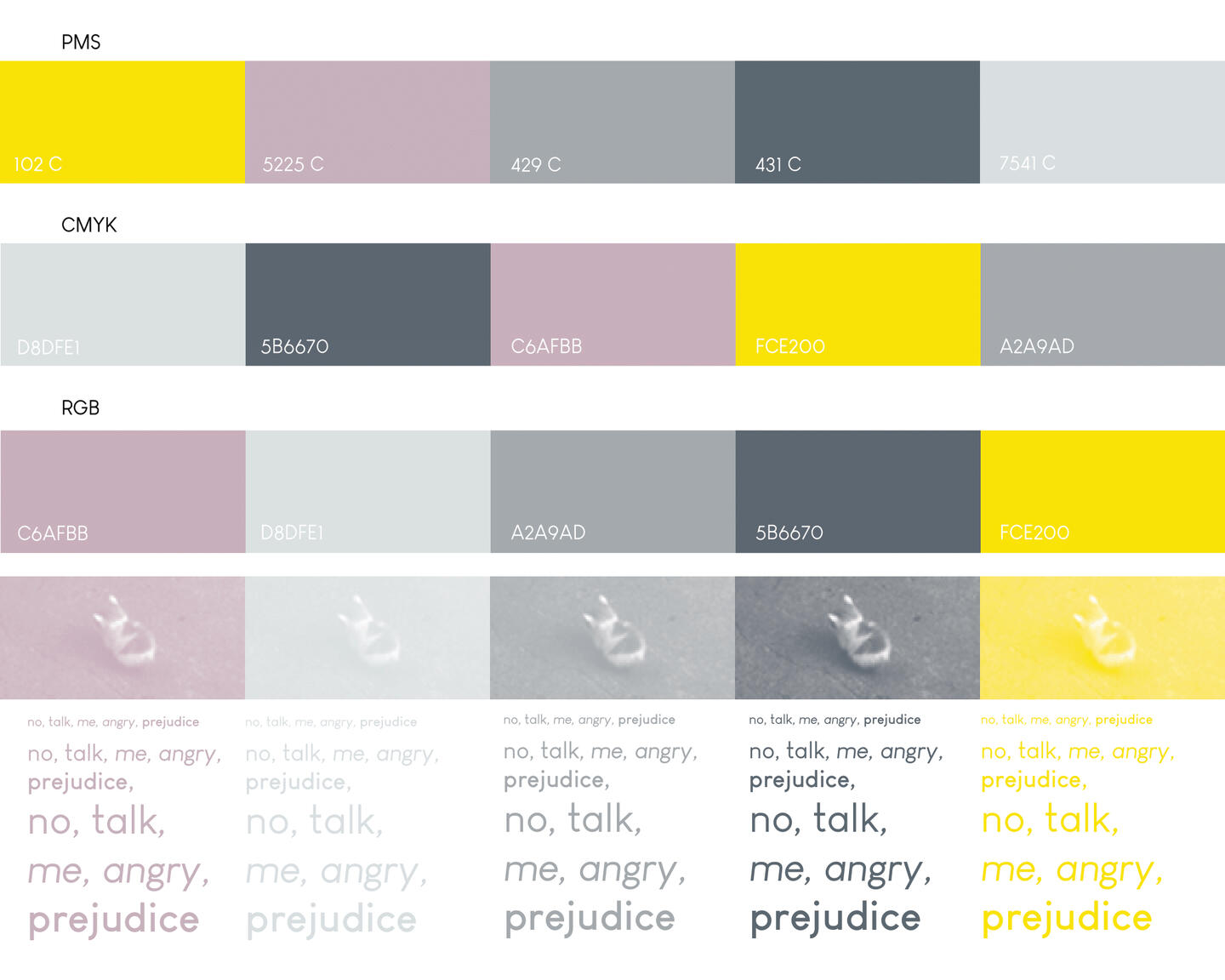
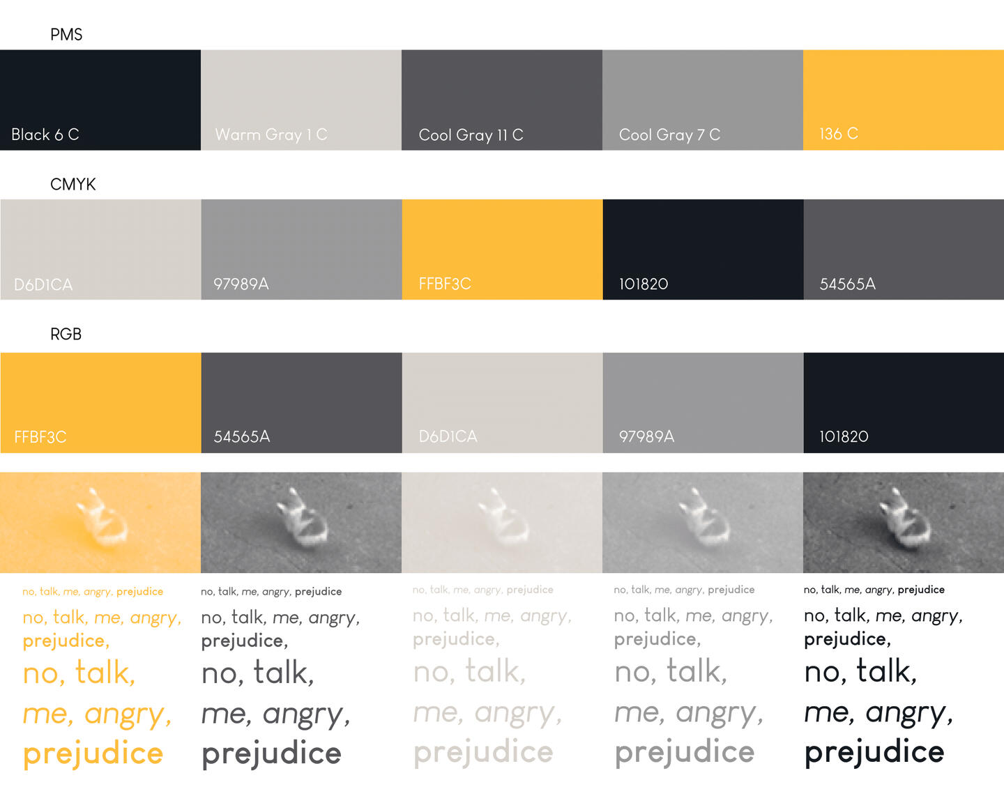
I explored three different color palettes for this project. The goal was to match the aesthetic of the film Pleasantville (1998). In the film, many of the iconic scenes are black and white with a touch of color. I tried to include shades of grey and one or two accent colors in my color palettes. For the first draft, I used the second palette.
Icons and Graphs (Draft)
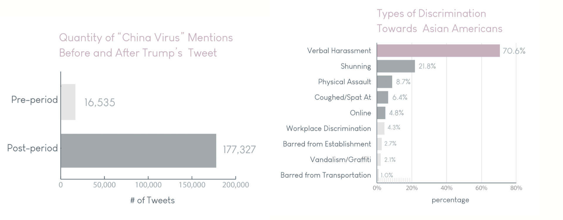
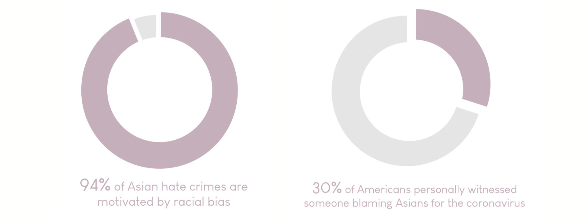
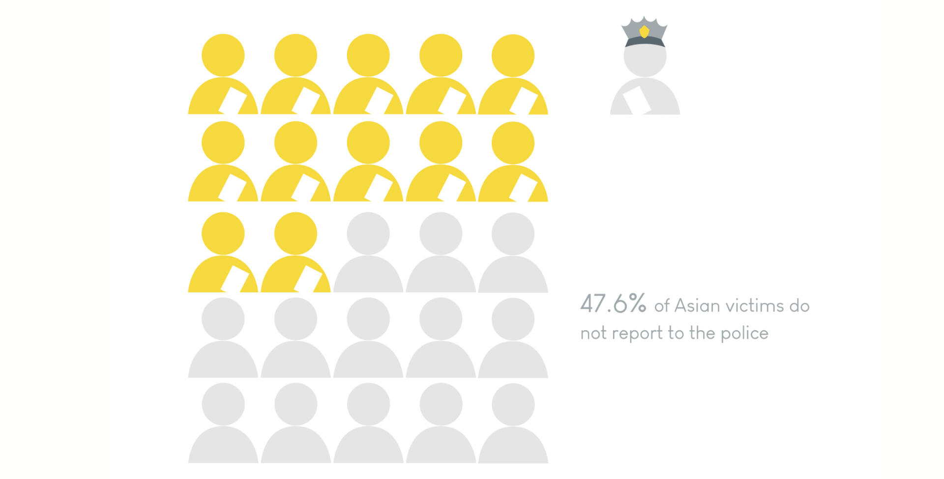

I created graphs and icons with Adobe Illustrator to support the statistics, quotes, and facts that will be shown in the infographic.
First Draft
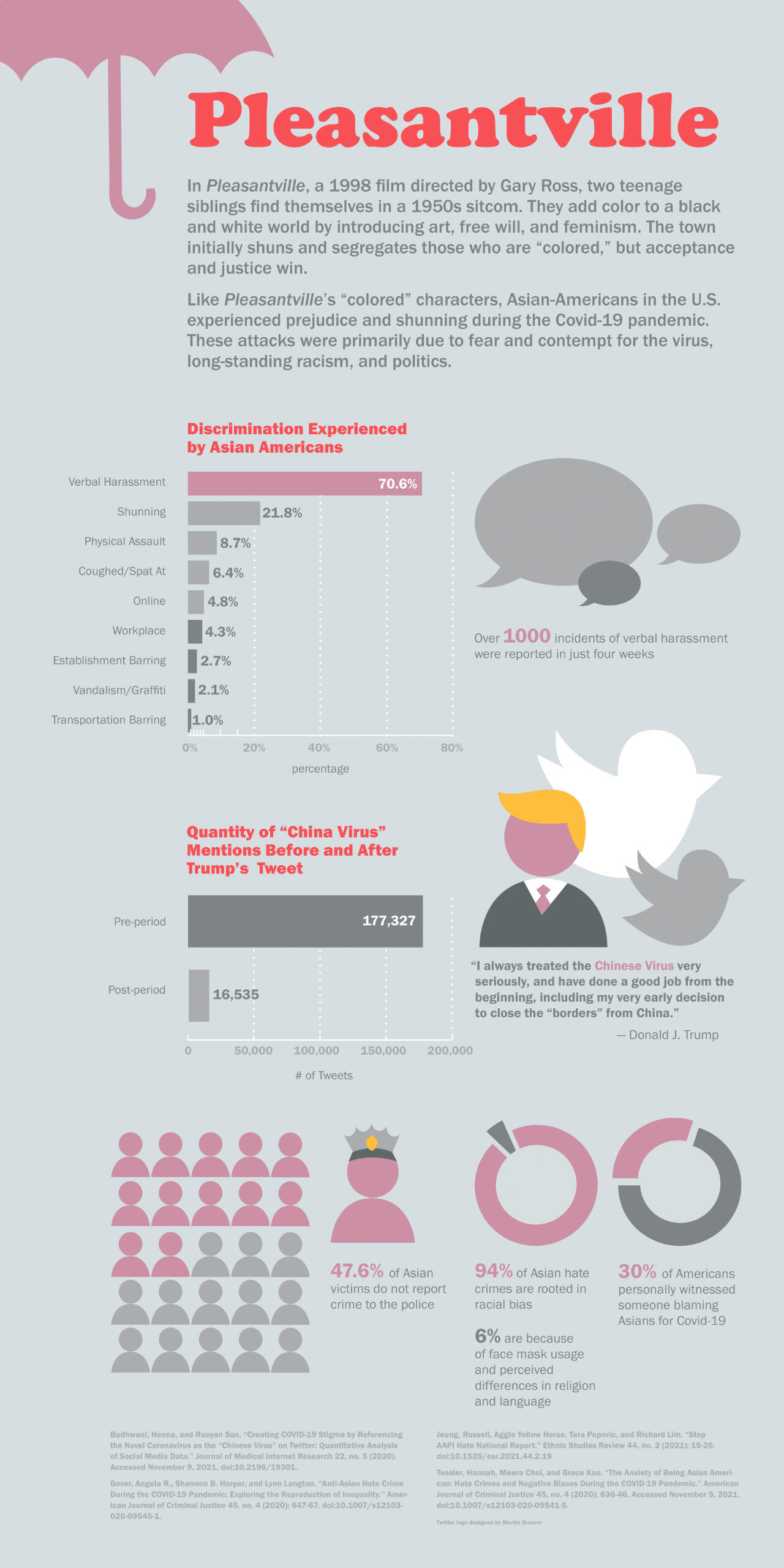
I combined the information from my research and supporting graphics in a long Adobe InDesign document. Unfortunately, the greys were too close in value to be legible in text. My next and final step was to fix this problem.
Final
After revising the colors to be more legible and appealing, this was the final result.
Ascend at Aspen Institute
Submark ⬩ Icons

Tools & Skills
Adobe Illustrator
Deliverables
Submark
Icons
About
I was tasked to create submark and icon concepts for Ascend at Aspen Institute, a global non-profit organization that promotes diverse leadership.
Submark
Original Logo

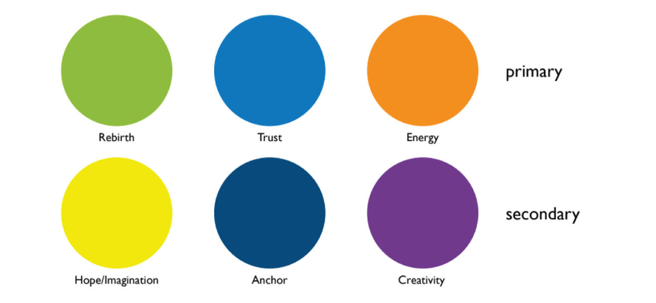
At the time, this (left) was the current logo used for Aspen. The organization was looking to update their logo along with their new color palette (right).
Sketch
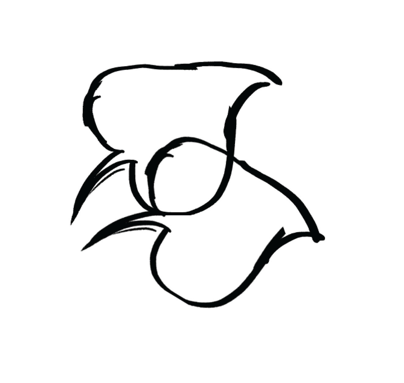
I digitally sketched a simplified version of their current logo to use as a base for my design. I changed the angle of the leaves slightly to better communicate that it was ascending.
Drafts

Using the sketch and the provided color palette, I create a few variations of the submark.
Final

I cleaned up my drafts and these were the final concepts for the submark.
Icons
Original Icons


These were the current icons provided to me at the time. I was tasked to create concepts for new ones using the updated color palette.
Final

I added more curves to the icons in order to match the style of my submark concepts.
Ocean City Travel Posters
Posters
Tools & Skills
Adobe Illustrator
Adobe Fresco
Illustration
Deliverables
Posters
About
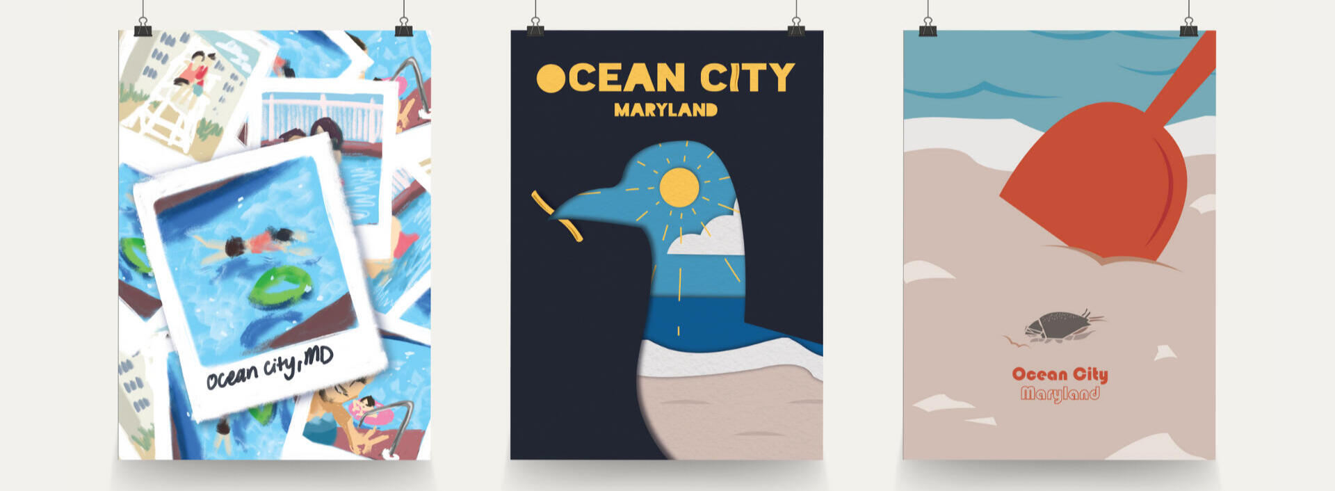
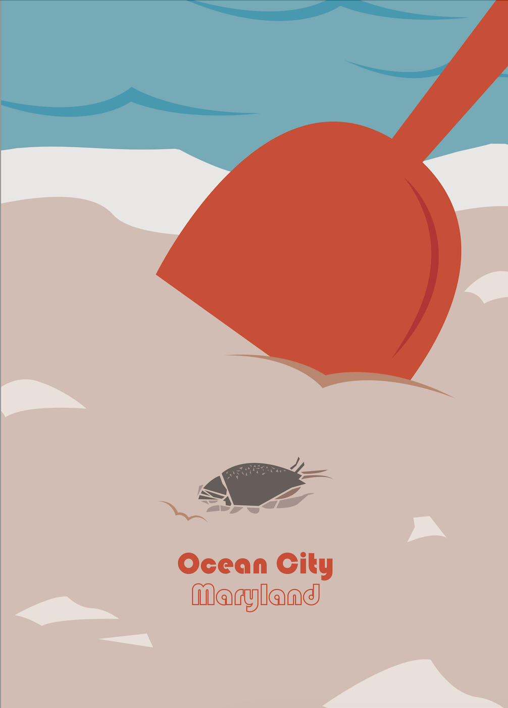
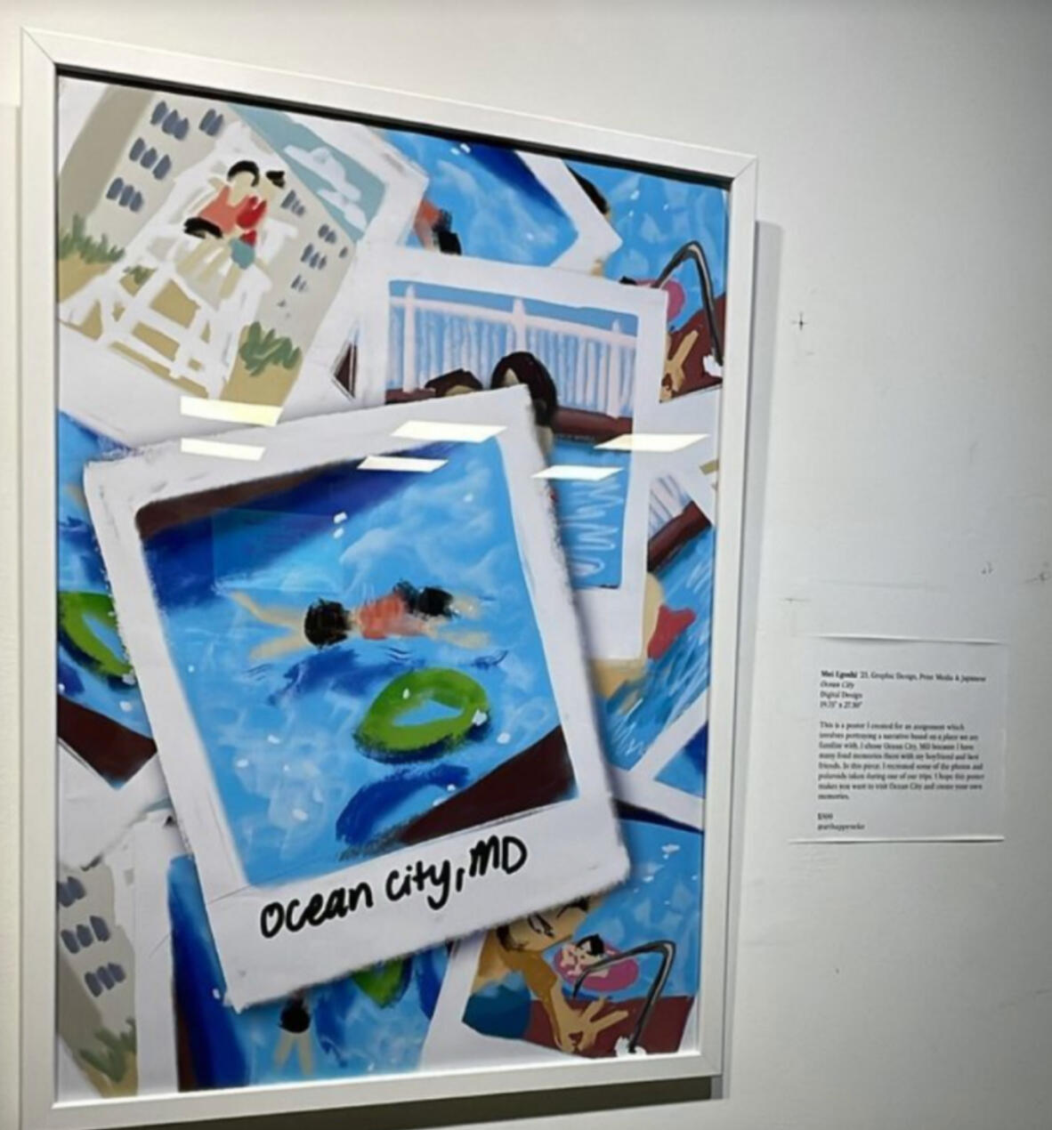
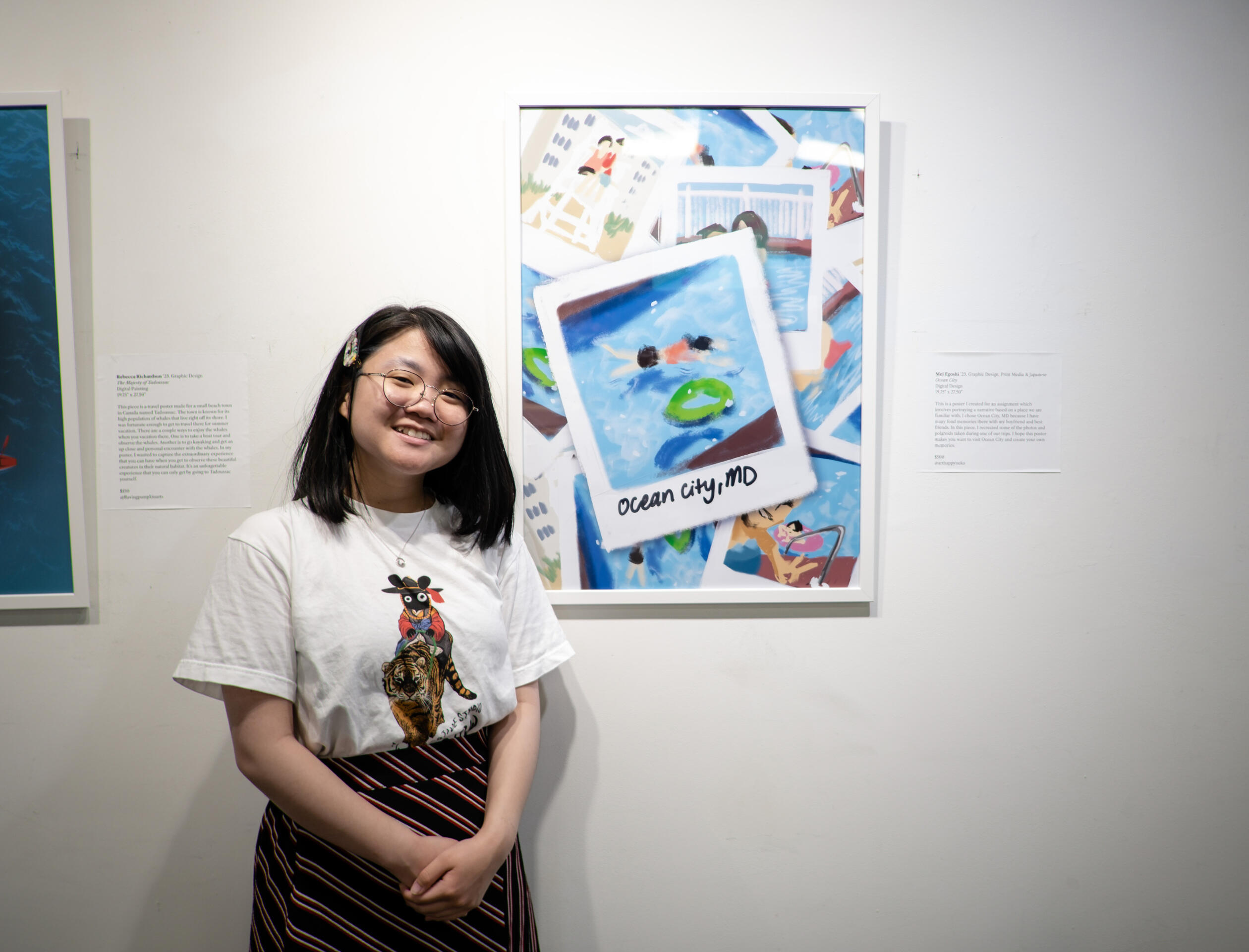
In this project, I created poster concepts for Ocean City, Maryland. These illustrative posters draw inspiration from vintage travel posters. One of the posters was printed and displayed at the Retriever Arts exhibition at Oca Mocha on May 2023.
Process
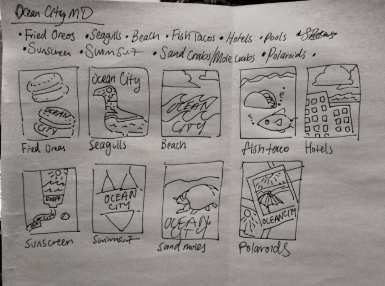
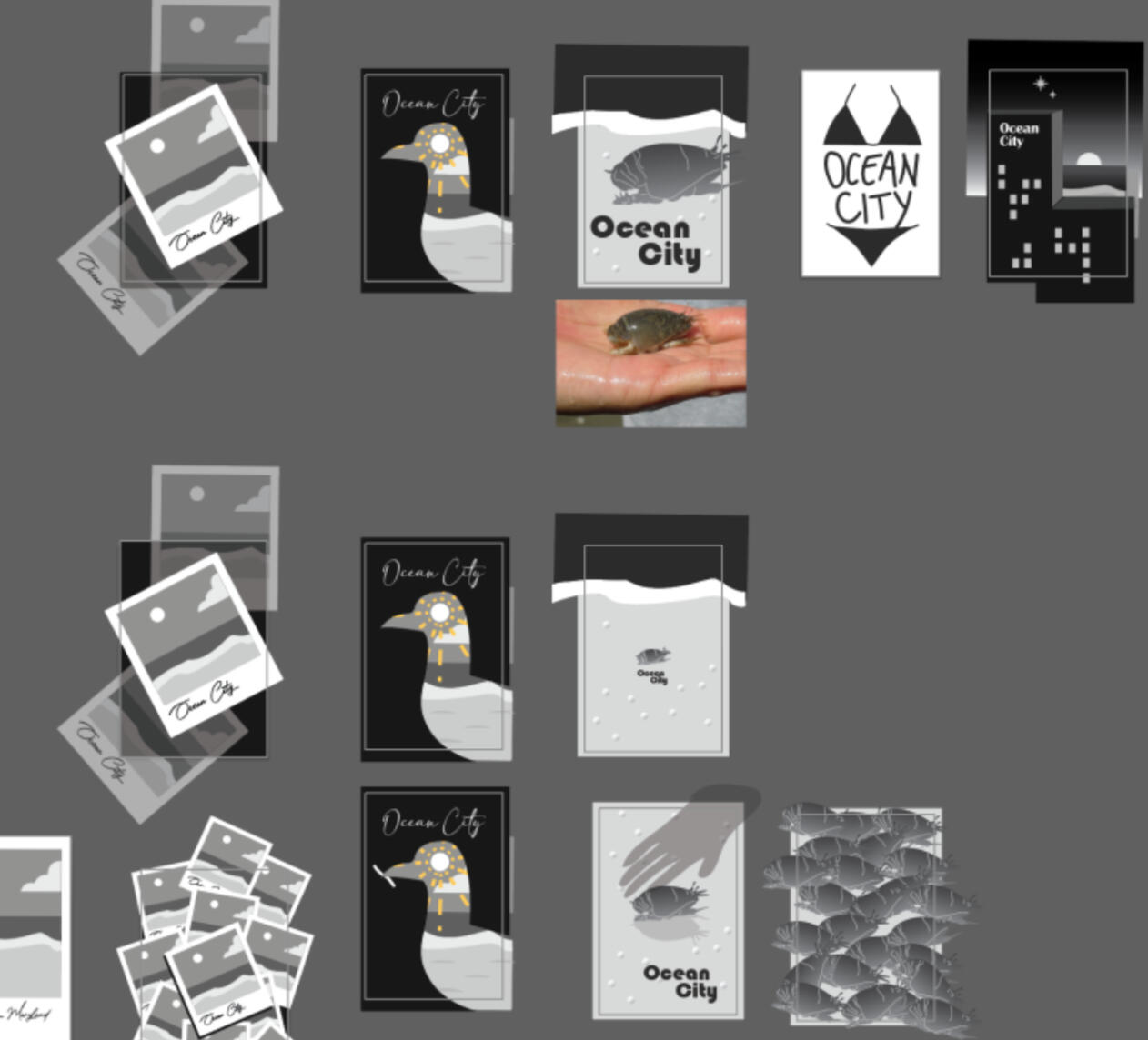
First, I started out with brainstorming words related to the location. Then, I made thumbnail sketches using pencil and paper. Finally, I used Adobe Illustrator and Fresco to create the illustrations and add text.
Final
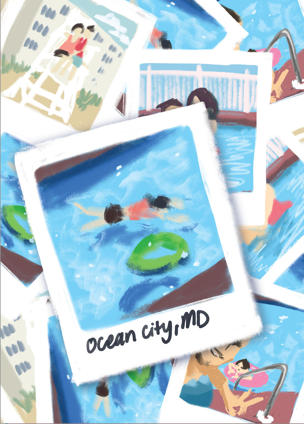
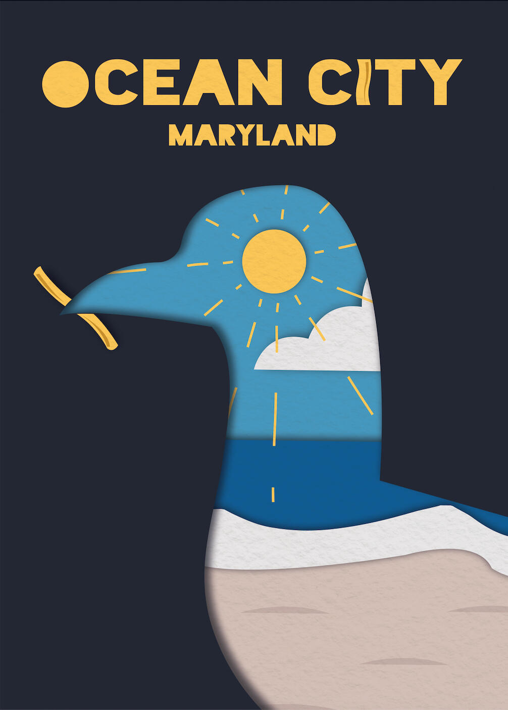
Retriever Arts Exhibition
The Colonized and the Colonizer Within Me — Chinen Aimi
Book ⬩ Typography
Tools & Skills
Adobe InDesign
Typography
Book Layout
Japanese
Deliverables
Book
About
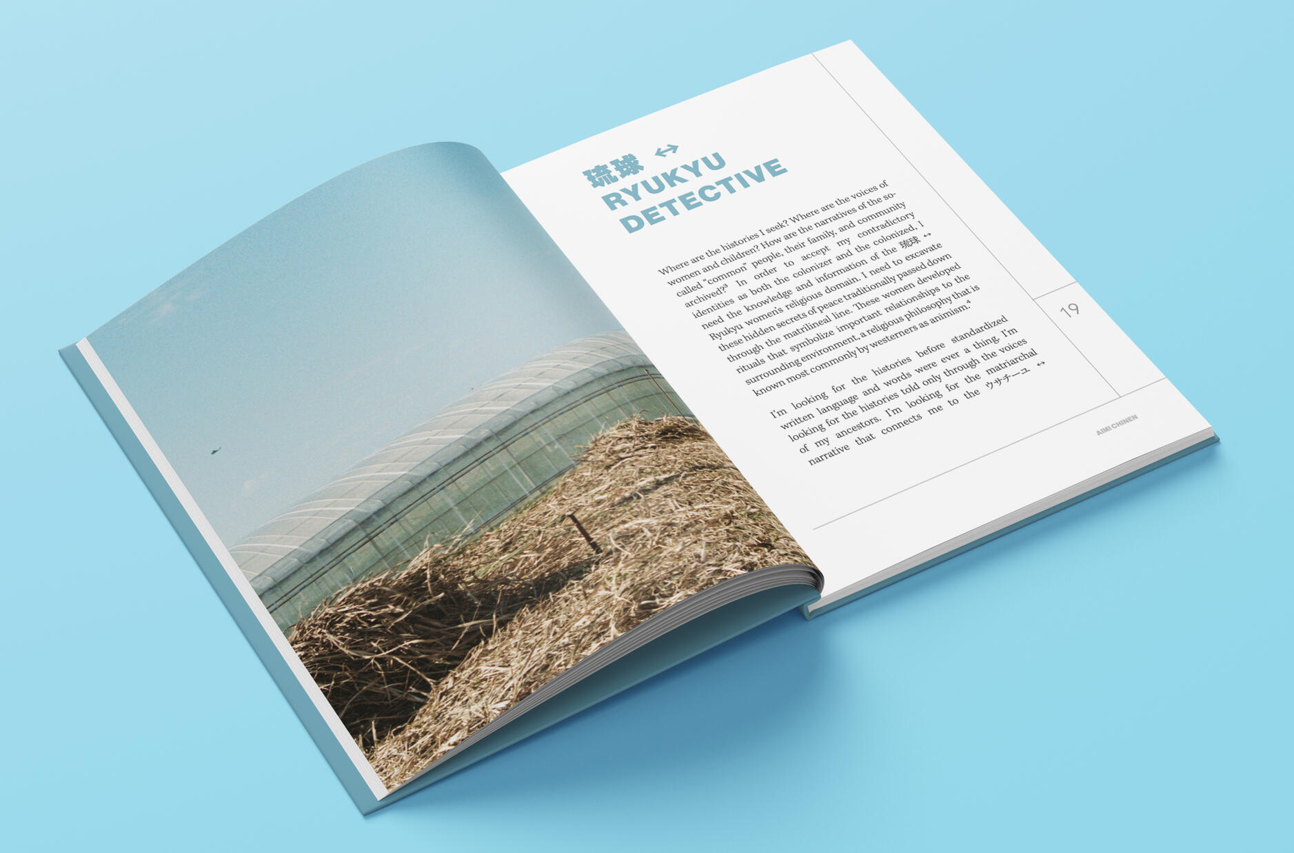
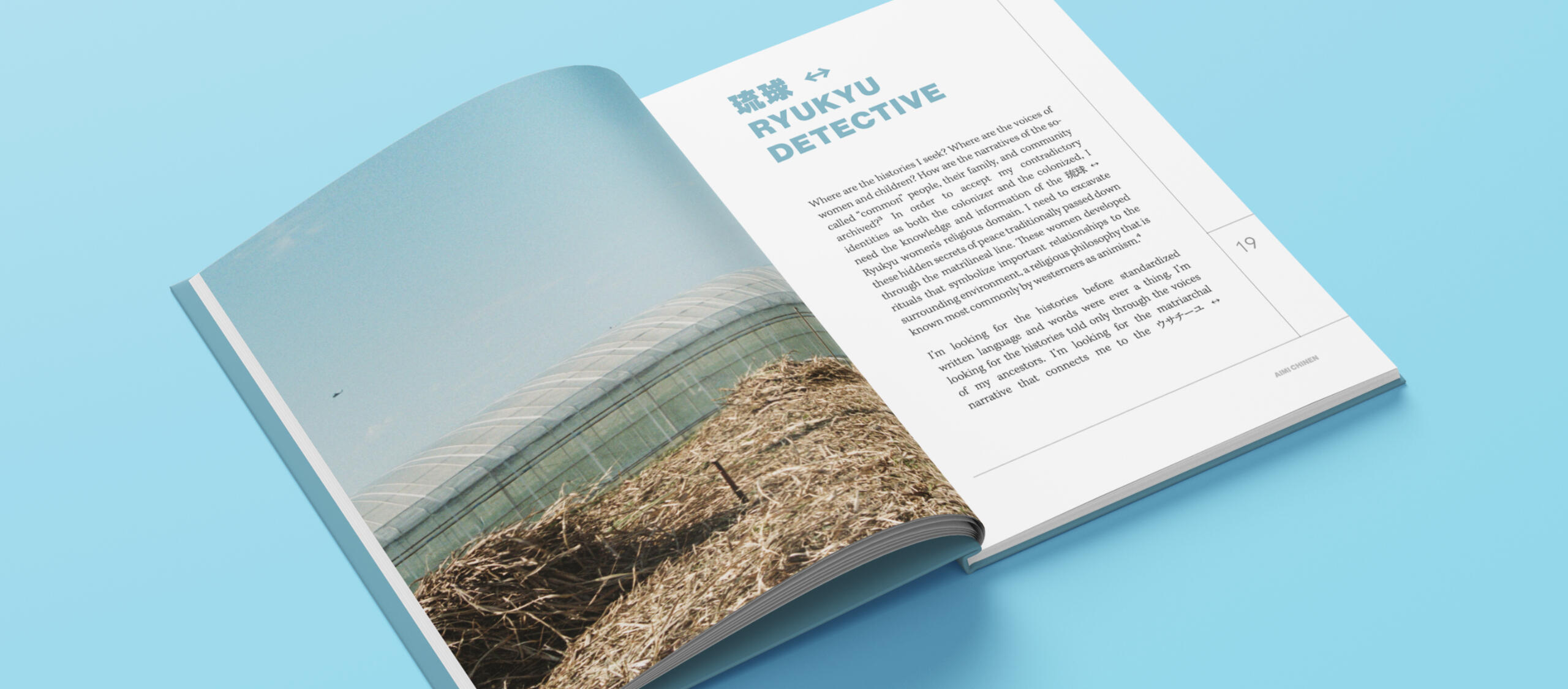
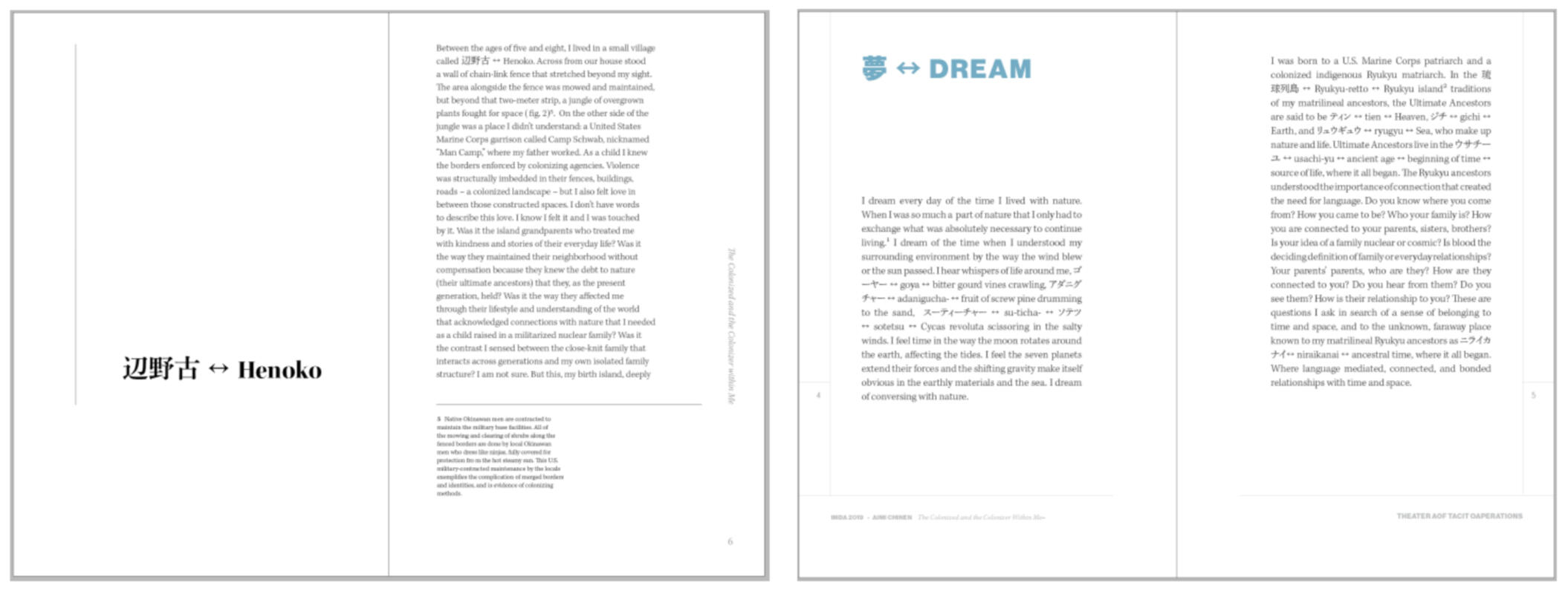
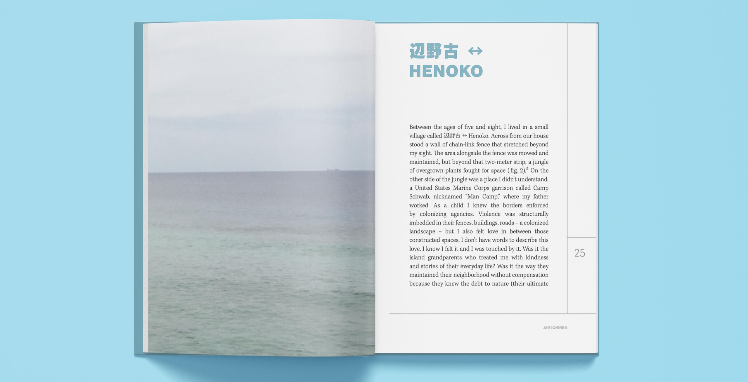
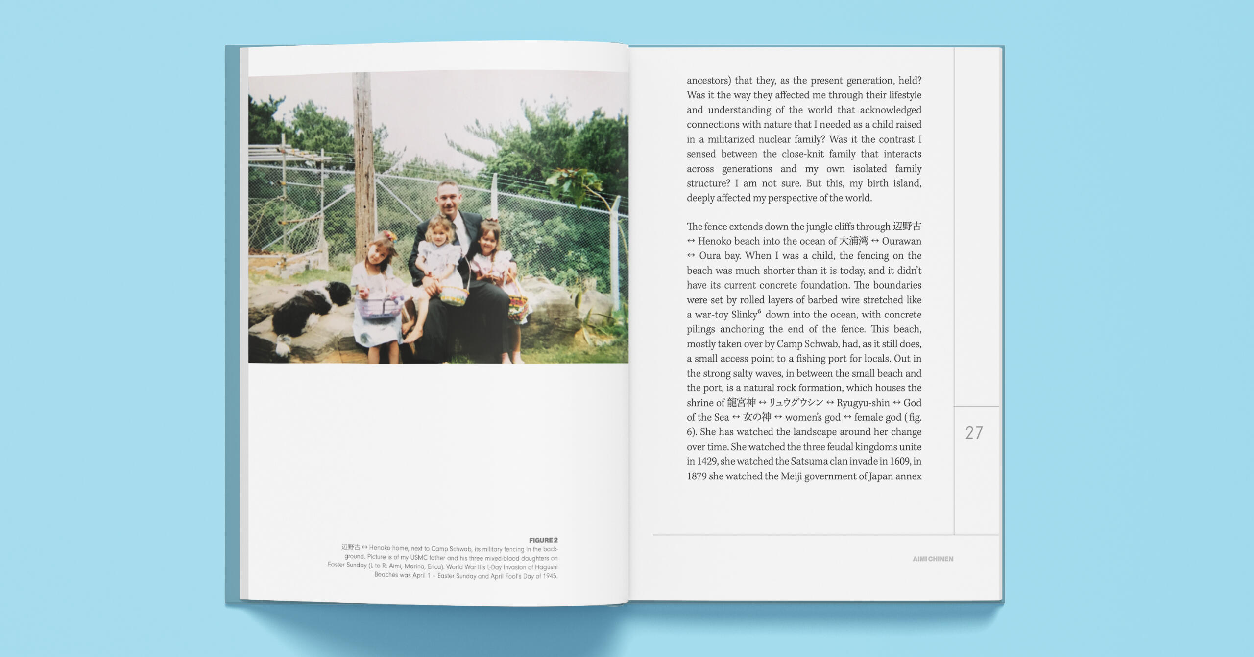
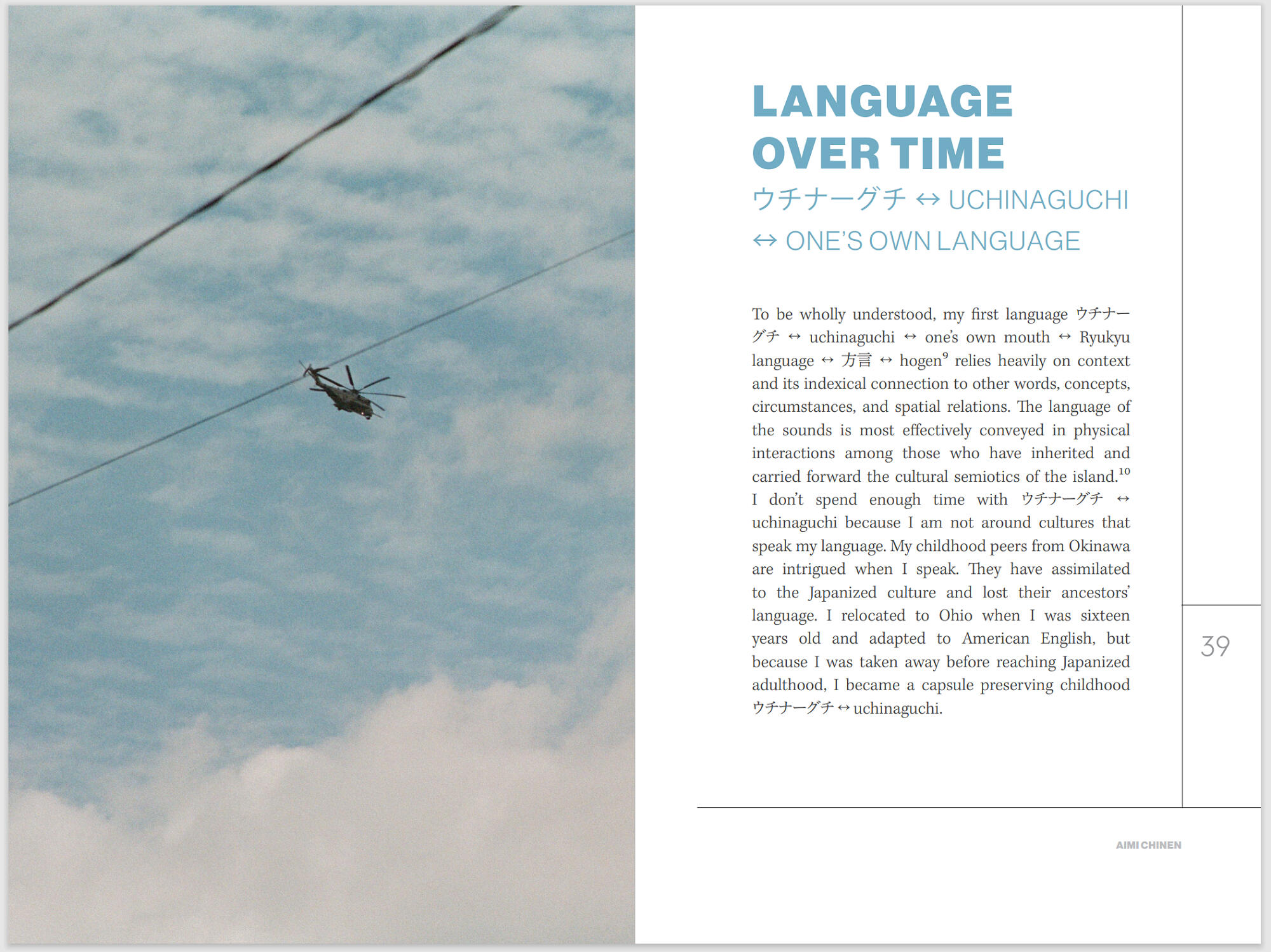
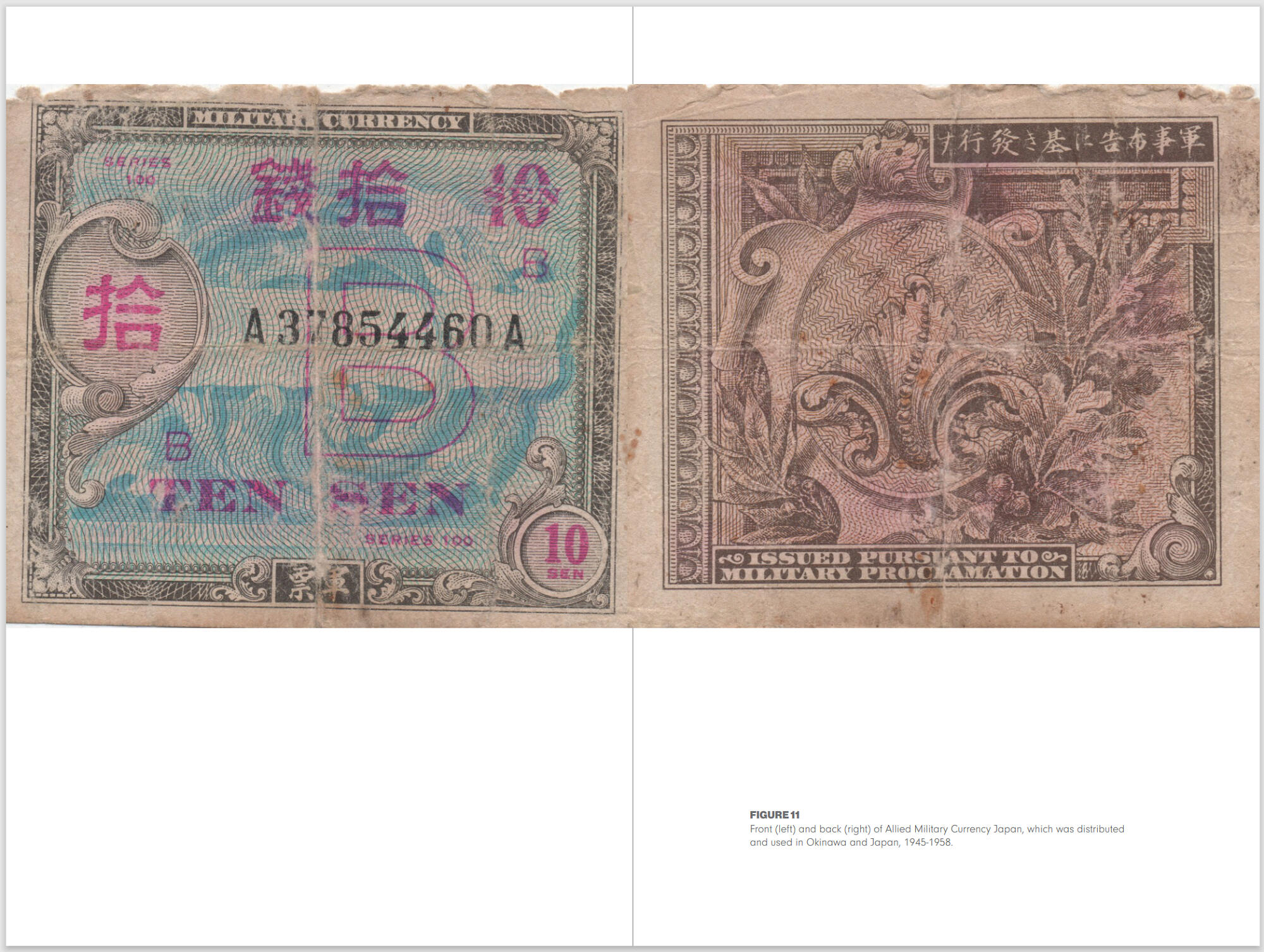
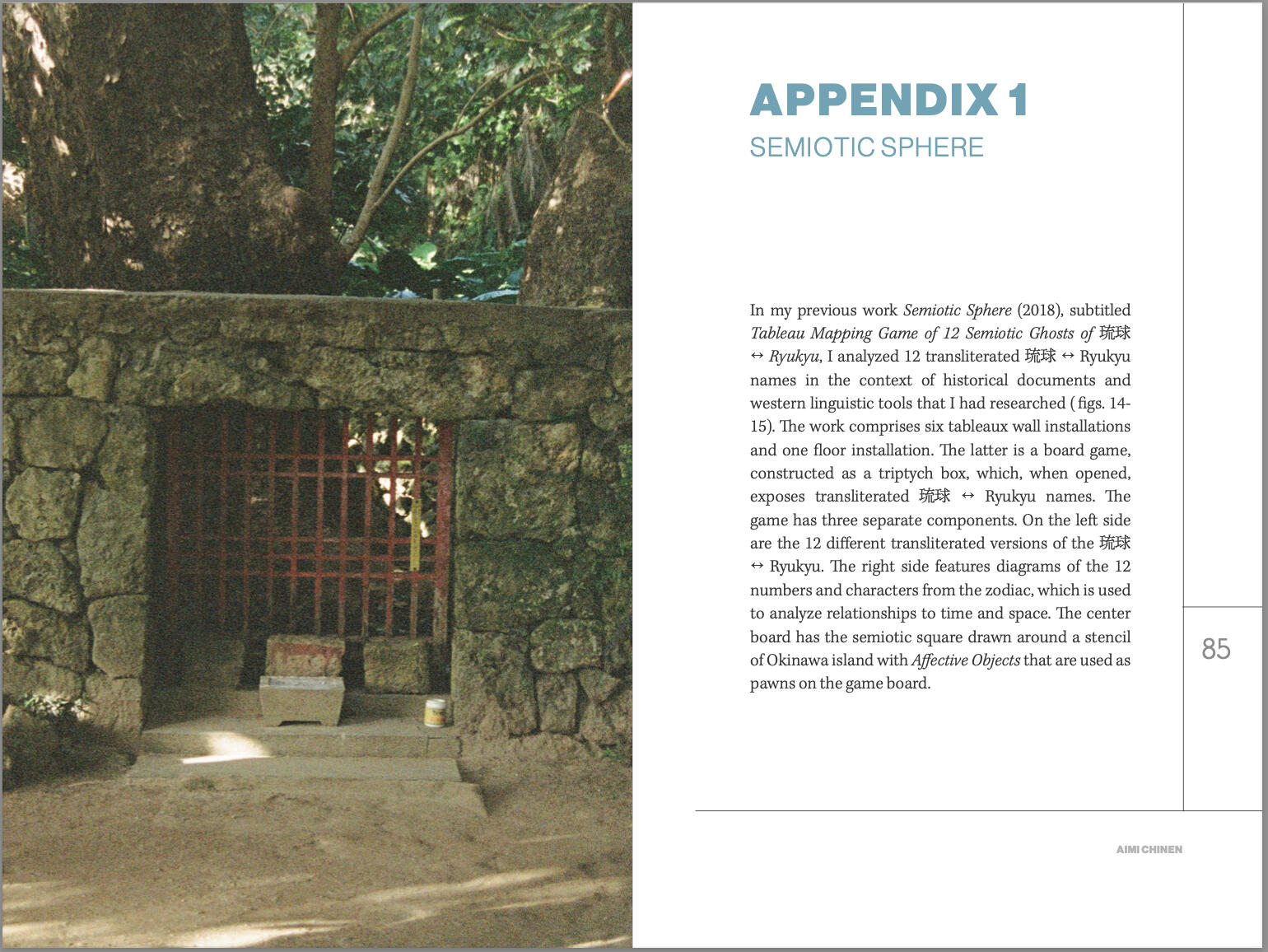
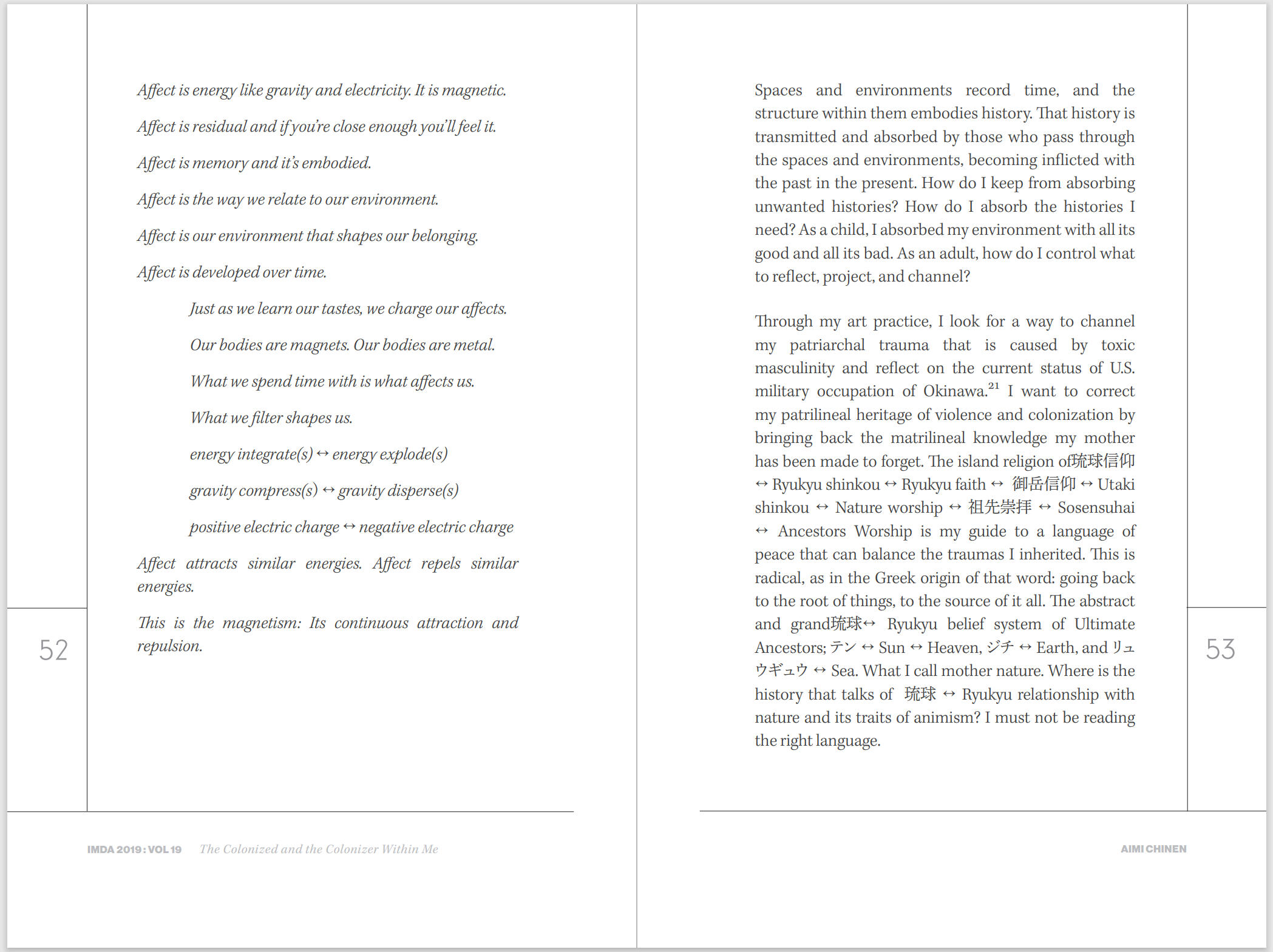
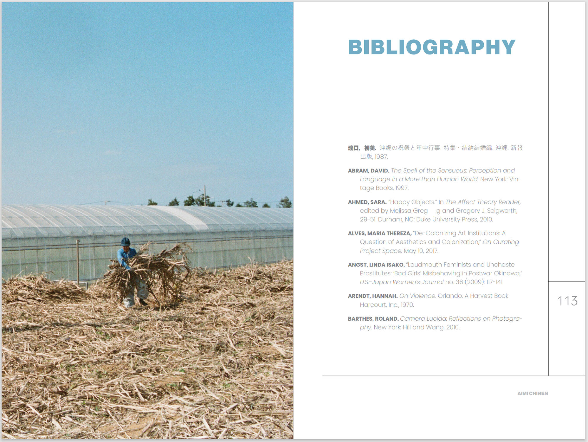
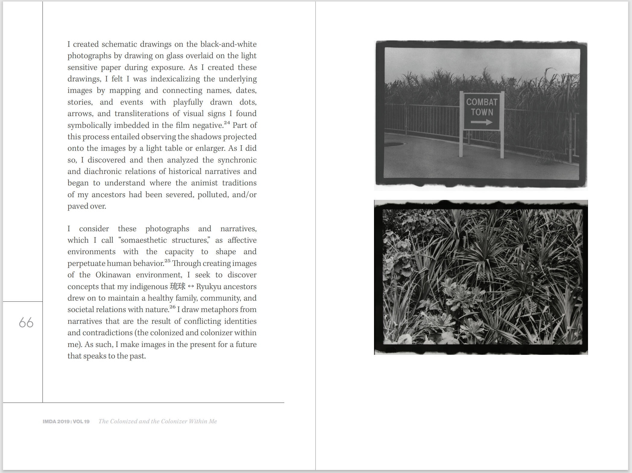
Working with the guidance of Art Director Guenet Abrahams, I designed a book for the Intermedia and Digital Arts Master's Program at the University of Maryland, Baltimore County. The Colonized and the Colonizer Within Me is a thesis written by Chinen Aimi. With only images and copy of the text provided to me, the layout was created from scratch. Finding typefaces which fit both Japanese and English language was challenging but worth the effort for this bilingual text.
Process
I designed the pages in Adobe InDesign. Below are initial layouts for the book.
Final
In the end, I delivered a 128 page book.
Can You See That? — Two Birds
Book ⬩ Documentation
Tools & Skills
Adobe InDesign
Page Layout
Photography
Documentation
Deliverables
Book
About
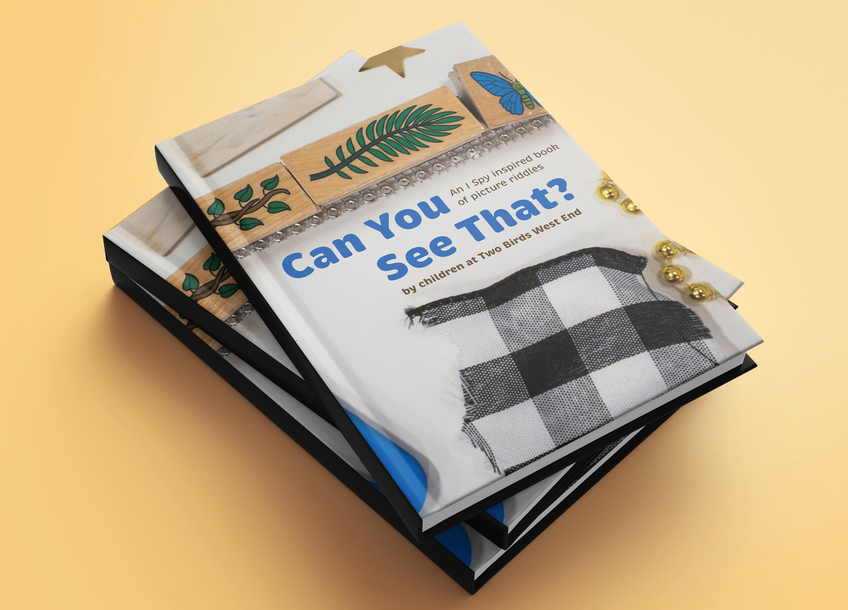
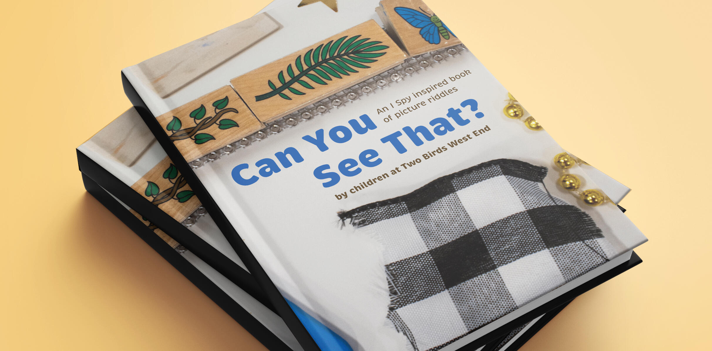
As the Studio Teacher at Two Birds Inc., an early childhood education center, I had the opportunity to lead art experiences with teachers and young children. In this project, I photographed works from one of my workshops and designed a book based on the I Spy series by Jean Marzollo
Process
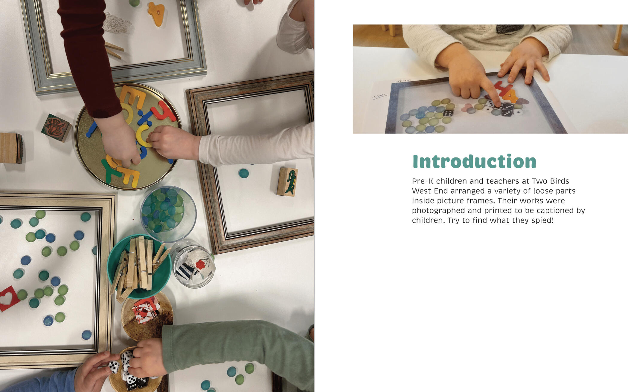
Introduction
Photograph by Daizy Rose Frazier
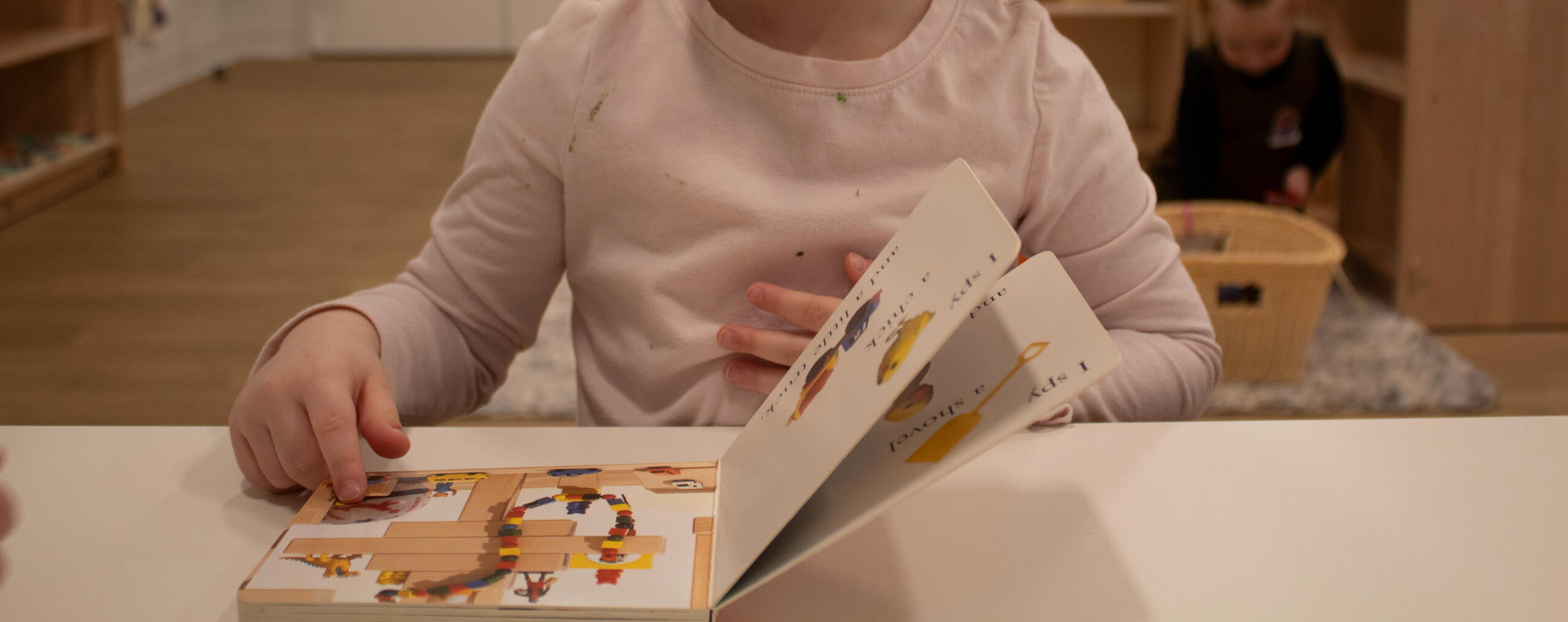
I introduced teachers and Pre-K children to the I Spy book series by having them read and complete the picture riddles. This book series served as the inspiration for this project. Children read from small board books while teachers solved from the classic I Spy books.
Creating
Photograph by Daizy Rose Frazier
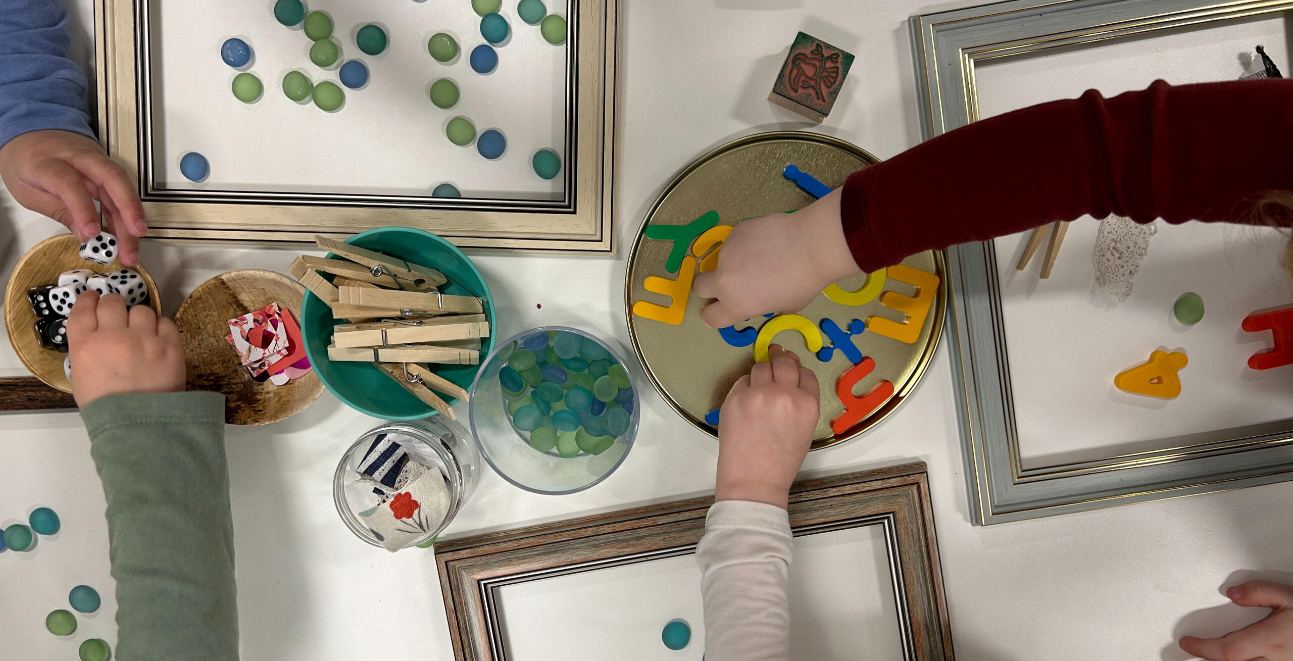
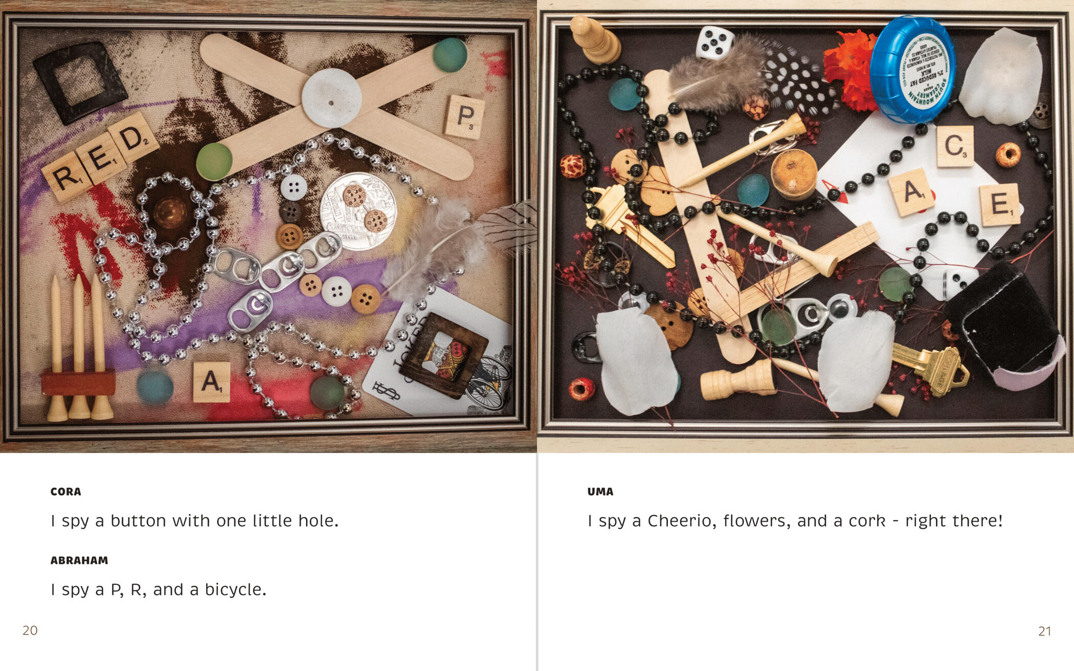
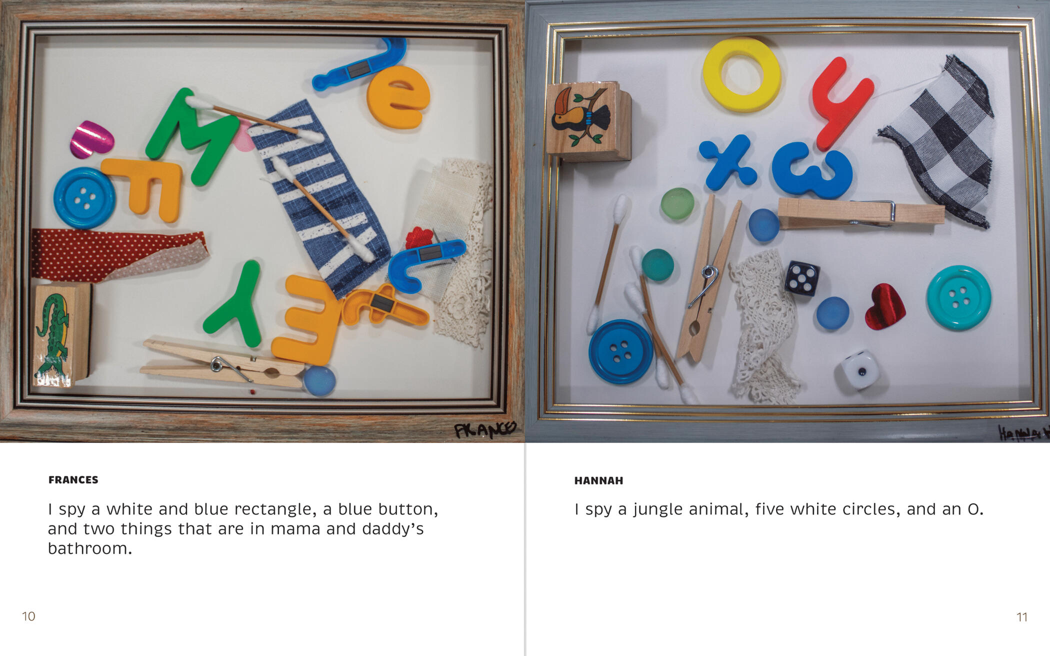
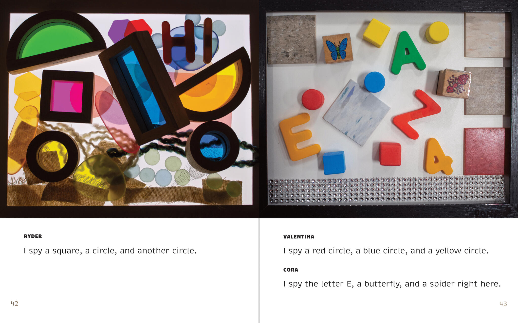
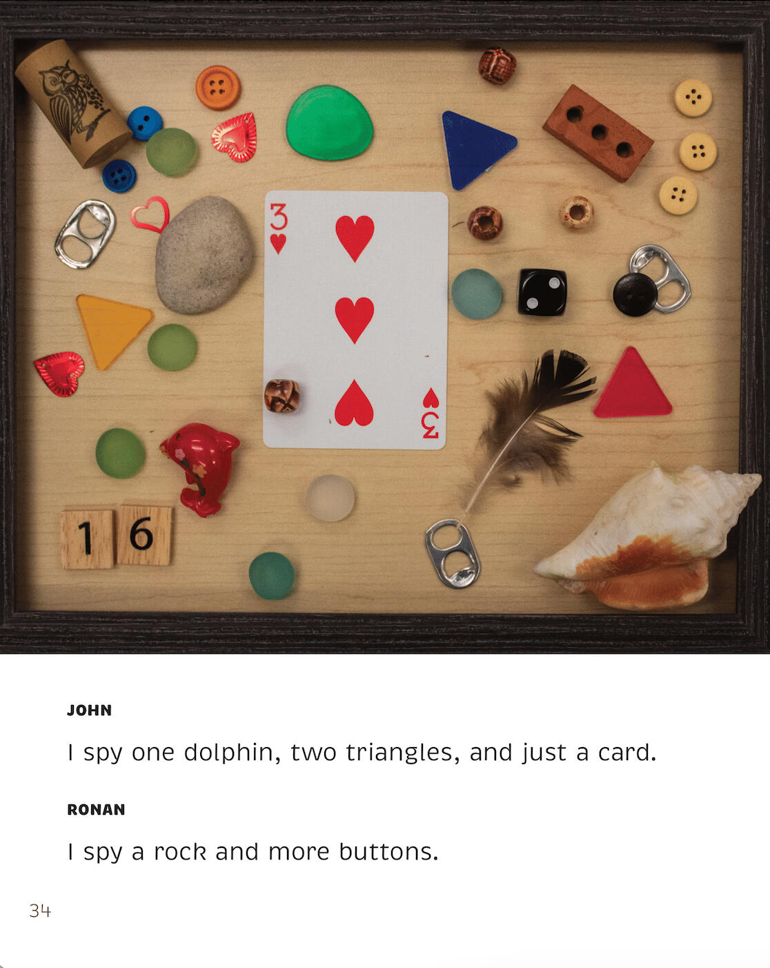
Teachers and children arranged loose parts (marbles, feathers, clothespins, dice, fabric scraps, etc) inside 8" x 10" picture frames. They were allowed to arrange the parts however they liked, but were told to hide things for readers to spy. Some people created words and pictures, while others placed the objects randomly to resemble classic I Spy pages. Daizy Rose Frazier (Studio Director) and I photographed their finished works.
Captioning
Photograph by Daizy Rose Frazier
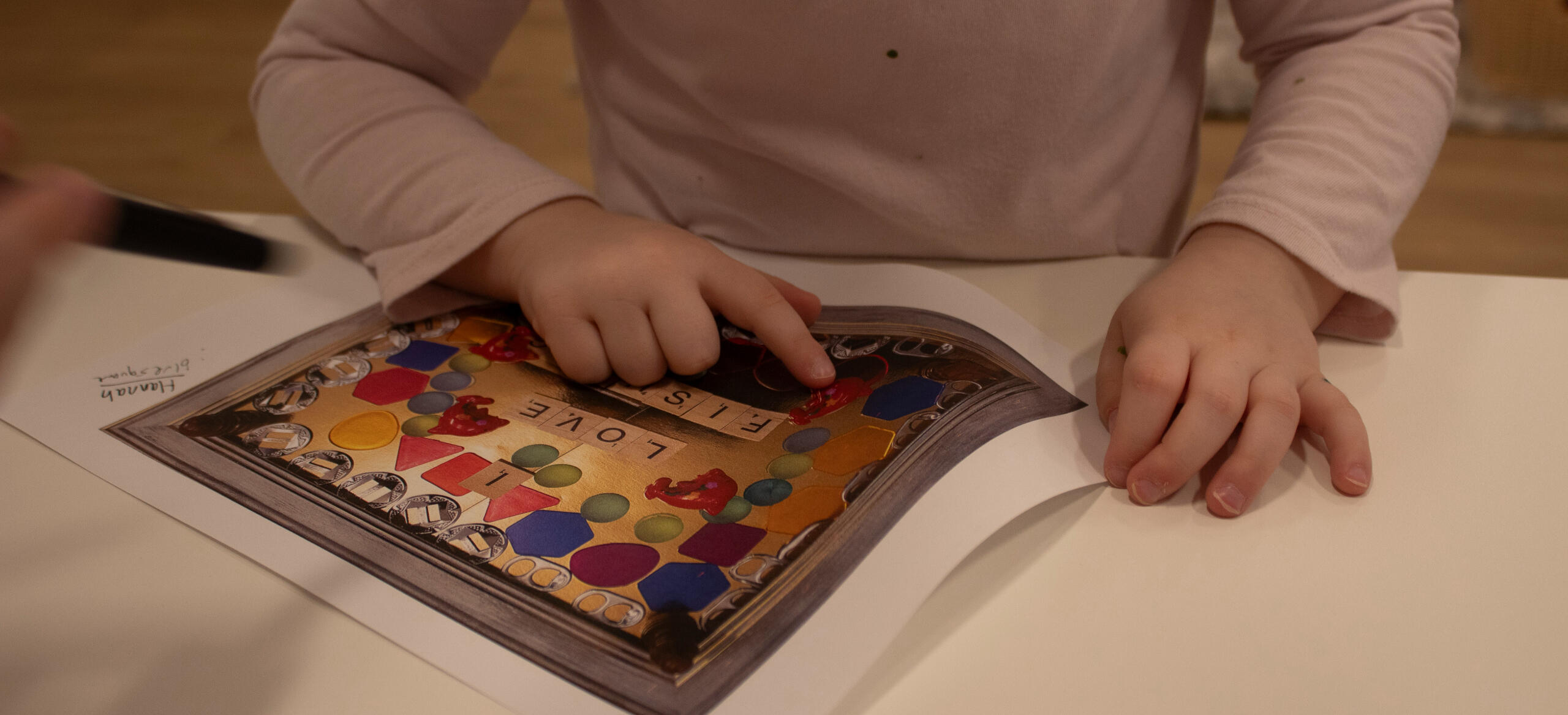
I printed out the photos and had Pre-K children look at them. They were tasked with listing objects they "spy" in the pictures. I jotted down their words on the margins of the paper. I later selected the most interesting words and wrote them as I Spy style captions.
Designing
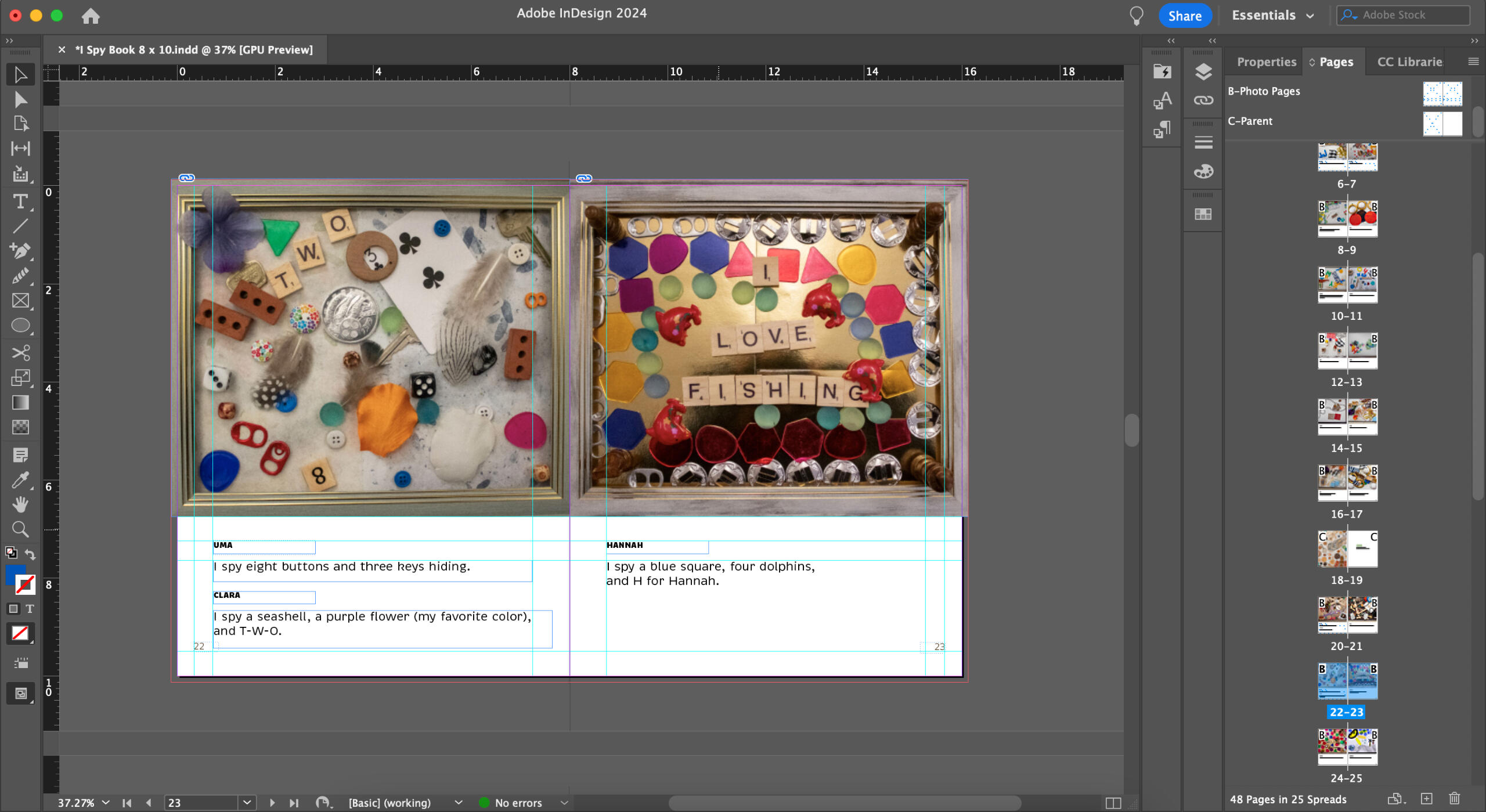
In Adobe InDesign, I compiled the photographs and captions into a 48 page book for the school. I used master pages and rulers to make the pages uniform. I made the decision to use a large sans-serif font for the captions because it would be easier for young children to read.
Final
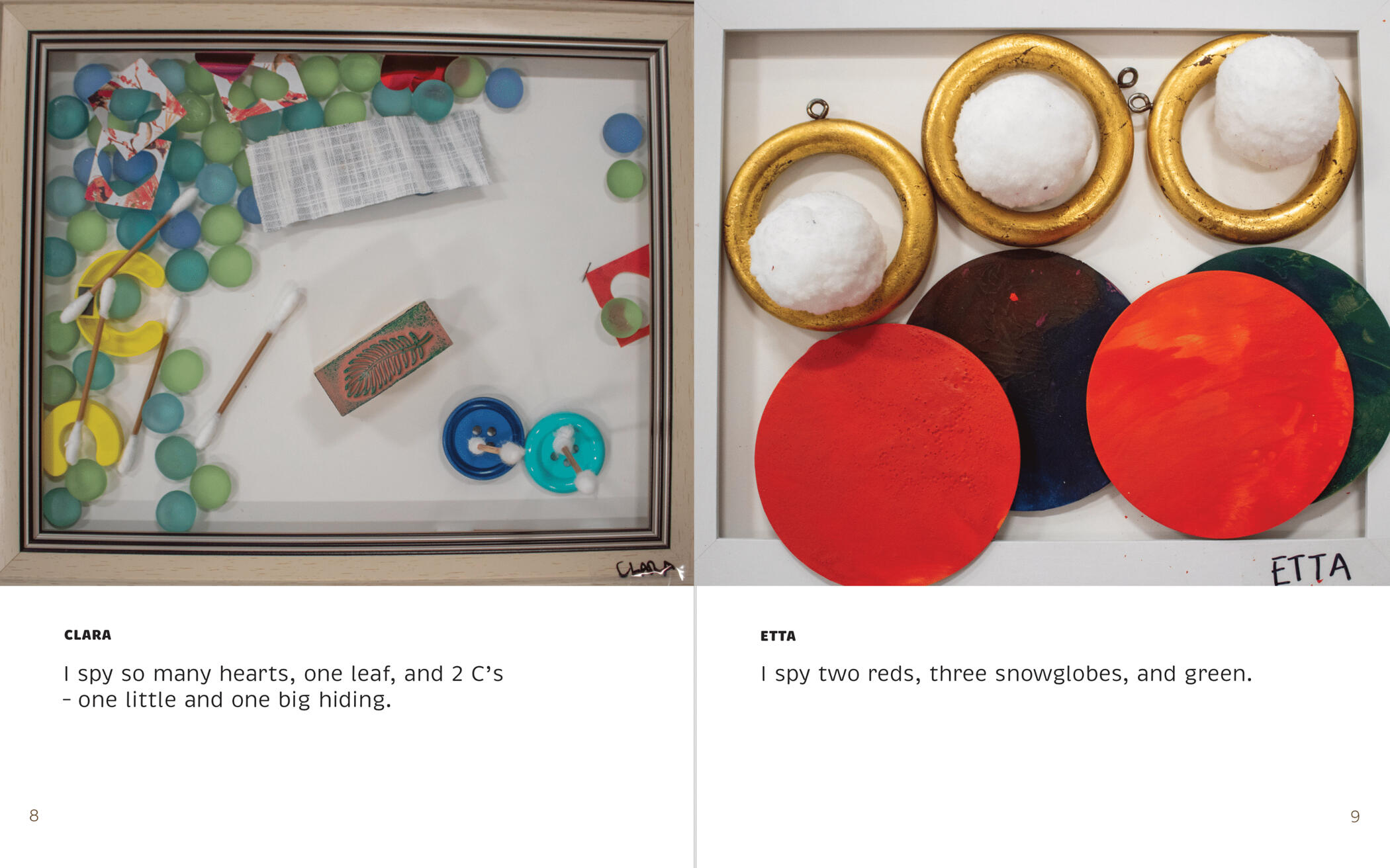
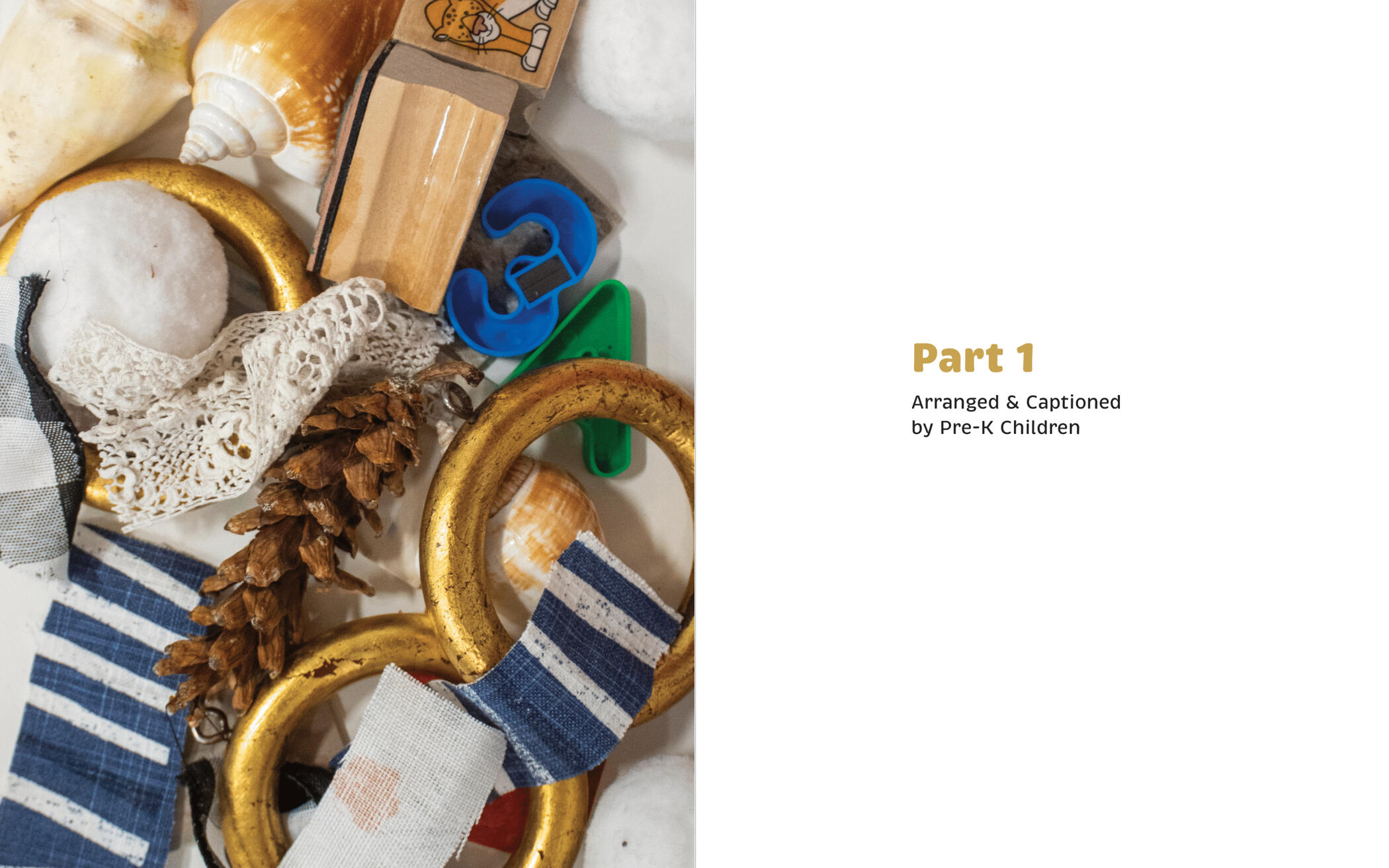
Shown below are samples of the spreads in the book.
UMBC Student Events Board
Social Media ⬩ Print Design
Tools & Skills
Adobe Illustrator
Adobe Photoshop
Adobe InDesign
Typography
Illustration
Team Management
Deliverables
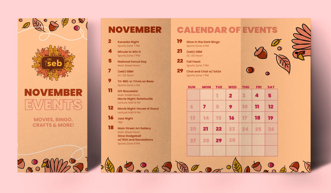
Pamphlets & Posters
Stickers, T-Shirts, & Bags
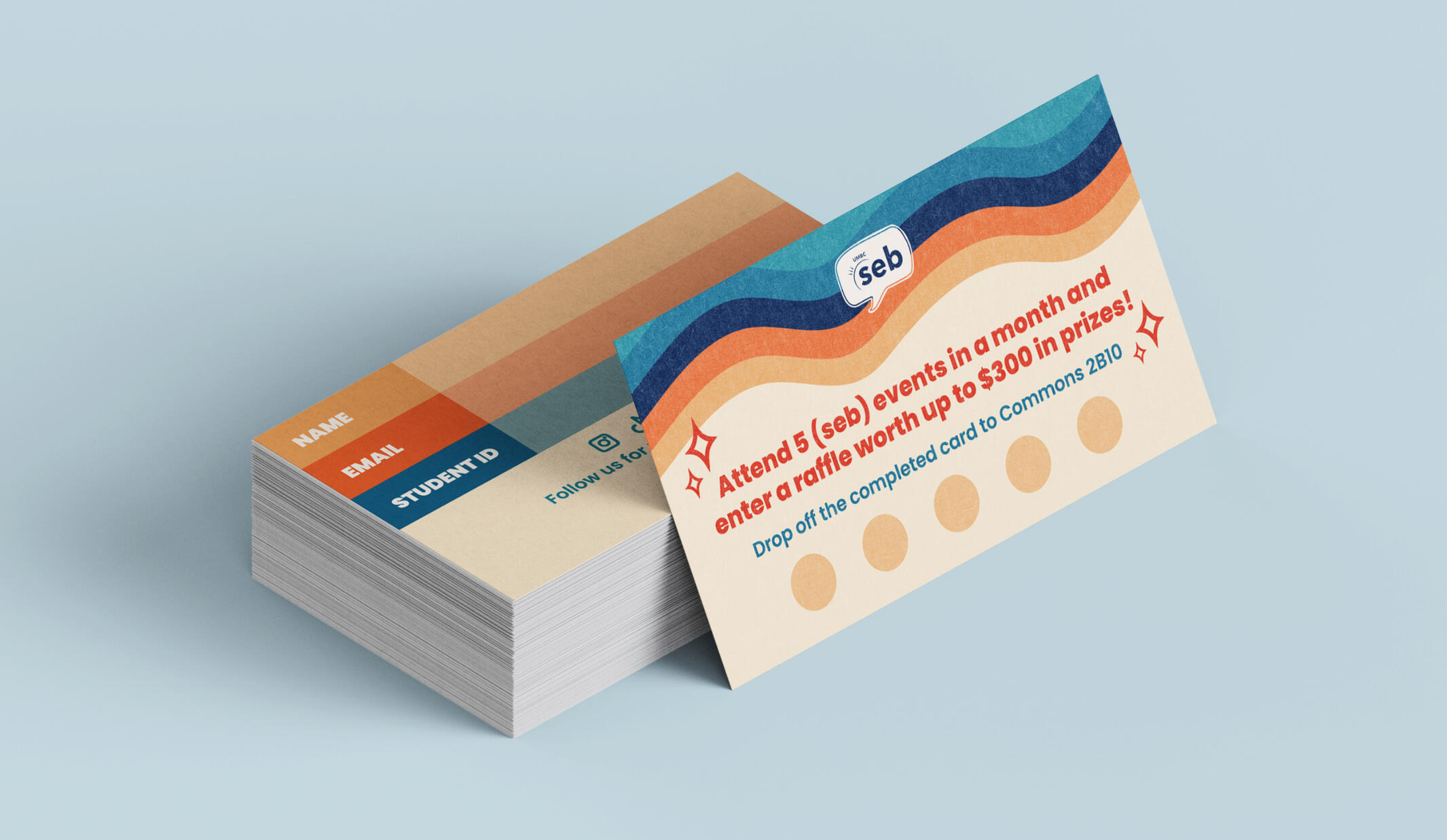
Business Cards
Social Media Materials
About
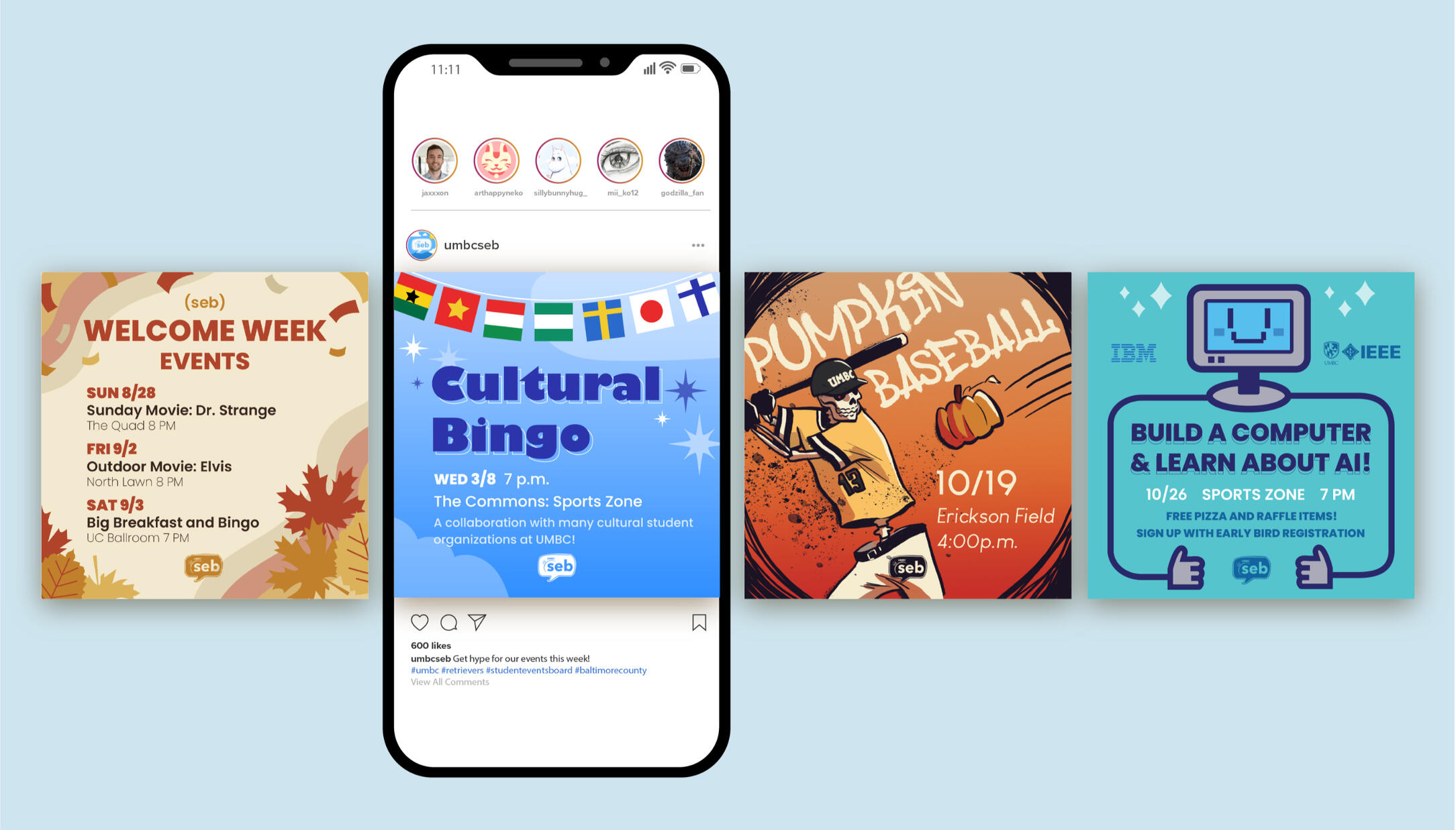
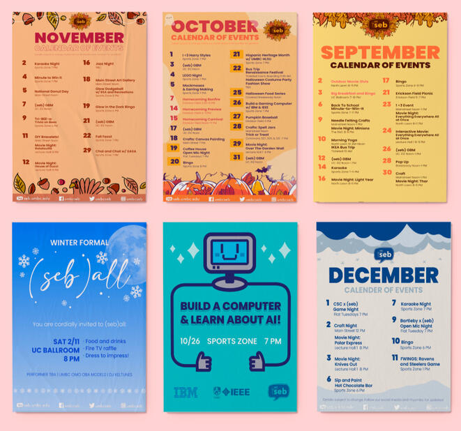
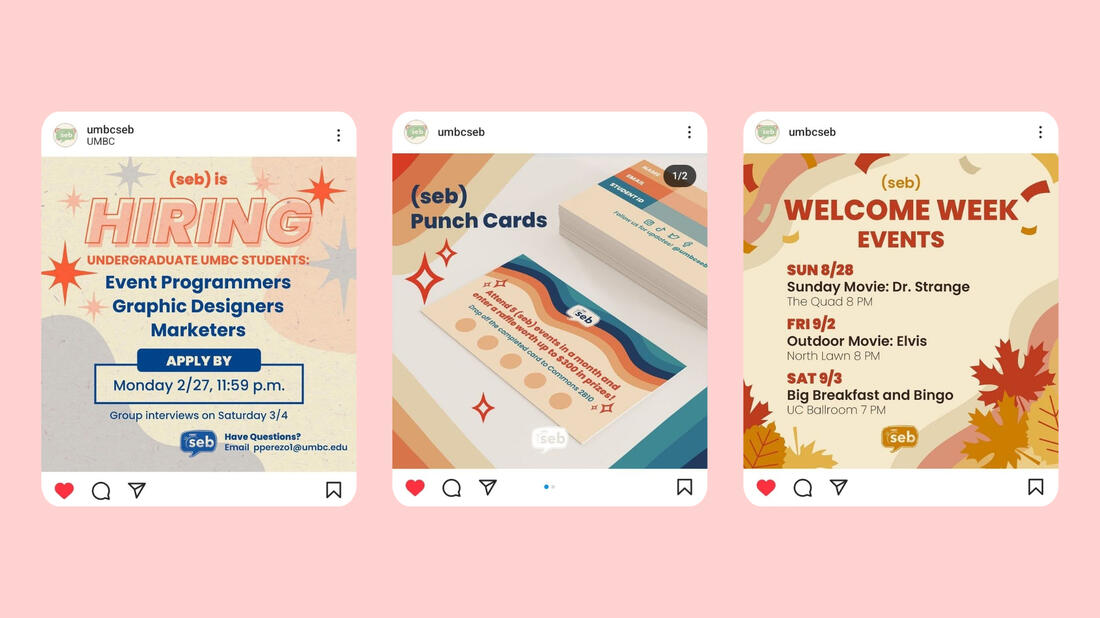
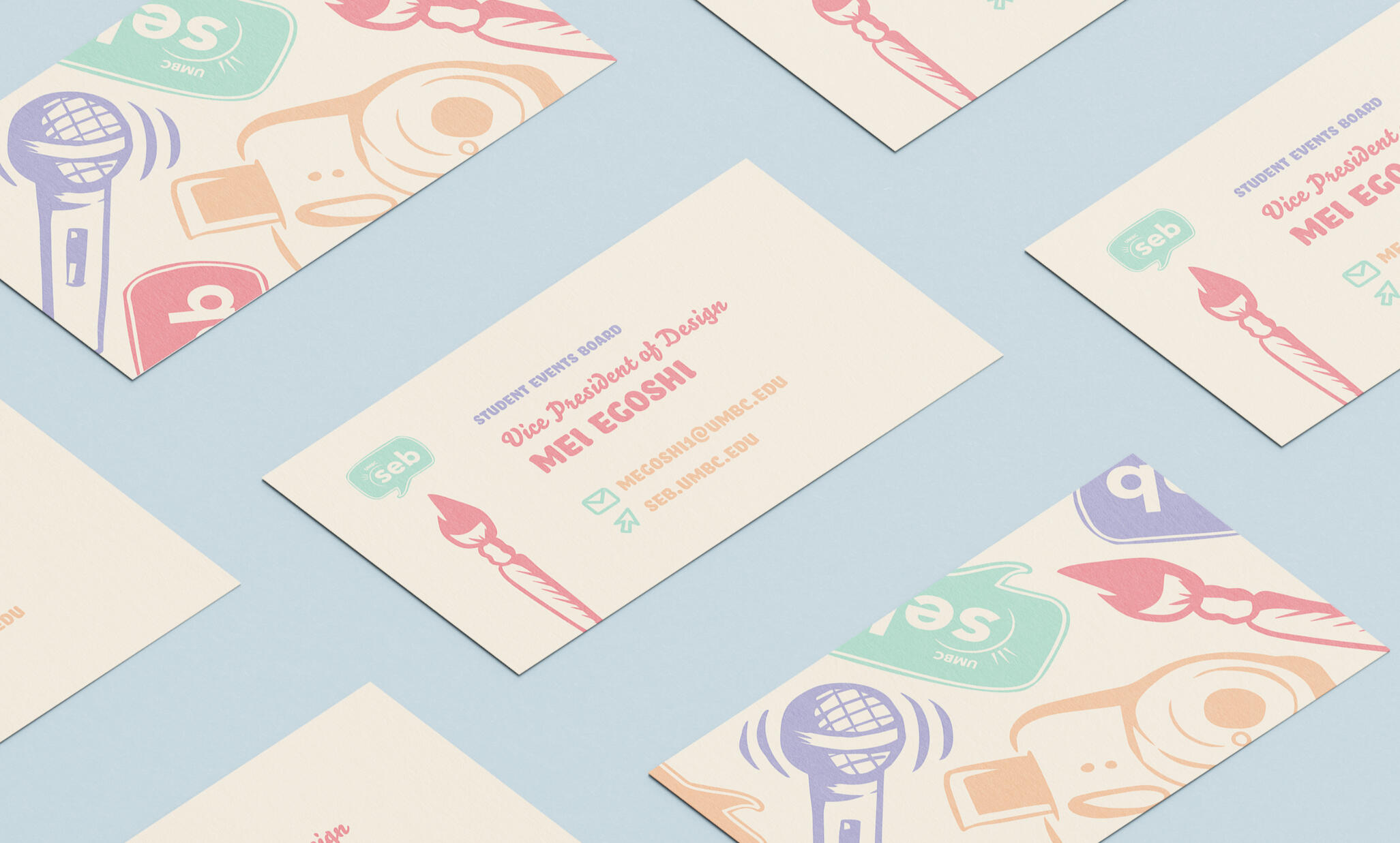
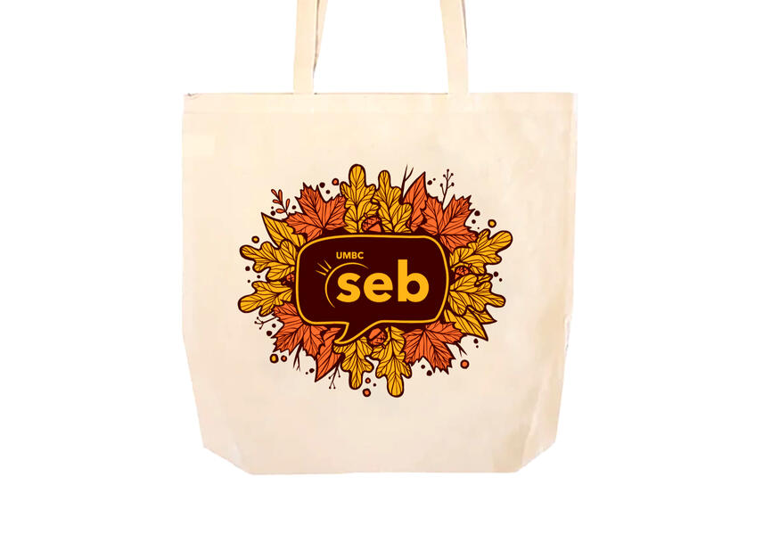
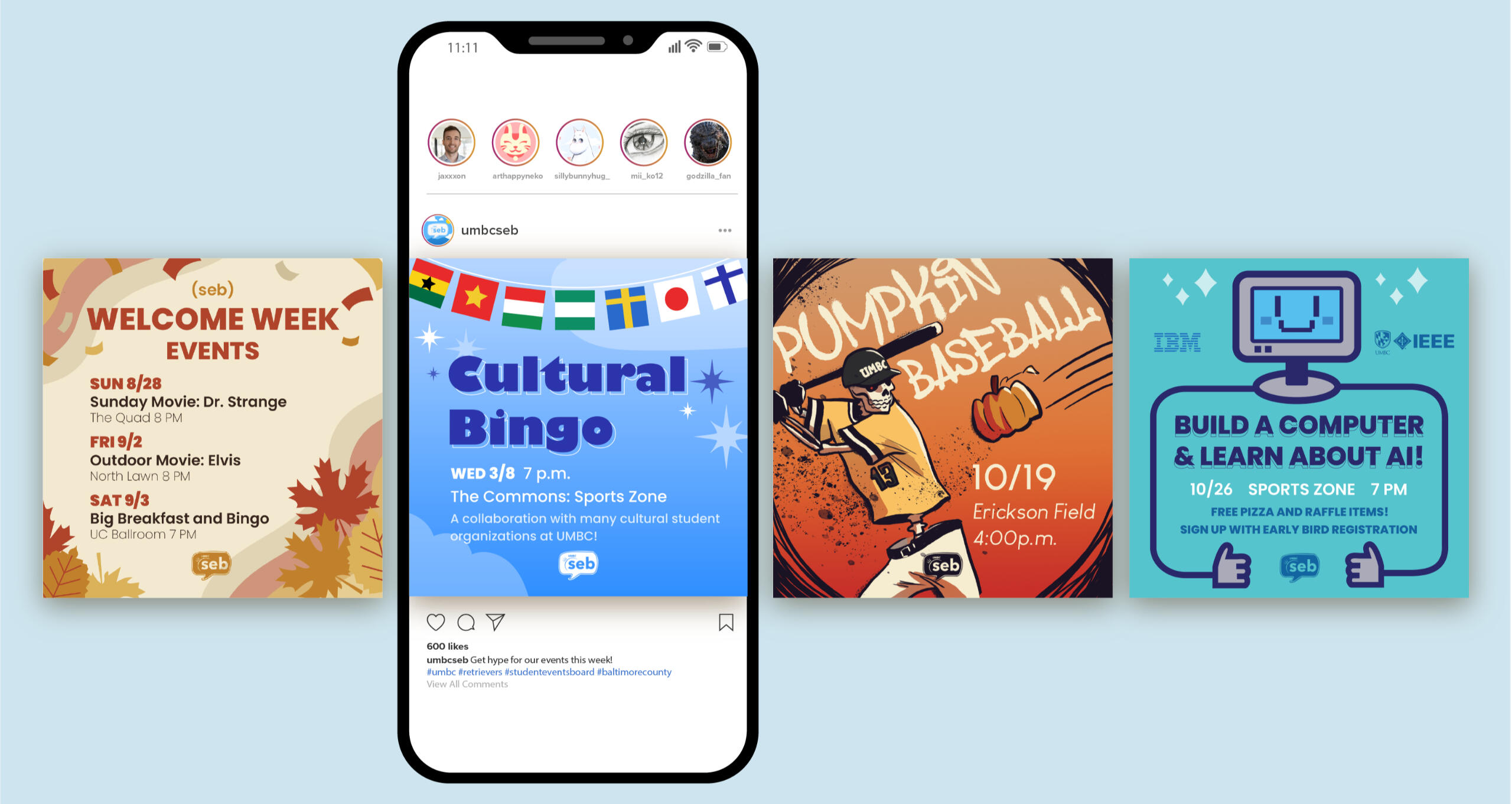
The Student Events Board at the University of Maryland, Baltimore County hosts events for undergraduate students every week. As the Vice President of Design, my role was to create social media and print materials while guiding a team of designers. I was also in charge of communicating with the marketing team and print shop to produce the best marketing materials possible. I made original illustrations, used simple color palettes, and bold fonts to appeal to students of all backgrounds.
Style Guide
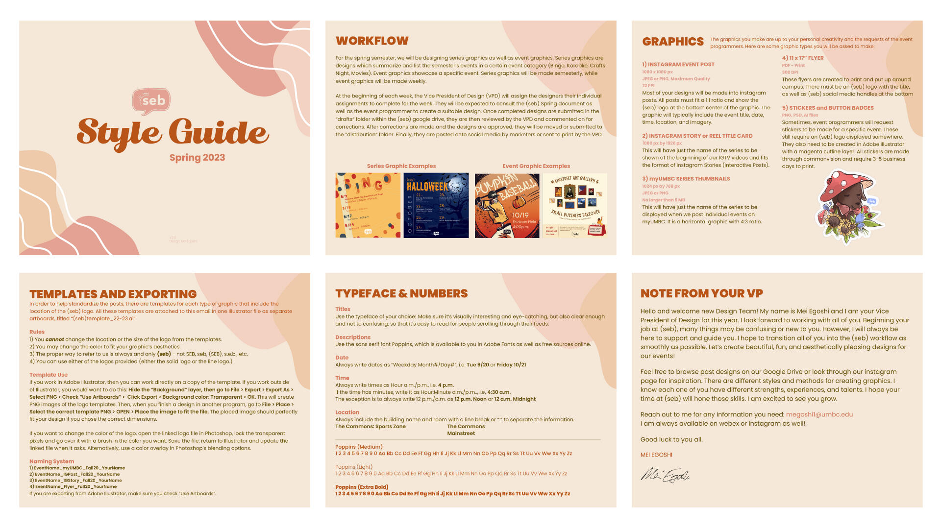
In order to have some uniformity in our work, I designed a style guide for the designers on our team. This was a crucial piece to transitioning the newly recruited designers into their positions. It included everything from information about our workflow, document sizes, template use, typeface, how we write dates, etc. Keeping in mind that the incoming designers are young college-age women, I designed the style guide to be simple but friendly by using organic shapes and warm colors.
Process
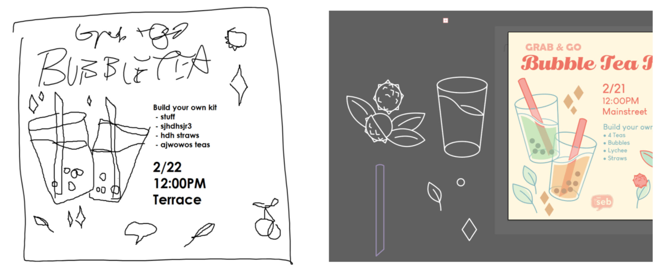
Before starting any design, I first thoroughly read the criterias and descriptions for the designs being requested by the event programmers. Then, I took their ideas and sketched out the general layout or imagery of the design. Sometimes this was done with pencil and paper, and other times it was done digitally. Finally, I fleshed out the design using Adobe Illustrator, Photoshop, and InDesign.
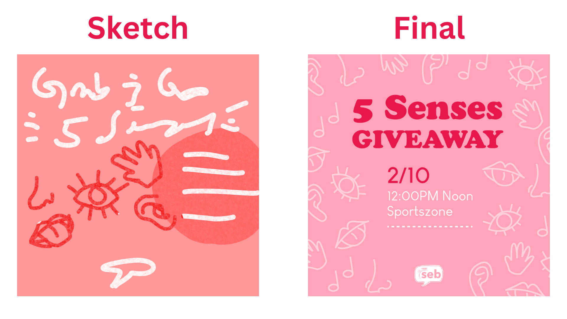
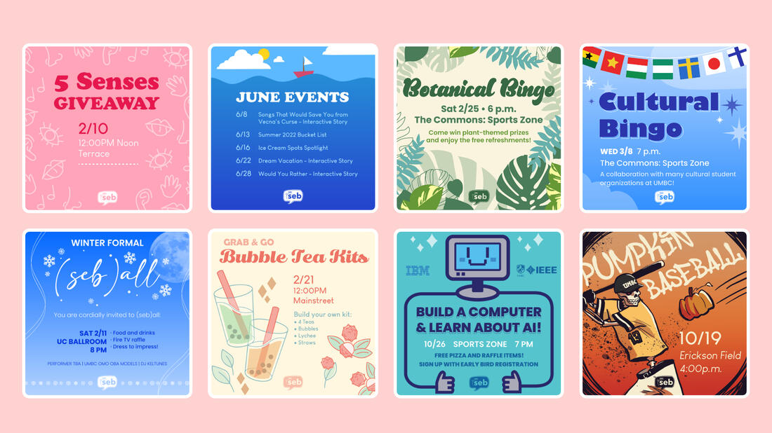
In the example above, the event programmer was planning a giveaway related to the five senses (touch, sight, hearing, smell and taste). I quickly sketched out the key elements I wanted to include in the design for the social media advertisement: an eyecatching title, space for the description, the organization's logo, and graphics representing the five senses. I used a pink color scheme because there were Valentine's Day themed events that week.The posts were exported as 1080 x 1080 pixel digital images to market events on instagram @umbcseb.
Gallery
UMBC Bonsai Club
Logos ⬩ Print Design
Tools & Skills
Adobe InDesign
Adobe Illustrator
Illustration
Logo Design
Print Design
Deliverables
Logo
Flyers
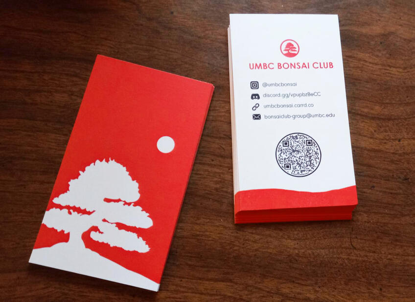
Business Card
Booklet
Merchandise
About
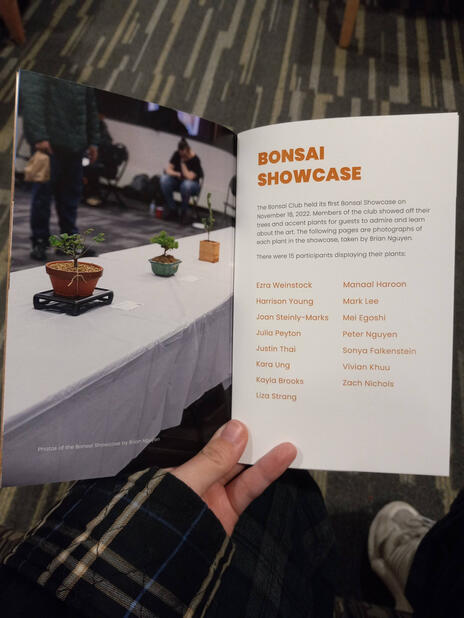
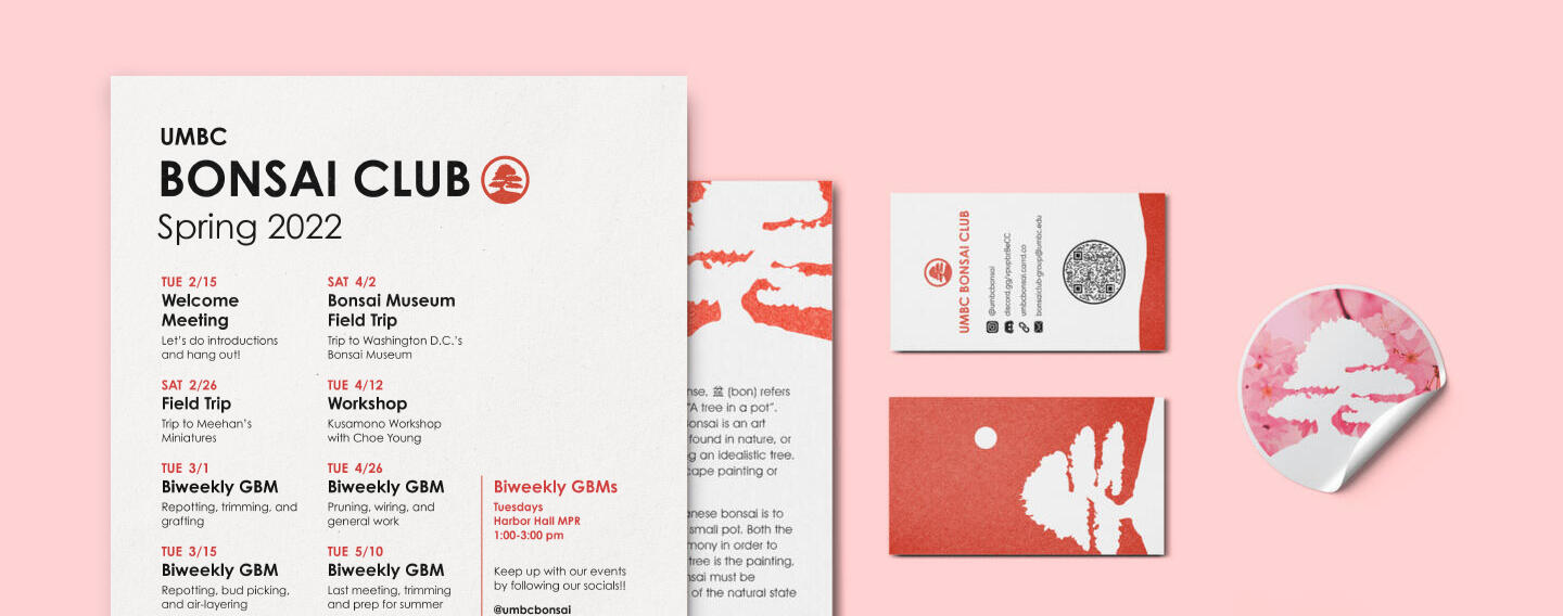
A student forming the Bonsai Club at University of Maryland, Baltimore County (UMBC) approached me for a logo design. Bonsai is the Japanese art of miniature trees in pots. They needed something recognizable to represent the club in the sea of student organizations. After creating the logo and becoming familiar with the club, I also made other designs for them such as business cards, flyers, and merchandise.
Logo Design

The client first wanted a logo that resembled a Japanese "mon" (or crest) and incorporated Japanese maple leaves. However, this idea was quickly scrapped after the first round of revisions when they realized that the maple leaves could look like marijuana leaves to college students. This would not be a good impression for a school organization. We decided that it would be safer to depict a whole bonsai tree instead of leaves.

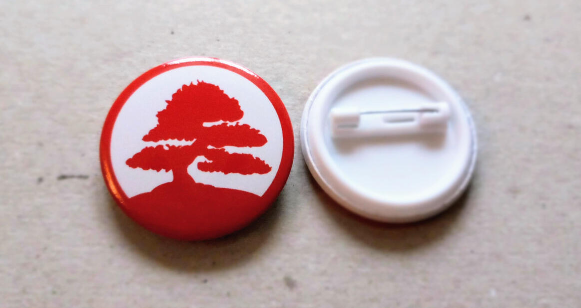
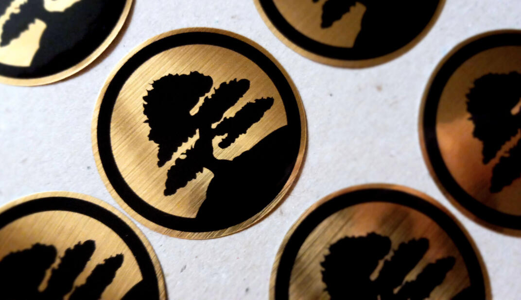
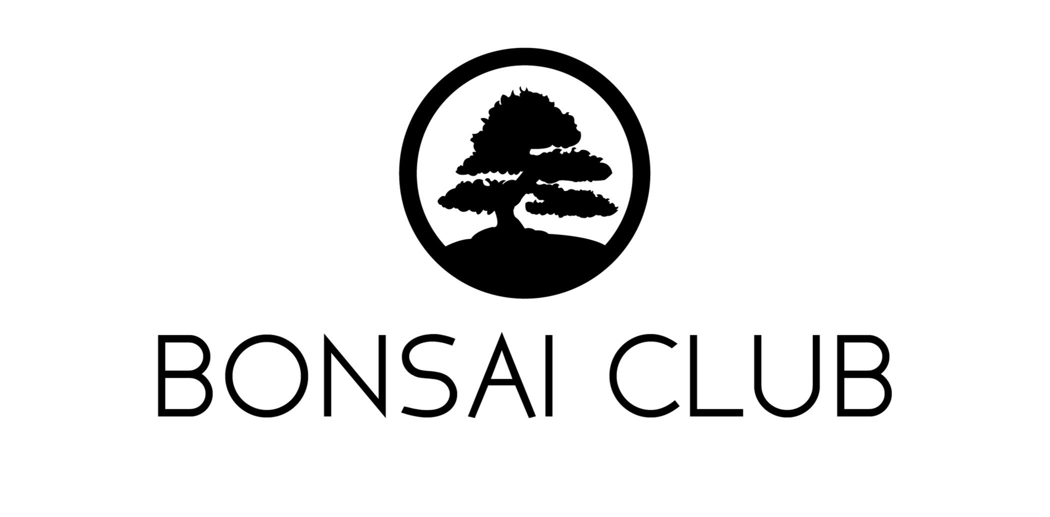
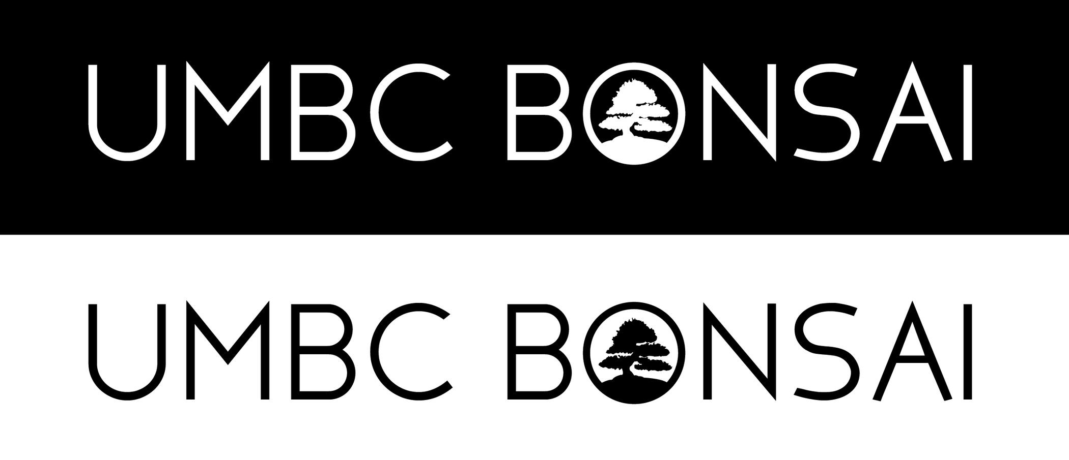
For the final logo design, I combined the circular design of a "mon", the silhouette of a pine bonsai tree, and the red sun from the Japanese flag. Even without any knowledge of bonsai, the imagery and colors in the logo allows the audience to quickly understand that it is related to Japan and trees.


Gallery
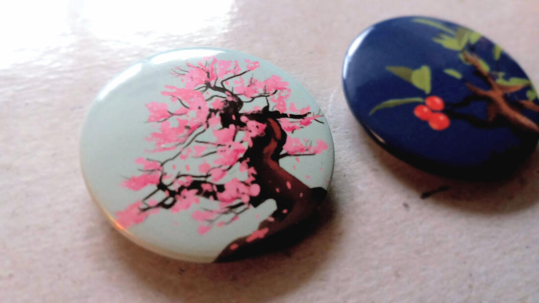
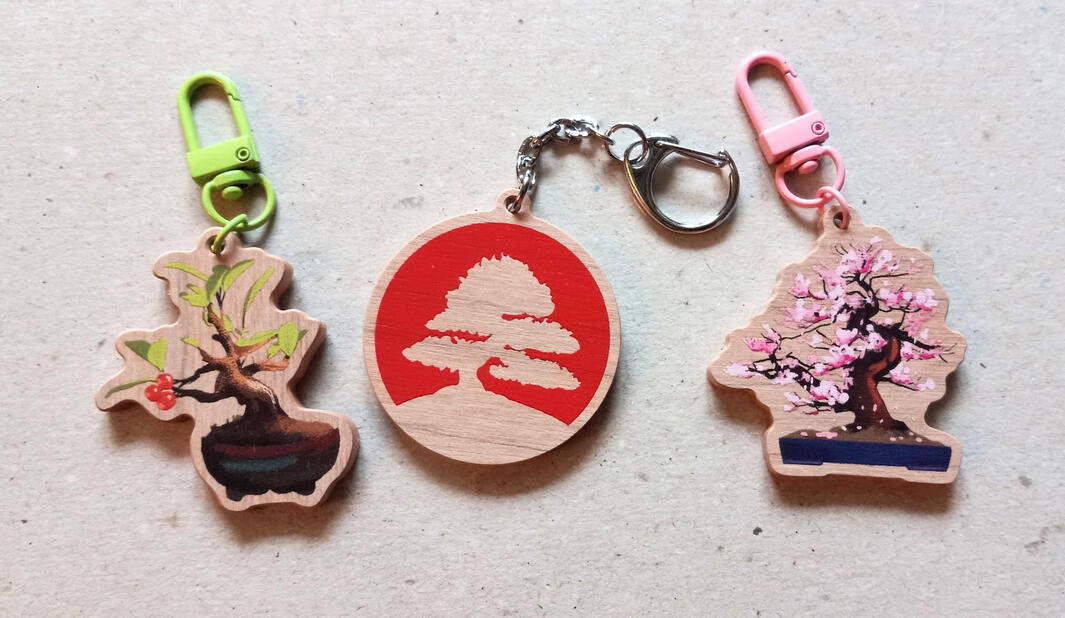
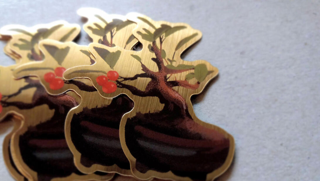
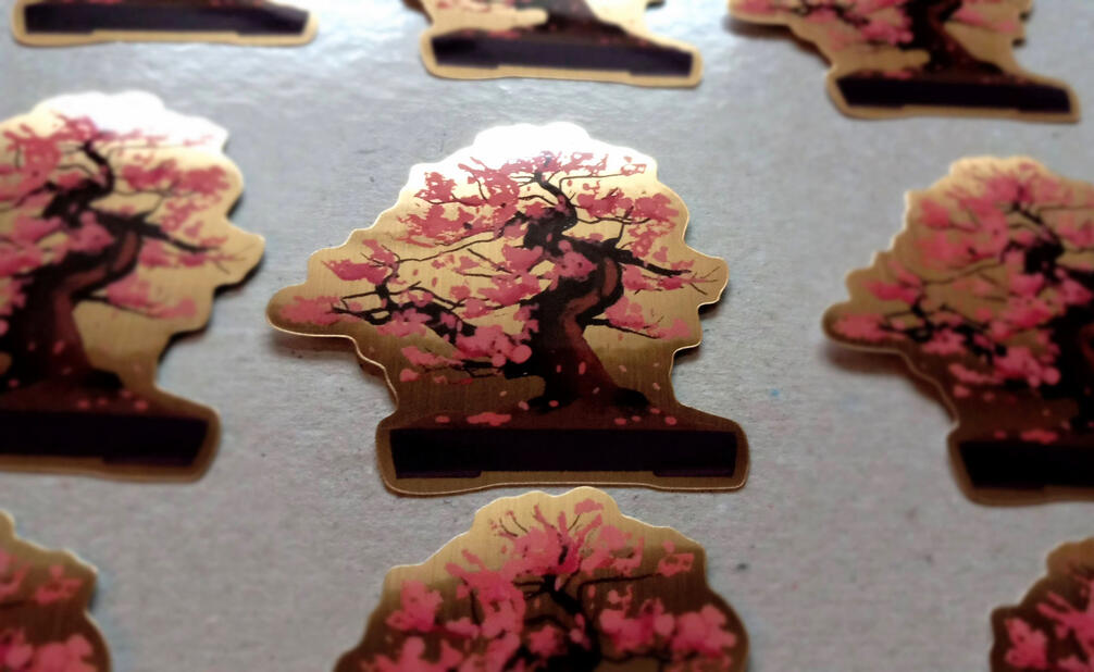
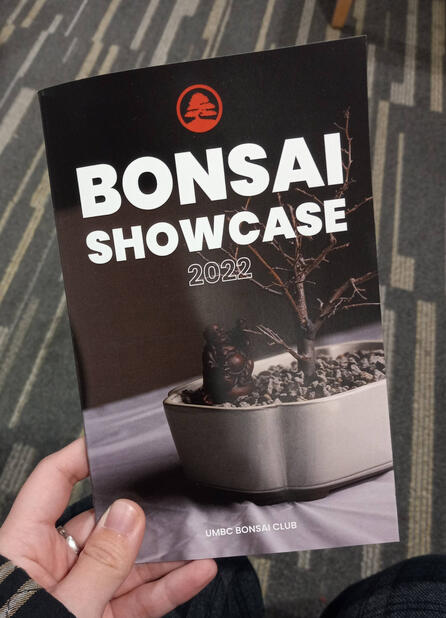
Using the logo, I created various marketing materials and documents for the club, including button badges, stickers, keychains, business cards, and booklets. I also had the opportunity to create illustrations of various bonsai trees as part of the merchandise designs.
Restructuring Eckmann Schrift
Book ⬩ Research ⬩ Typography
Tools & Skills
Adobe InDesign
Adobe Illustrator
Typography
Research
Book Layout
Deliverables
Book
Glyphs
About
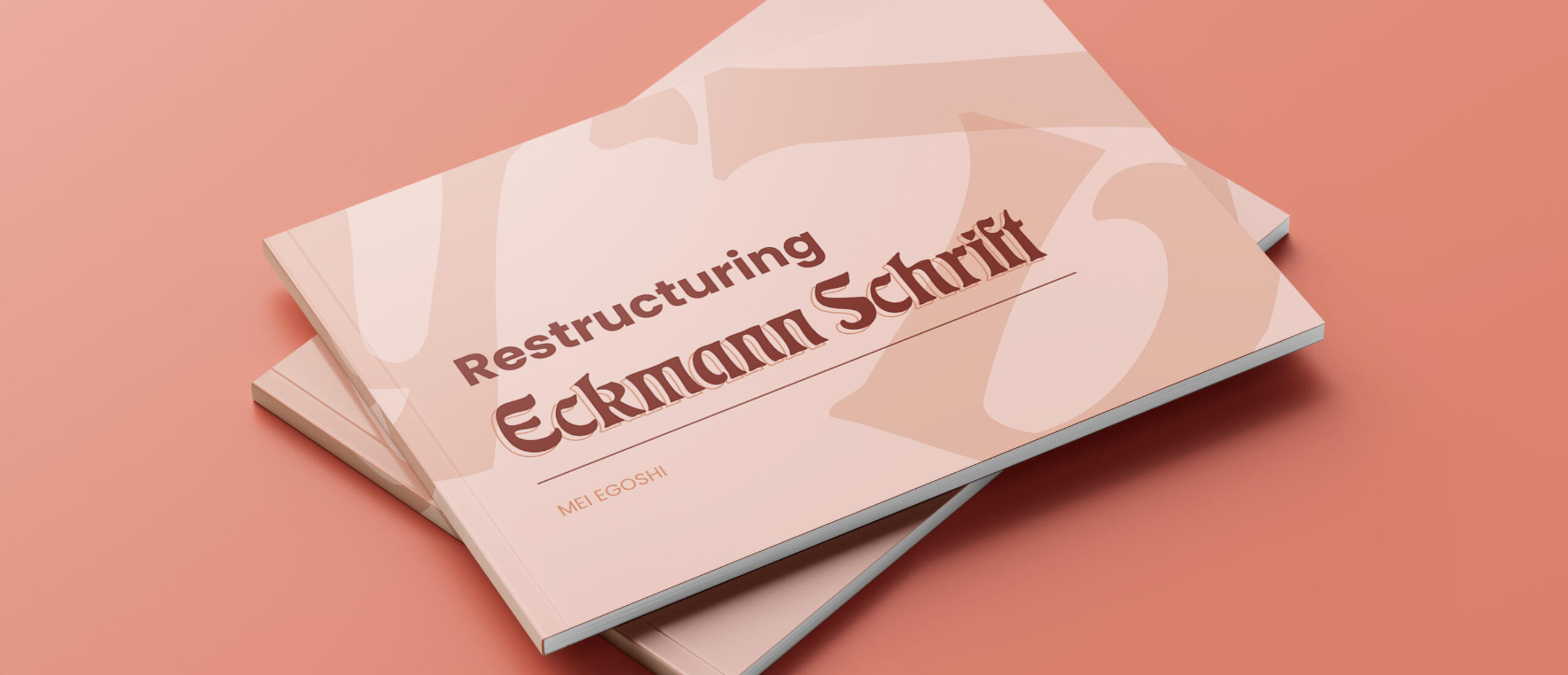
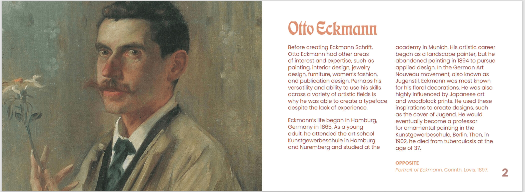
In this project, I created unique glyphs to fit within Eckmann Schrift, a typeface created by Otto Eckmann. The glyphs were hand drawn as vector graphics to emulate the style of the original typeface. I presented these glyphs in a book along with information about the typeface designer.
Process
Research
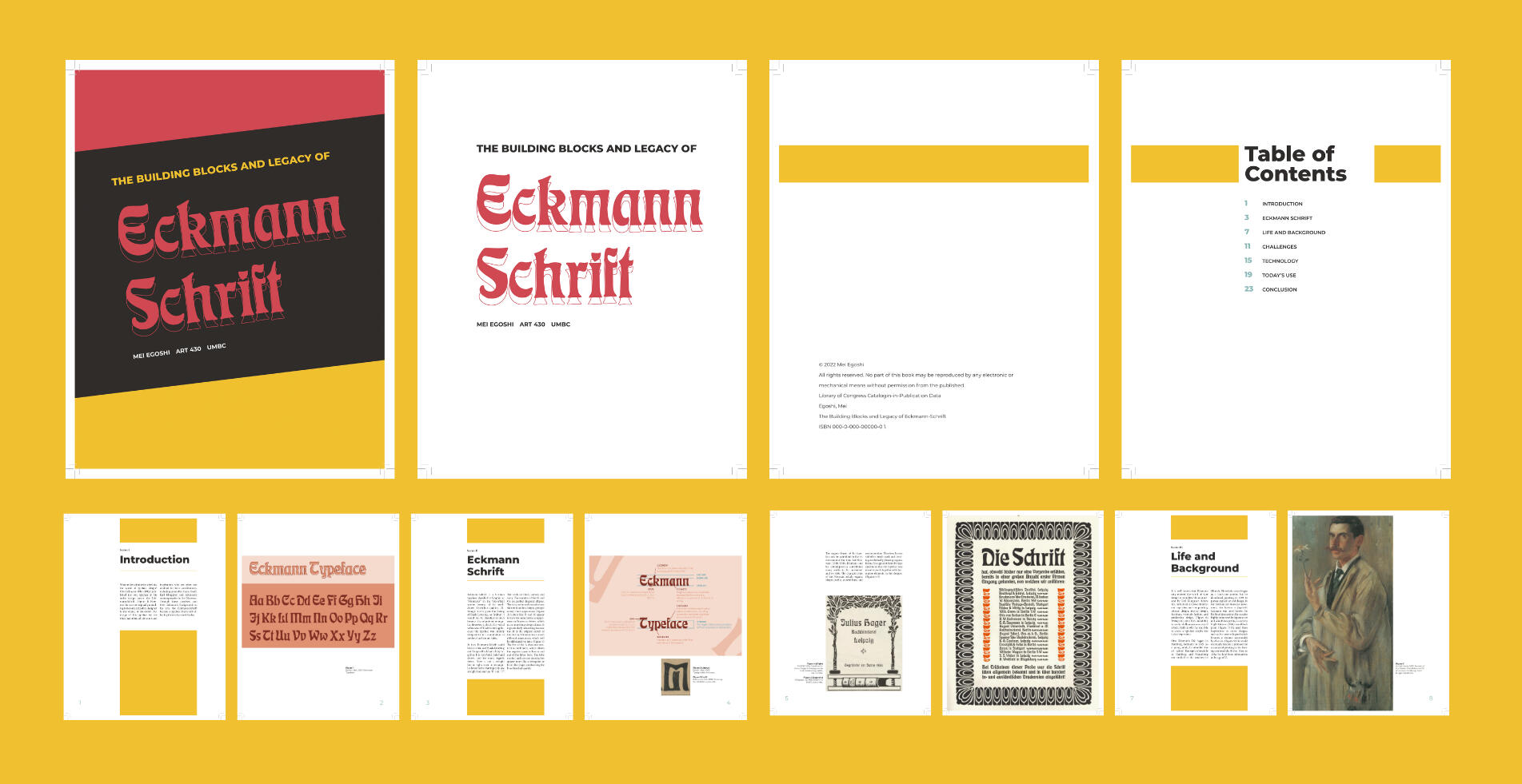
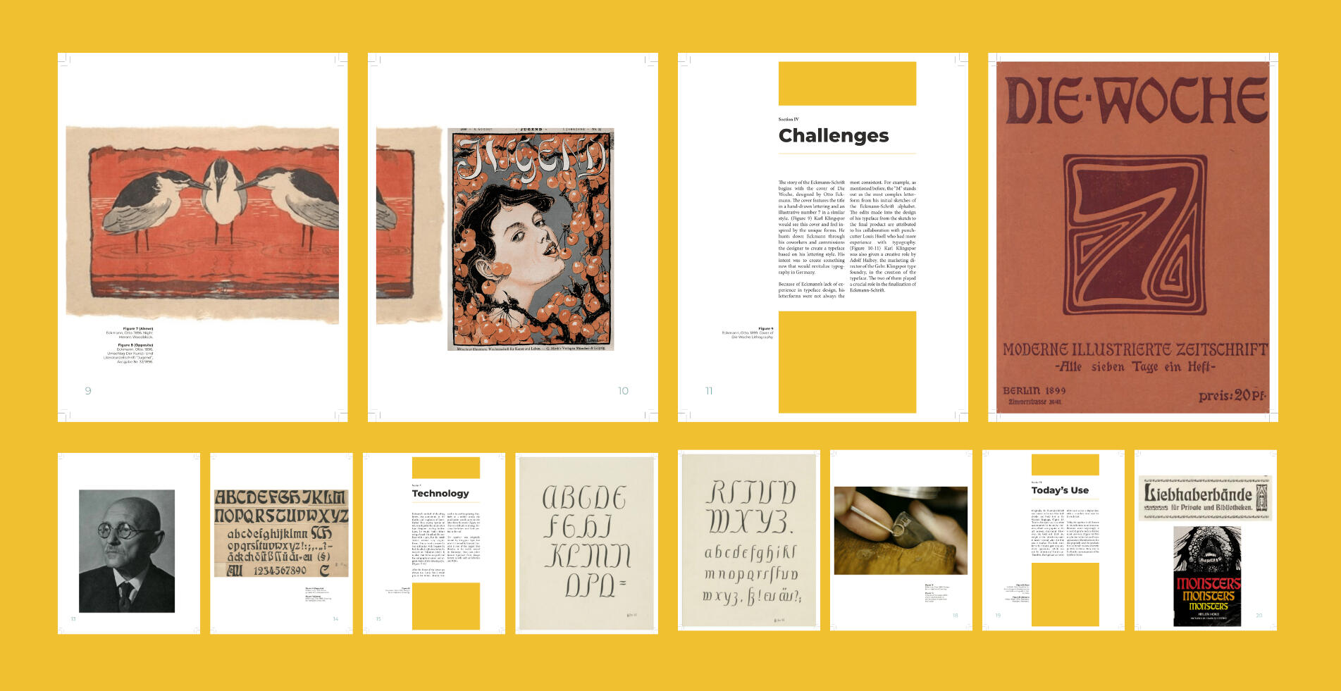
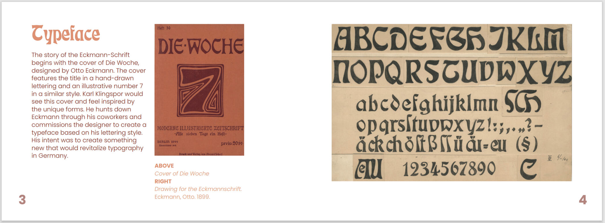
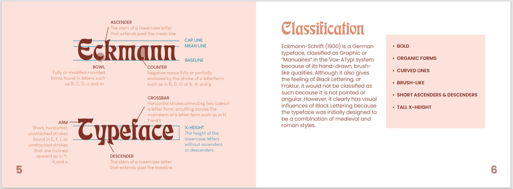
To learn more about Eckmann Schrift, I wrote a paper called "The Building Blocks and Legacy of Eckmann Schrift".
Sketches
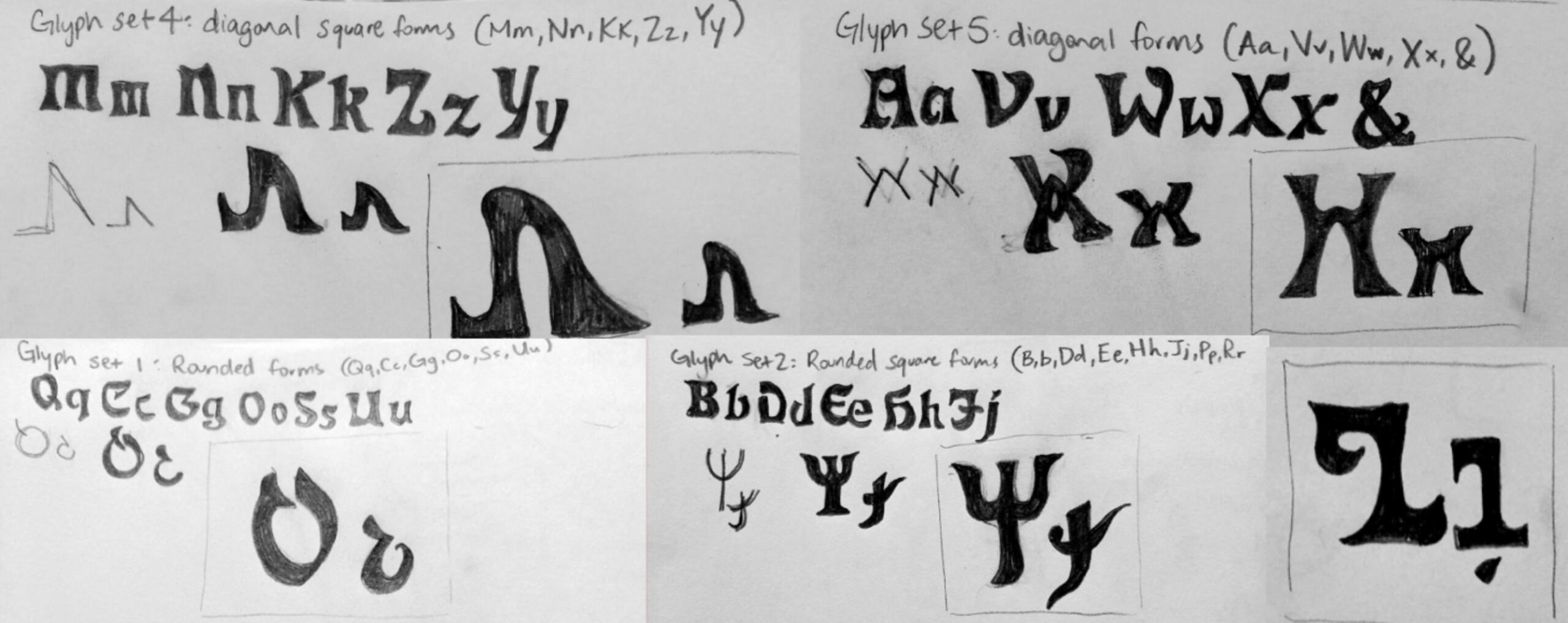
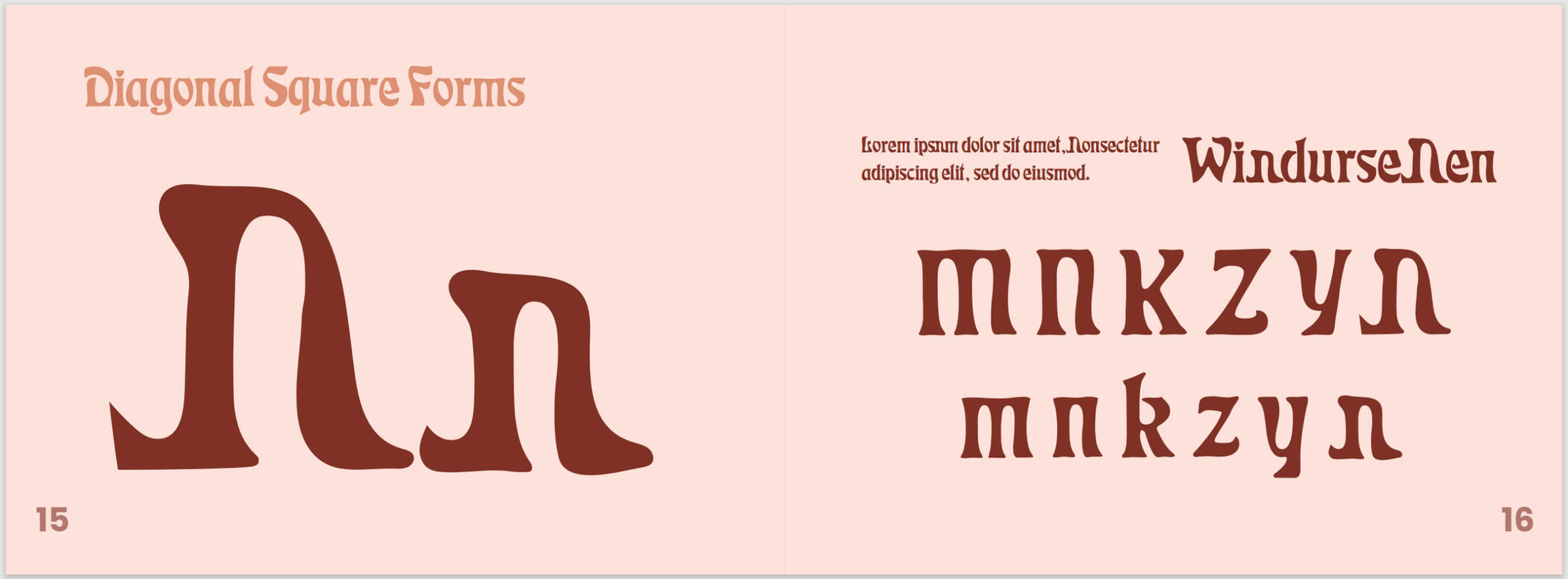
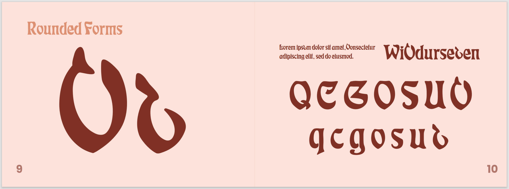
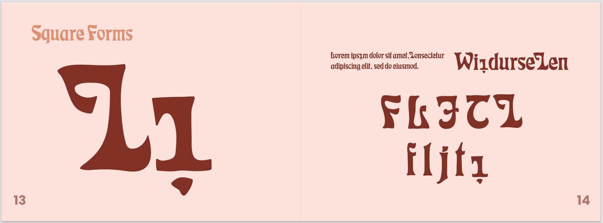
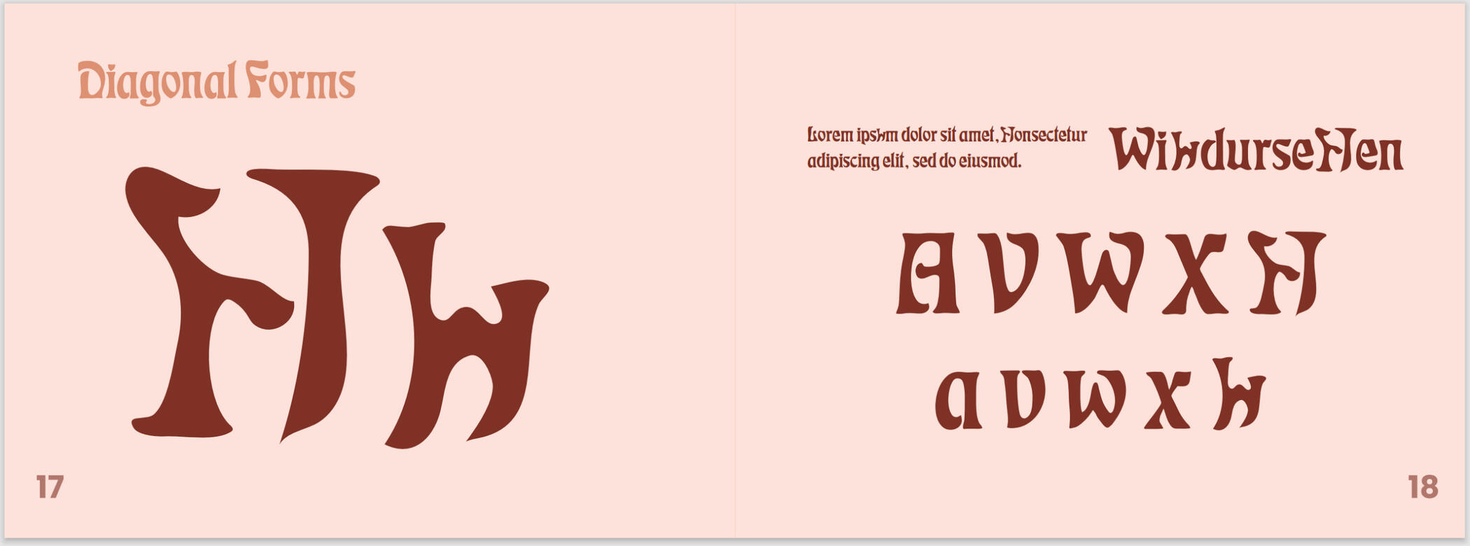
I made sketches for four types of glyohs: diagonal square forms, diagonal forms, rounded forms, and rounded square forms. I first studied the letters in the typeface. I noticed the little curves and unique characteristics of each letter. Then, I sketched my glyphs with pencil and paper, keeping in mind the other forms.
Final Glyph Sets

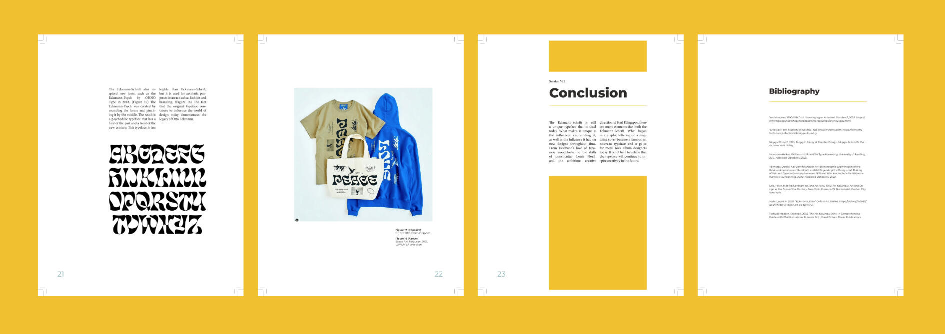
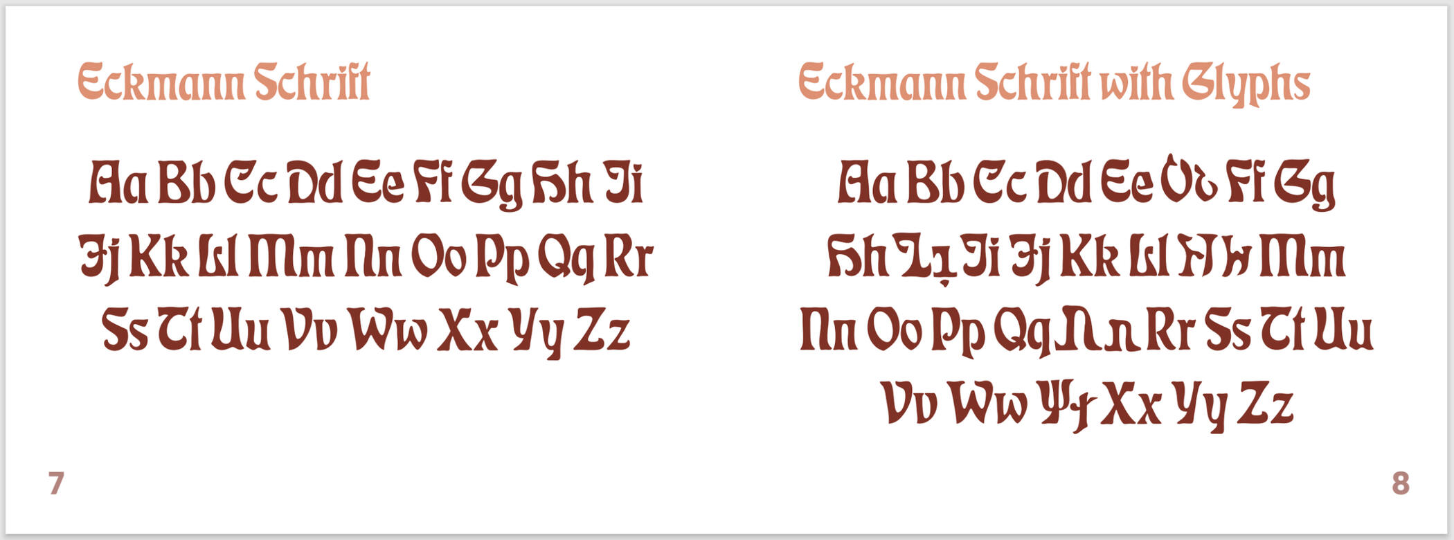
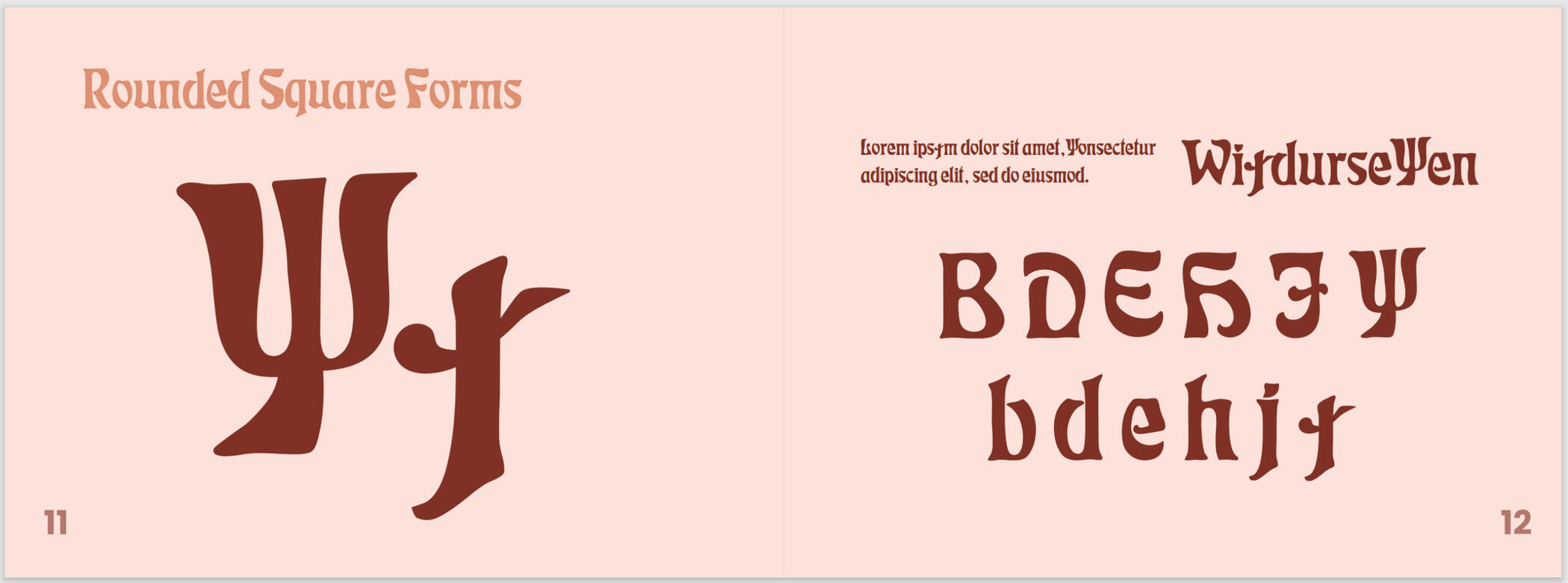
From the sketches, I created 5 sets of glyphs in Adobe Illustrator. Each set has an uppercase and lowercase variation.
Book
The research and glyphs were combined into a book called "Restructuring Eckmann Schrift." I briefly described the history and designer behind the typeface. Then, I included my glyphs and showed how they fit into the alphabet.

Quadmania 2023
Logos ⬩ Branding ⬩ Print Design

Tools & Skills
Adobe InDesign
Adobe Illustrator
Branding
Logo Design
Print Design
Team Management
Deliverables
Logo
Style Guide
Flyers & Booklets
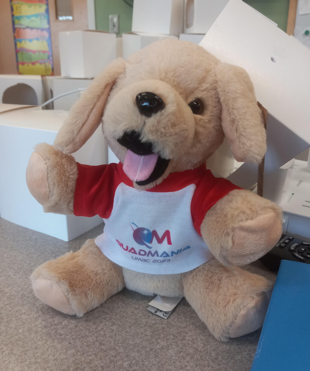
Merchandise
About
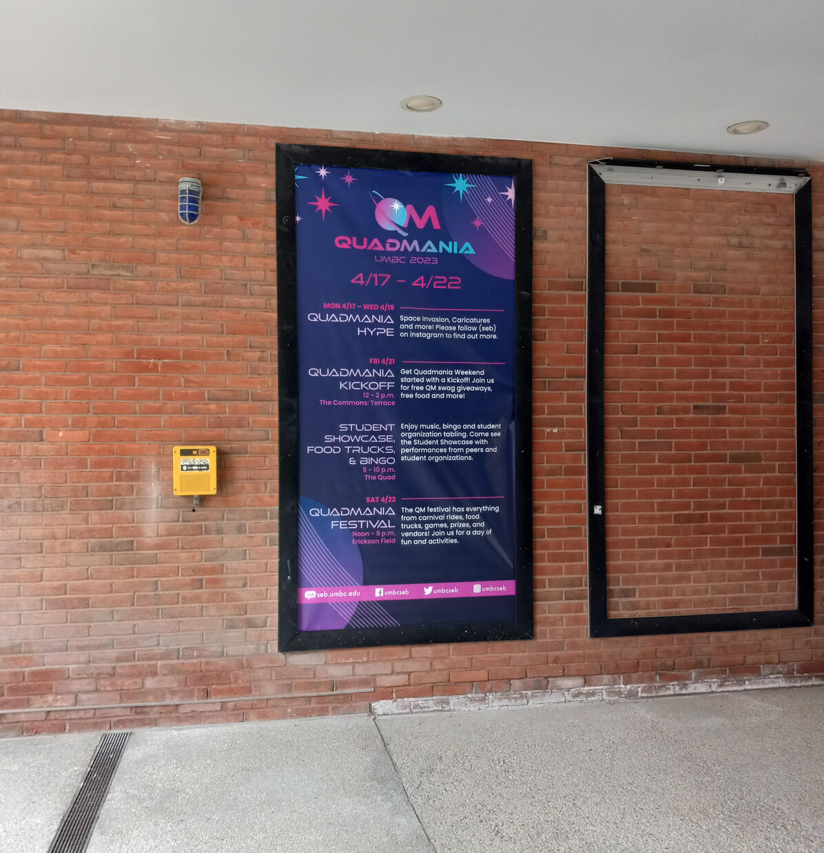
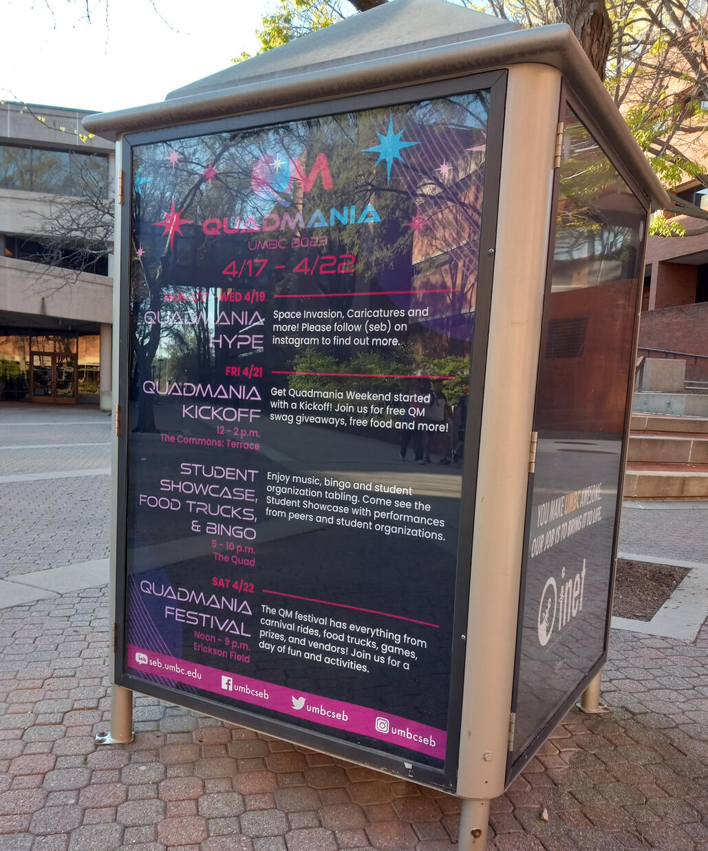
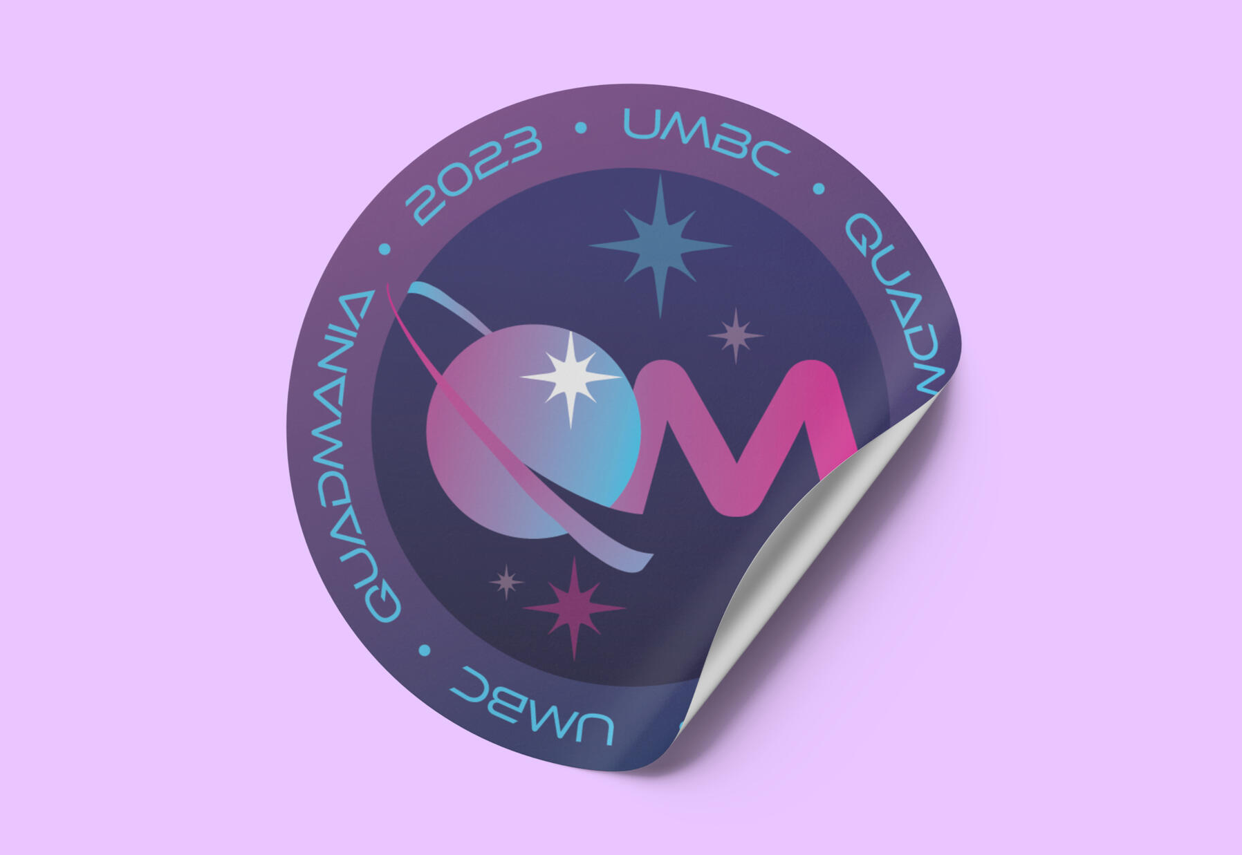
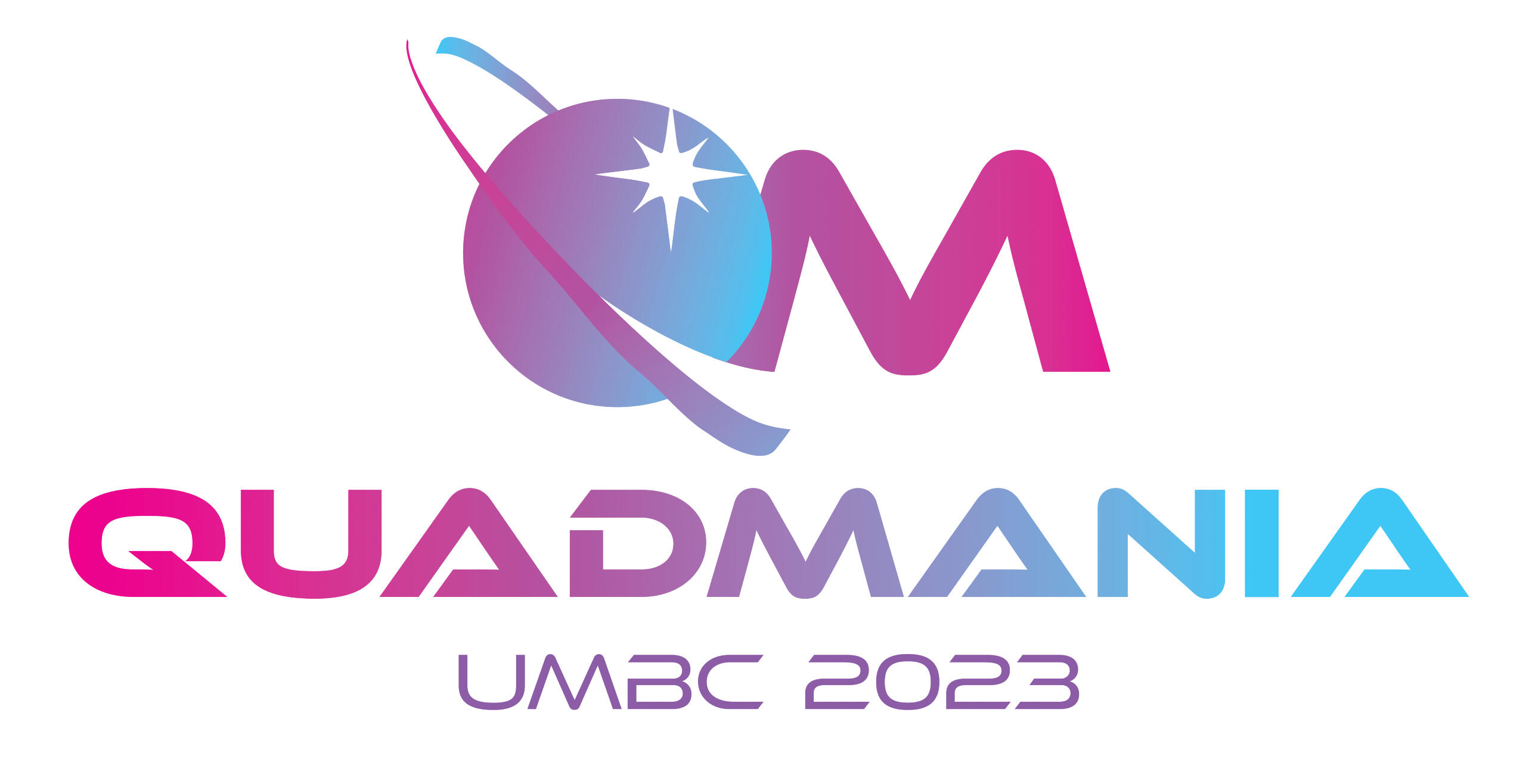
Quadmania is the annual spring festival hosted at the University of Maryland, Baltimore County (UMBC) by the Student Events Board. The theme for 2023 was "Space." I was in charge of creating the logo, the style guide, directing other designers on the team, and designing materials for the event.
Logo Design Process
Moodboard
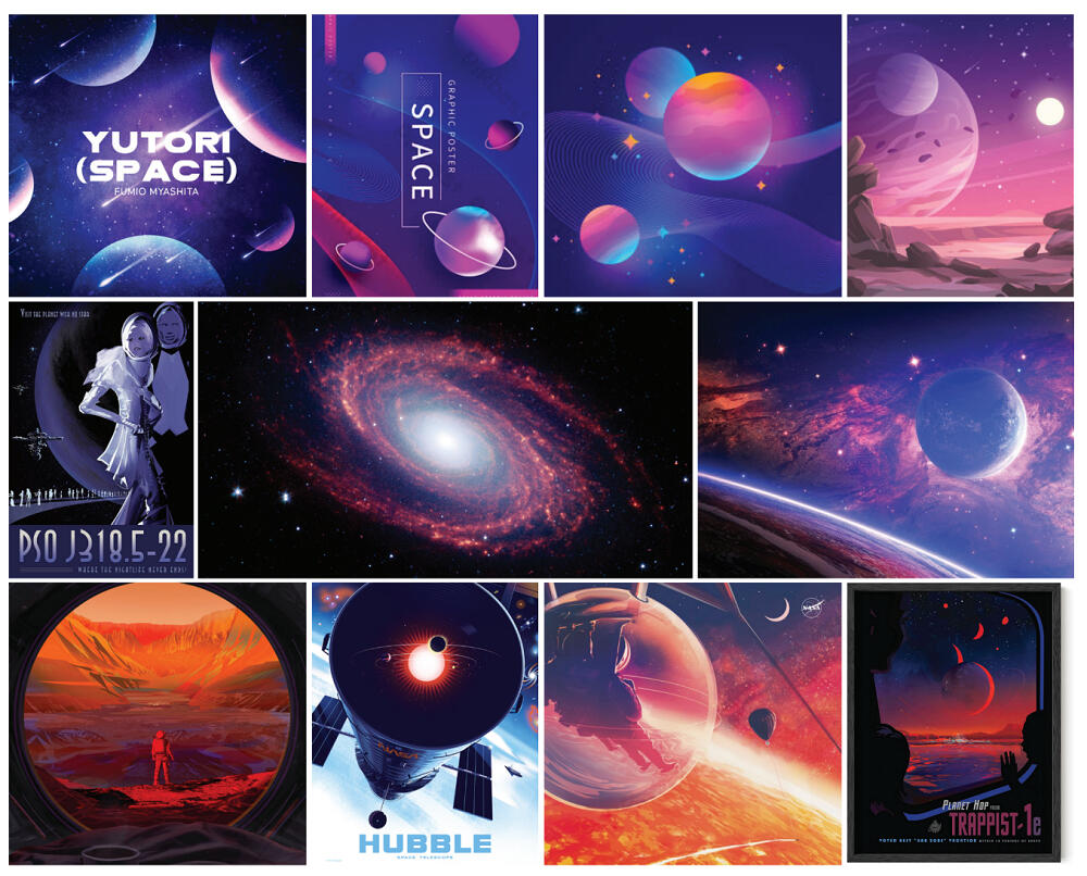
Because the festival is space themed, I first began my design process by researching posters, illustrations, photographs, album covers, and book covers related to space. I specifically looked for appealing compositions, color palettes, and font choices that represented the theme well.I noticed that a lot of designs used gradients on planets, dark purples and blues for the background, and bold fonts. I also thought depicting stars as sparkles will be appealing to the younger audience. These are characteristics I kept in mind while designing the logo.
Exploration
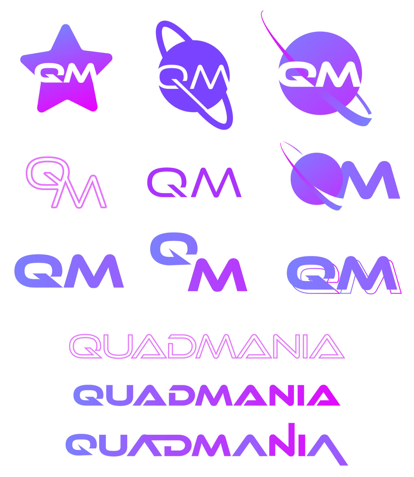
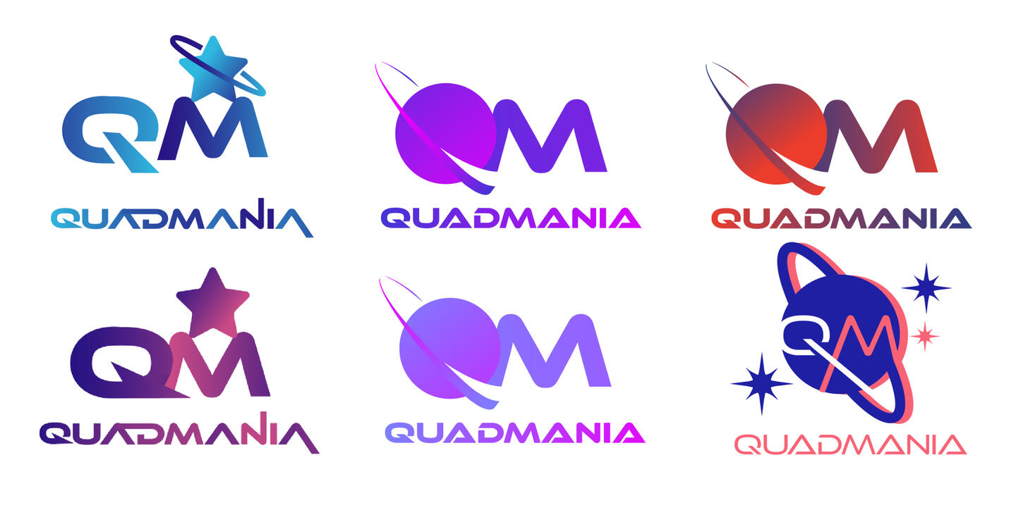
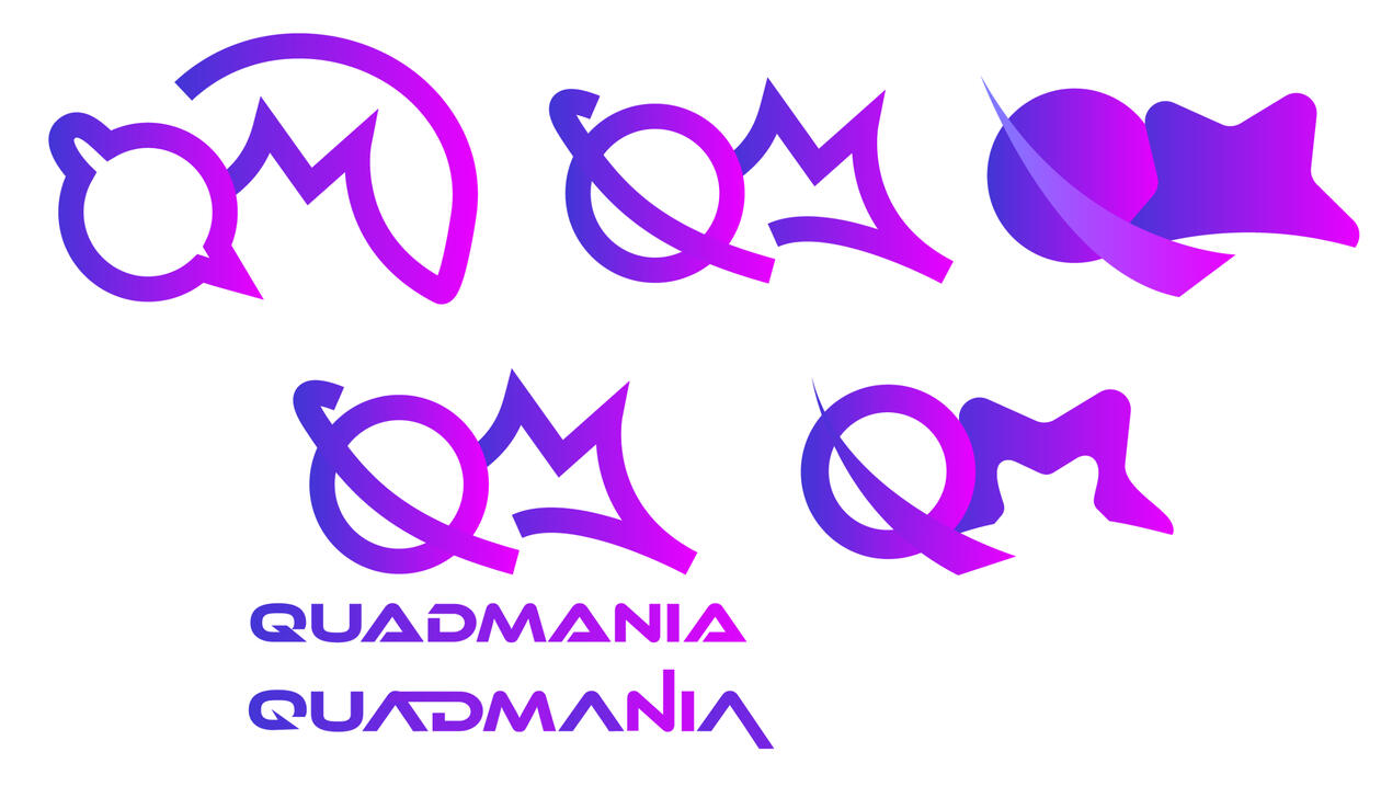
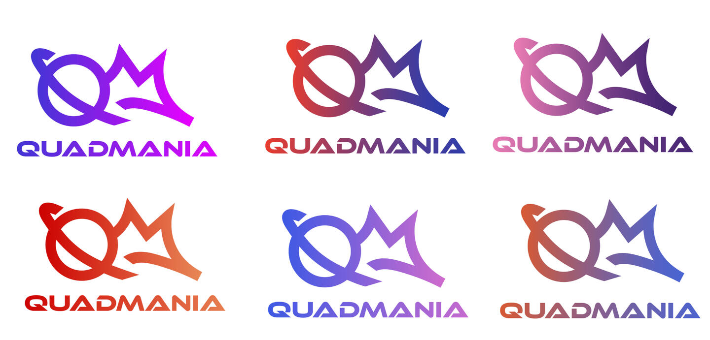
I used Adobe Illustrator to make many variations of QM and Quadmania. I explored different ways of incorporating the "space" theme, including turning the Q into Saturn or adding star motifs. I also explored various color palettes using inspiration from the mood board, but generally stuck with the blue-purple-magenta gradient for a bright and vibrant appearance.
Final Picks
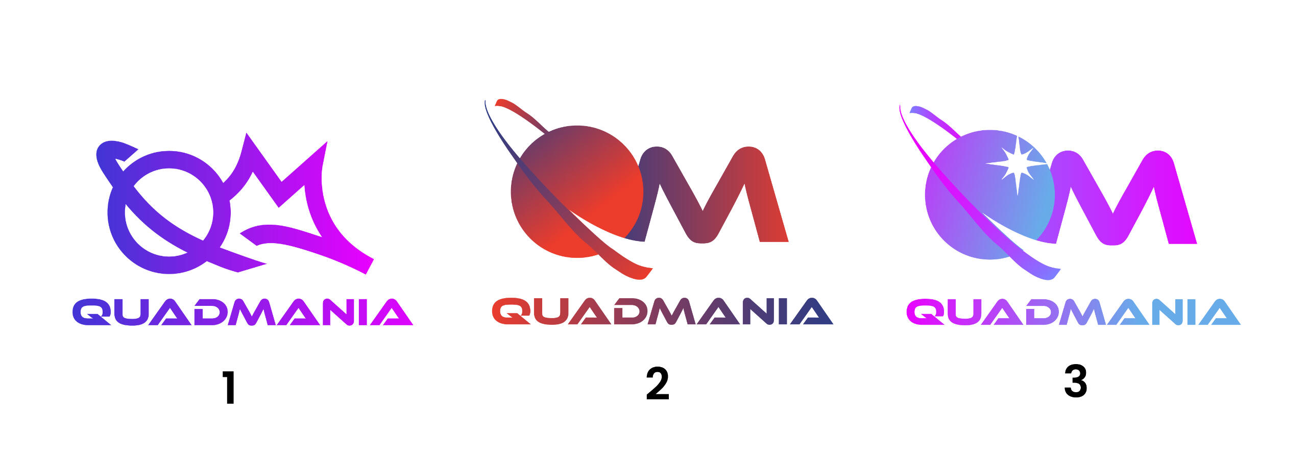
After showing my team the explorations, we chose three different choices to present to the Student Events Board. The board did a majority vote and decided on design #3. After tweaking the colors to be more print-friendly, I created a style guide using the logo.
Style Guide

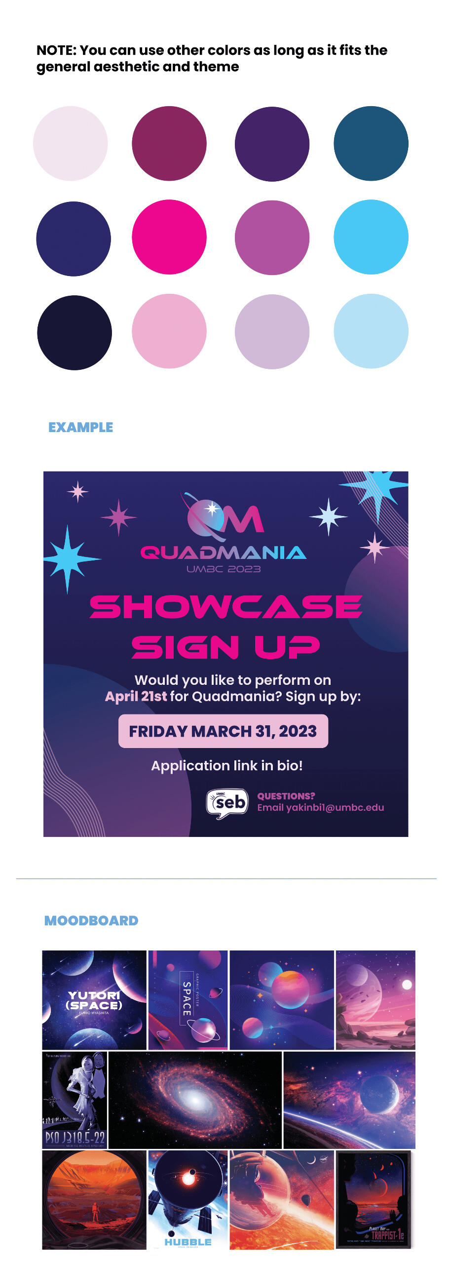
For the style guide, I prepared an Adobe Illustrator file that the other designs on the team could take components from directly. I included everything they'd need including the logo, icons, colors, typeface, and an example to follow. This made the designing process easier for everyone.
Booklet
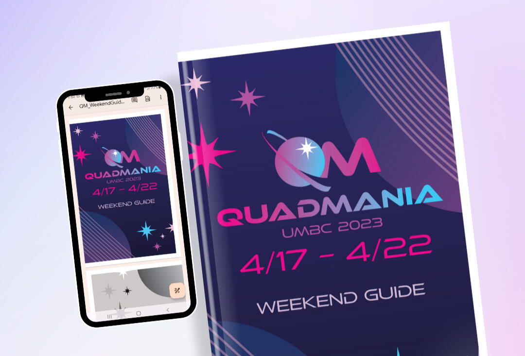
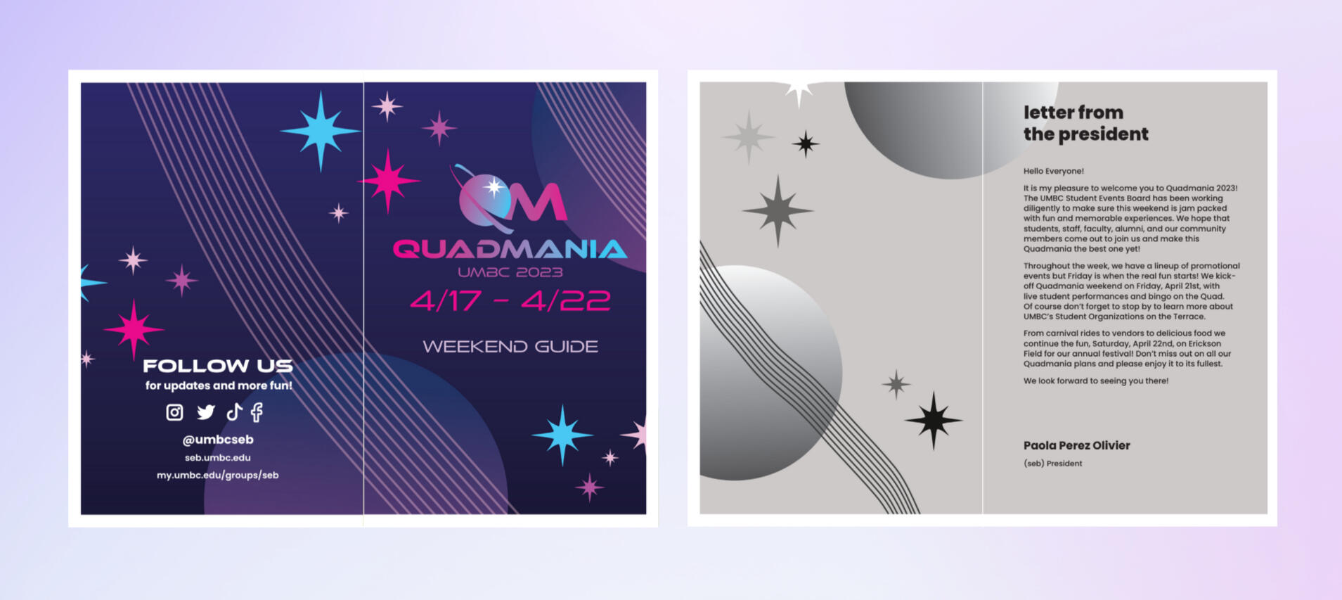
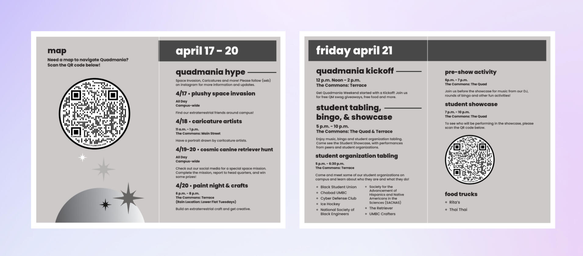
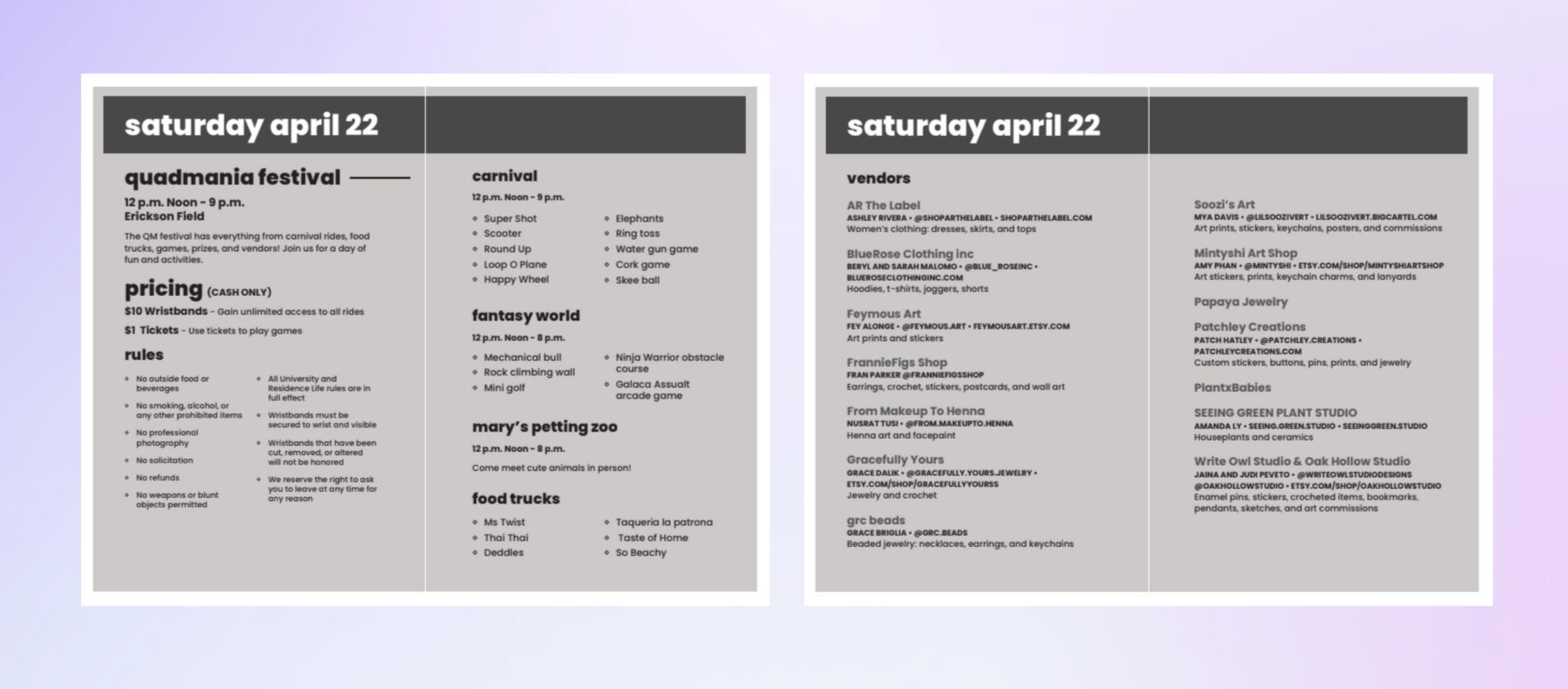
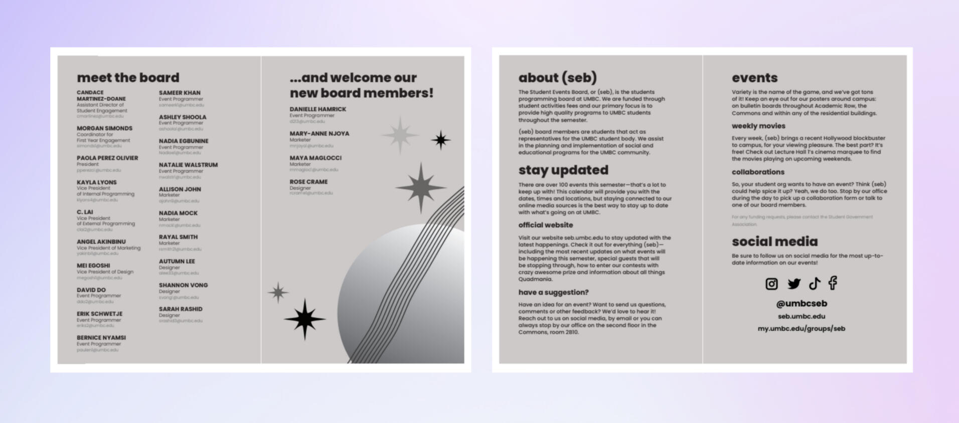
Using Adobe InDesign and Illustrator, I designed a booklet to guide festival goers through the different activities and events. The guide was also available to view on mobile through a pdf.I kept the inner pages black and white to reduce printing costs for the Student Events Board. Without color, I relied on heavy font weight to make information stand out.I made the decision to make titles all lowercase because the Student Event's Board refers to themselves as (seb) with all lowercase.
Gallery
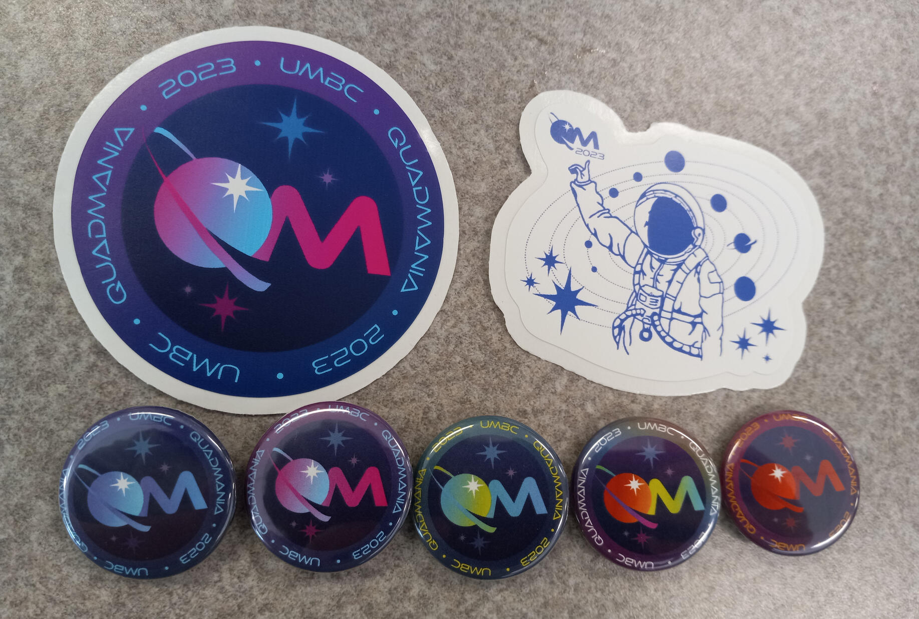
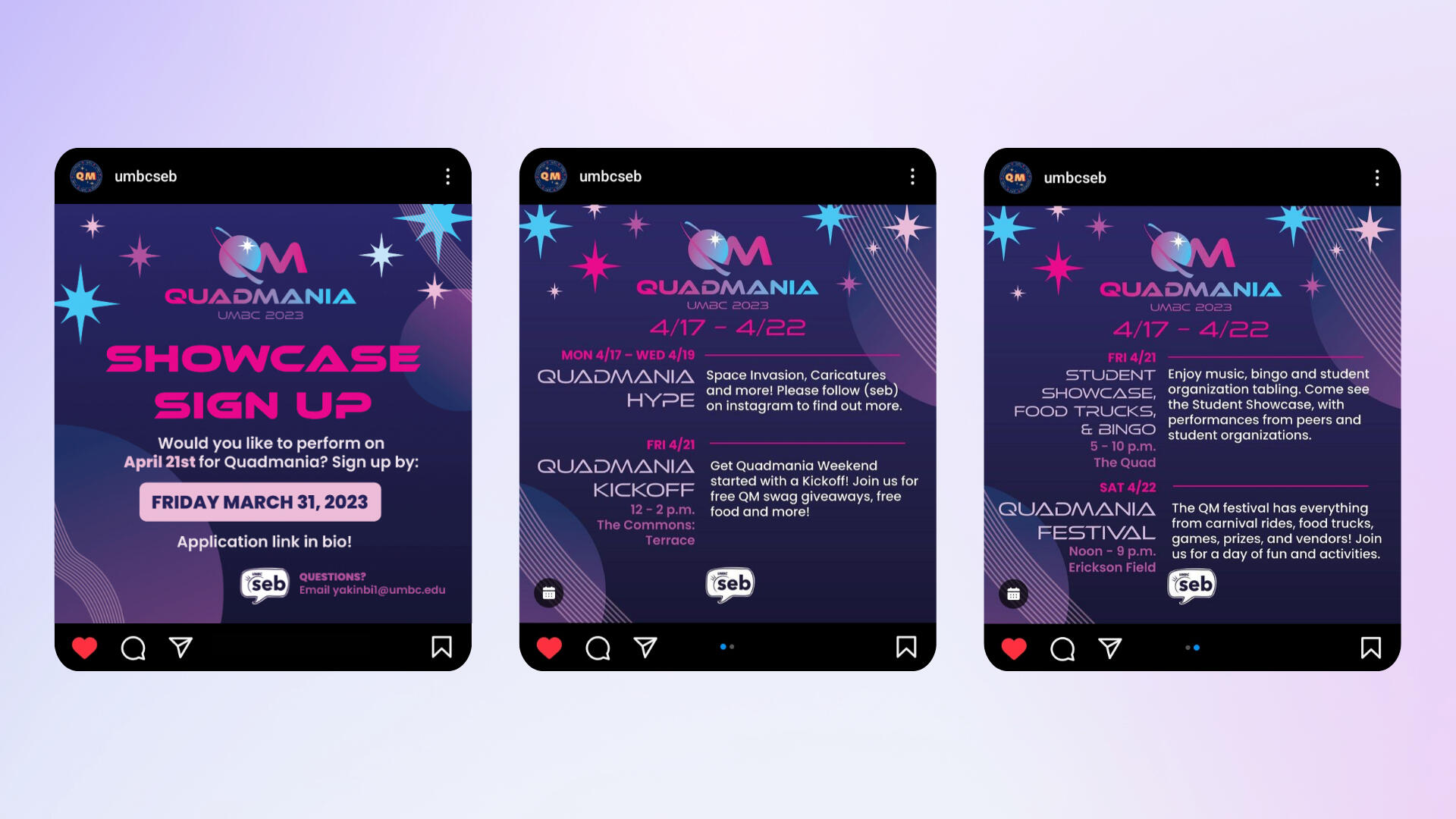
After I made and shared the style guide, my team and I created print, social media, and merchandise designs for the event. Shown below is a gallery of my designs. Designs which are not made by me are specified.
About
Hi, my name is Mei.
I am a Japanese American graphic designer based in Laurel, Maryland. Art and design is something I have always been passionate about. I am currently the Marketing and Design Coordinator at Concord Hill School. In my free time, I like to rollerskate, draw digitally, and design merchandise for my Etsy shop!Please feel free to contact me for inquiries about working together!
Education
University of Maryland, Baltimore County
Graphic Design B.F.A
Print Media Minor
Japanese Minor
Softwares/Skills
Adobe Illustrator
Adobe Photoshop
Adobe InDesign
Illustration
Print Design
Motion Design
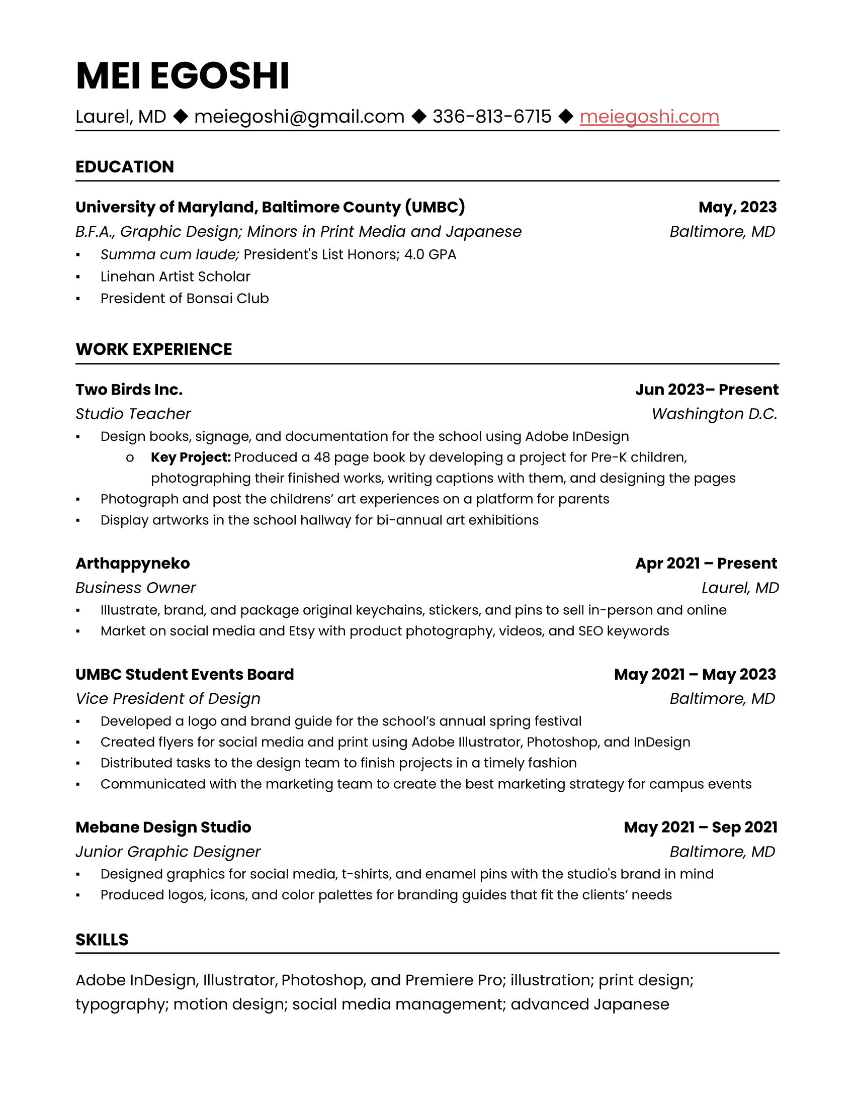
Resume
Contact
Interested in working together? Contact me!
